
Contents:

Course with employment: "The Methodologist Profession from Scratch to PRO"
Find out moreFull title: "Data: Visualize, Tell, Use. Storytelling in Analytics." This course focuses on how to effectively present data and use it to create engaging and informative stories. In this course, you'll learn how to visualize data so it's understandable and accessible to a wide audience. We'll cover key storytelling techniques that will help you not only present information but also engage your audience. Using analytical tools and techniques, you'll learn to transform dry numbers into compelling narratives that will help you make informed decisions. This course is useful for both novice analysts and experienced professionals looking to improve their skills in data visualization and communication.
Book Title: "Storytelling with Data: A Guide to Data Visualization for Business Professionals." This publication is a valuable guide for professionals looking to improve their skills in data visualization and effective information presentation. The book explores in detail storytelling methods and techniques that help transform complex data into understandable and engaging visual formats. The authors emphasize the importance of context and audience, and offer practical tips for creating visualizations that not only inform but also influence decision making. This guide will be an indispensable resource for business professionals looking to enhance their skills in data analysis and visualization, which, in turn, can lead to more effective interactions with clients and colleagues.
MIF Publishing House is one of the leading Russian publishers specializing in high-quality literature. Since its founding, it has established itself as a reliable source of relevant and engaging books covering a variety of genres and topics. The publishing house actively collaborates with talented authors and offers readers a wide range of books, including fiction and nonfiction, as well as books for children and young adults. MIF strives for high publishing quality, making its products popular among both readers and booksellers.
Published in 2020.
Every date and figure has a story, says Cole Nussbaumer Naflic, a data visualization specialist and former Google analyst. Naflic and her team at Storytelling with Data currently offer courses and workshops teaching people how to effectively and clearly present information using graphs and charts. Her blog, also called Storytelling with Data, publishes examples of poor visualizations, along with recommendations for improvement. These resources help improve data skills and make visualizations more engaging and understandable for a wider audience.
The book "Data: Visualize, Tell, Use" is a practical guide useful for creating educational presentations and slide courses, as well as for preparing analytical reports in business. Published in 2015 in English, it quickly became an international bestseller. In 2020, the book was translated into Russian by MIF Publishing House, and a reprint was published in 2025. This edition will become an indispensable resource for anyone who wants to work effectively with data and improve their visualization and communication skills. Naflik shares valuable experience gained while working with clients from various industries, including education, healthcare, information technology, and public administration. The book presents a variety of examples covering a wide range of topics, and Naflik's methodology is universal and suitable for visualizing any data. The author presents his ideas in the format of six lessons that will help readers master effective information presentation techniques. Understand the context. First, you need to answer the questions: "Who is my target audience?", "What do they need to know or do?", "How will I communicate with the audience?" (for example, present in person or distribute the data as an electronic document). Choose the optimal data visualization format. According to Naflik, while there are many ways to present data, just ten basic formats get the job done. Sometimes, plain text or a table is best. Simply put, don't use graphs "just for the sake of graphs." Eliminate clutter. Naflik urges you to be mindful of cognitive load and eliminate any elements that don't add meaningful value or facilitate understanding. The author also recommends applying Gestalt principles—a set of laws that describe how people read images and assemble a coherent picture from them. This will help create a design that's easy to perceive. Direct your audience's attention. The author explains which elements and techniques will help emphasize the most important points on a slide. Think like a designer. In this section, Naflik dives deeper into design principles that will make a graph or chart not only as clear as possible, but also aesthetically pleasing. Tell a story. The author discusses several storytelling strategies, such as horizontal logic, vertical logic, "reverse storyboarding," and "fresh perspective." According to Naflic, these strategies can help you craft an engaging story from a sequence of slides or even elements of a single slide.
The author breaks down each lesson in detail, demonstrating the data visualization process using a specific example. He covers all stages, from clarifying the context to presenting the finished story on slides. This approach allows for a deeper understanding of visualization techniques and their practical application.
The Storytelling with Data blog presents numerous before-and-after examples in English. One of them demonstrates a common problem: the slide is overloaded with data, making it unclear which aspects should be emphasized and what expectations exist regarding audience reaction. This highlights the importance of clearly visualizing information and correctly emphasizing key points for effective communication.
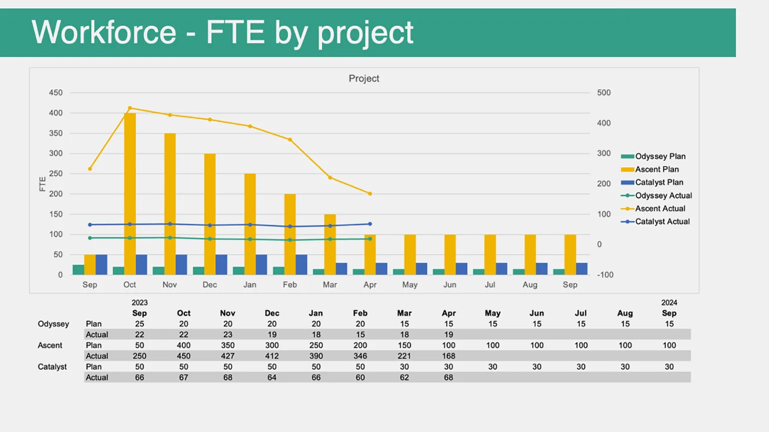
The vertical axis represents the number of full-time employees involved in the company's projects. The columns illustrate the projected number of employees by month, while the lines represent the actual number of employees involved in projects. This information is also presented in the table below for ease of analysis.
The updated version of the slide has removed all unnecessary elements, Including grid lines to minimize visual noise. Data from various projects has been combined to highlight an important idea: project planning has significantly underestimated the number of people needed to successfully complete them. This key idea is captured in the slide title. Below this is a call to action: "Let's discuss how to raise funding to cover the cost of additional staff." The discrepancies between planned and actual figures are highlighted in orange for emphasis. The chart also highlights an important number: 1,026 more people have been added to projects in recent months than expected. This significant increase in team size underscores the success of ongoing efforts and allows for more effective achievement of goals.
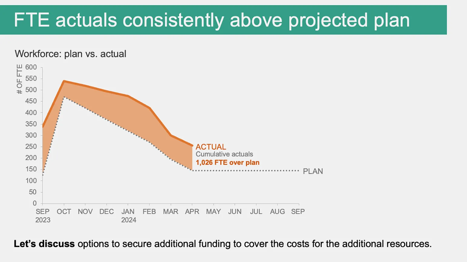
If necessary, you can add additional context to this graph, and also prepare slides with indicators for each individual project. This will allow you to analyze your data in more detail and present your results in a more understandable form.
This course will be useful for anyone seeking to master data visualization skills. It is especially suitable for educators, students, colleagues, and partners who want to create effective and informative presentations for a variety of audiences. By learning to visualize data, you will be able to better convey your ideas and increase audience engagement.
Learn more about education by subscribing to our Telegram channel. Here you will find current news, useful tips, and interesting materials that will help you stay up-to-date with all developments in the field of education. Don't miss the opportunity to expand your knowledge and interests.
Reading is an important part of our lives, contributing to the development and broadening of our horizons. It not only enriches knowledge but also helps improve critical thinking skills. If you are looking for high-quality reading materials, consider books, articles, and blogs that will help you deepen your understanding of the topics that interest you. Choose literature that matches your interests and goals, and don't forget to share your discoveries with others. Reading stimulates the imagination and allows you to immerse yourself in new worlds. Don't miss the opportunity to learn something new and enrich your inner world.
- Bookshelf: "How to Get the Most Out of Data," by Jordan Morrow
- 10 Design Mistakes That Will Ruin an Online Course
- Bookshelf: "Word on a Slide," by Alexander Grigoriev
- Principles of Multimedia Learning That Help Create Digital Learning Content