
Contents:
- A bit of theory: the benefits and risks of color design
- Why there is no clear color guide for educational designers
- Rely on the principles of UX design
- Consider color rendition, contrast, and other technical features
- Don't forget that the colors of the background and the speaker's clothing also matter
- Consider the characteristics of the audience, and rely on the brand book without fanaticism
- Combine no more than three colors
- If you are working without a designer, use the principles of the palette by Royce Kimmons
- Remember the color associations

Course with employment: "The profession of a methodologist from scratch to PRO"
Find out moreA little theory: what are the benefits and risks of color design
In the theory of multimedia learning, there is a signaling principle, which emphasizes the importance of focusing students' attention on key elements Educational presentations and other educational materials. An effective tool for this is color highlighting, which helps highlight important information and directs students' attention to key points. Proper use of color accents promotes better comprehension and retention of material, which in turn improves the learning process. Color in educational materials serves two key functions: it can serve as a useful indicator or simply fulfill an aesthetic role. Bright and distracting colors in an educational presentation can violate the principle of coherence, based on multimedia learning theory. This theory states that educational materials should not contain anything that distracts attention from the main content. If a presentation contains unnecessary elements, this leads to increased cognitive load and hinders comprehension of the educational material. Richard Mayer, the author of the principles of multimedia learning, emphasizes that "increased interest" of secondary details negatively affects the assimilation of information. Therefore, it's important to choose colors wisely so they don't distract but instead help emphasize the key elements of the learning process.
Elena Tikhomirova, CEO of eLearning Center, author of the popular Telegram channel "Live Learning" and the book "Learning with Meaning: 13 Rules for Those Who Teach Adults," shares an interesting thought. She cites her American colleague, instructional designer Casey Moore, who argues that the ideal design for online learning should be simple and clear, presented in black and white. However, according to Moore, a touch of red can be added to this minimalist approach to highlight key points. This approach emphasizes the importance of combining simplicity and expressiveness in the design of educational platforms, which contributes to more effective adult learning.
Elena notes that although this approach may seem radical, many leading online schools and universities, such as Harvard, use minimalist and ascetic designs for their courses for adults. This is no coincidence, as such simplicity promotes more effective information comprehension and helps focus on the content rather than unnecessary visual elements. Minimalism in design allows students to better absorb the material and avoid distractions, making the learning process more productive. Do educational presentations for adults really need to be boring and monotonous, or even black and white? Is there scientific research confirming which colors and shades promote the absorption of educational information, and which can negatively impact the learning process? It is important to rely on solid scientific data and the results of experimental studies conducted on large samples, rather than on common stereotypes about the symbolism of color, which are often unfounded. The approach to choosing a color palette in educational materials can significantly affect the perception and comprehension of information.

Research into color perception shows that it is a complex and multifaceted process. While strictly scientific data may be contradictory, it is clear that aesthetics play a key role in educational materials. Attractive design not only improves information comprehension but also promotes deeper student engagement. Therefore, it is important not to underestimate the importance of visual design, as it can significantly increase the effectiveness of knowledge transfer, complementing useful content with beauty and harmony.
In instructional design, an important aspect is emotional design, which encompasses elements of visual design in multimedia learning environments. These elements influence students' emotional perceptions and contribute to effective learning. Research shows that aesthetically pleasing design of multimedia learning materials evokes positive emotions in students. These emotions, in turn, increase motivation to learn, as students enjoy the process. Furthermore, positive emotions help reduce the perceived difficulty of tasks, making them more accessible and less daunting. Ultimately, all these factors contribute to improving the learning process and enhancing the quality of material acquisition. Educational materials should be not only informative but also visually appealing. The authors of one interesting experiment applying Mayer's principles to the development of educational materials rightly noted that the principle of coherence suggests the removal of unnecessary and redundant design elements. However, this does not mean that educational materials should be devoid of interactivity and creativity. It is important to find a balance between ease of perception and aesthetic appeal to ensure better information acquisition. Research shows that bright and colorful design of educational materials can increase students' cognitive load. However, such materials contribute to better information retention. This emphasizes the importance of visual design in educational resources, as attractive design can improve knowledge acquisition and retention. It can be assumed that limited working memory resources affect information perception. Bright design can promote better memorization, but it may convey less information compared to a more subdued style. This topic requires further research, and there are currently no definitive recommendations.
Why There Are No Clear Color Guidelines for Instructional Designers
Emotional design, on the one hand, contributes to the effectiveness of learning, but on the other, it increases cognitive load. This is due to the fact that interesting, but not always necessary, elements are introduced into the educational material, which can distract attention. Bright color is one such element, which, despite its attractiveness, can violate the principle of coherence.
The organizers of the experiment, based on Mayer's principles, came to the conclusion that it is necessary to use color carefully. However, there is a fine line between harm and benefit. In their studies, they used color exclusively for pragmatic purposes, to highlight key elements, such as different variables in examples. At the same time, the option was provided for users to turn off the color and leave the materials in black and white. This ensures the accessibility of information and avoids the potential negative impact of color on perception.

Find Finding the right balance between the benefits and harms of color can be challenging. One thing is clear: avoiding excessive brightness and garishness is essential. Proper color schemes should create a harmonious perception without distracting from the main content. Moderation in the use of color schemes improves readability and comprehension of information, which, in turn, has a positive impact on the user experience. When parts of a single sentence are presented in different colors, such as orange, blue, and red, this creates a significant load on the brain. It receives multiple signals simultaneously, making it difficult to perceive the main idea. From the perspective of instructional design and the development of educational materials, it is necessary to minimize the cognitive load on students. For them, the material presented may be both new and complex. If the design is excessively bright and saturated with various colors and graphic elements, the brain will be forced to "decode" these visual stimuli. As a result, this distracts from the process of perceiving the information itself. Elena Tikhomirova emphasizes the importance of creating educational materials that promote better understanding and knowledge acquisition without unnecessary visual clutter.
Creating a clear and understandable guide to online course color design principles, with recommendations for both beneficial and harmful colors, is a challenging task. The reasons why this is impossible are as follows. First, color perception is individual and depends on cultural and personal factors, making universal recommendations difficult to apply. Second, the context of color use in course design plays a key role; a color that is appropriate for one topic may be inappropriate for another. Third, the pursuit of fashion and design trends also influences color palette selection, making fixed recommendations less relevant. Finally, technology and learning tools are constantly evolving, requiring constant updating and adaptation of any recommendations. Therefore, while creating a universal guide is difficult, it is important to consider general principles and conduct testing with target audiences to select the most appropriate color solutions.
There is limited research on the impact of color on perception without considering other factors. This creates a gap in understanding how color can influence people's behavior and emotions. Further research is needed to more deeply explore how color influences perception and decision-making in various contexts.
Emotional design involves not only the use of vibrant colors but also the use of anthropomorphism—the addition of human characteristics to design elements. For example, training courses may use characters that resemble students, which helps implement the personalization principle from multimedia learning theory. Research on the effectiveness of emotional design often examines its elements holistically, examining the effects of both color and anthropomorphism simultaneously. This makes it difficult to isolate the specific impact of individual colors. Emotional design plays an important role in creating engaging and memorable content, which in turn improves information comprehension and increases user engagement.
Existing research on the impact of different colors on people's perceptions and behavior provides inconclusive results. Colors can evoke a variety of emotions and associations, but their impact can vary depending on cultural context, personal experience, and individual preferences. Therefore, it is important to consider this factor when choosing a color palette for branding, marketing, and design.
The authors of the experiment we mentioned also confirm this problem. They note that warm colors such as yellow, orange, and red increase arousal and, as a result, promote improved productivity and concentration. In contrast, cool colors such as blue and green have a less pronounced effect on focus. There is not only this study, but also many others confirming this connection between colors and productivity.
Some colors have everyday associations that can significantly influence a person's psychological state, regardless of their temperature—warm or cool. For example, red, although considered warm, is often perceived as a signal of danger or prohibition, which creates negative associations. At the same time, cool green is associated with resolution and calm, making it calming. Understanding these color associations can help create a harmonious atmosphere in your home or when choosing clothing, and can also contribute to improved mood and well-being.
Associations associated with colors can vary significantly across cultures and generations. Therefore, research findings on the effects of specific colors should be viewed with caution. It is important to consider the characteristics of the study population, such as age group (e.g., children, adolescents, or adults), the country where the study was conducted, and the cultural characteristics of the region. Furthermore, color perception is always an individual factor, which also influences the results.
Research on the influence of colors on human perception often leads to conflicting conclusions. For example, Russian scientists analyzed various scientific studies on the effect of color on memory. One study found that blue and green colors can cause boredom, while another showed that prolonged exposure to blue helps improve working memory performance during mental tasks. This raises the question: is using blue beneficial or, conversely, harmful? This question remains open and requires further research.
Read also:
Color has a significant impact on our perception and emotions. It can evoke various associations and feelings, which makes it an important tool in design, art, and marketing. Each color has its own characteristics and meanings. For example, red symbolizes energy and passion, while blue is associated with calm and reliability.
In interior design, the correct use of color can change the perception of a space. Light shades visually enlarge a space, while dark shades can create a cozy atmosphere. In marketing, the choice of packaging or logo color can influence a consumer's purchasing decision. Research shows that up to 90% of purchasing decisions are based on visual factors, among which color plays a key role.
Furthermore, color has cultural and psychological significance. Different cultures may perceive the same colors differently. For example, white is associated with purity and innocence in Western culture, while in some Eastern cultures it symbolizes mourning.
Thus, color is a powerful tool that can influence our perceptions, mood, and behavior. Its correct use in various fields, such as design, marketing, and art, opens up wide opportunities for creating effective and memorable solutions.
Colors can be complemented by tints and shades, which give them depth and variety. Tints are lighter or darker versions of the base color, while shades are created by adding black or white. Understanding the differences between colors, tints, and shades helps create harmonious color compositions and improves the perception of visual content. This knowledge is especially useful in design, art, and advertising, where the right choice of color can significantly influence the emotions and reactions of the audience.
It is unclear which specific shade of blue was examined in the studies that concluded its ability to induce boredom and simultaneously improve working memory performance. This is an important aspect, as it is possible that completely different shades were being considered. For example, the Pantone palette offers many variations of blue. Could it be that different tones of the same color affect perception and behavior differently? Absolutely, so ideally, studies should contain more precise characteristics of the color under study. However, when you delve deeper into such studies, you will find it difficult to find detailed examples. Paying attention to the nuances of color perception can significantly enrich the results and help in further understanding the influence of color on a person.
Color has three main characteristics: hue, saturation, and brightness. To better understand the impact of color on perception, it is necessary to study these three parameters and vary their values. However, this is difficult, as the number of possible combinations seems practically endless. Ekaterina Kosova, a research intern at the Scientific and Educational Laboratory of Cognitive Psychology of Digital Interface Users in the Department of Psychology at the National Research University Higher School of Economics, shared her opinion on this issue in the editorial office of Design by Skillbox Media. The study of colors and their properties is of great importance for designers and marketers, as the correct use of a color palette can significantly affect the perception of a product and user interaction with the interface.
Research on this topic is insufficient.
There are many studies on color perception, but most of them are focused on marketing. Therefore, their results may not always be applicable in the educational field. It's important to consider that color perception can vary depending on the context in which it's used and the target audience. This highlights the need for additional research to determine how color palettes influence learning and information comprehension in educational settings.
A Yandex Textbook study found that bright colors in course advertisements attract the attention of adults. This is due to their overall perception of advertising. Meanwhile, soft, calm colors are more likely to attract teenagers, as they evaluate advertising in terms of future learning. However, this doesn't mean that adult courses should be designed in bright colors. The goals of advertising and the educational process differ significantly. A colorful banner may attract attention for only a few seconds, whereas educational materials are studied for a long time, as Elena Tikhomirova notes. She also warns that many advertising and marketing studies that appear attractive may not actually be suitable for the educational context.
Research on color in the context of multimedia learning spaces is relatively rare. However, understanding the impact of color on information comprehension and learning is essential. Colors can significantly influence attention, mood, and retention of information. It is important to consider how different color schemes can enhance the effectiveness of educational materials and improve user interaction with the content. Creating attractive and functional multimedia resources requires thinking about color solutions that promote information retention and maintain learner interest.
Since there is no uniform guide for working with color in educational courses, we decided to reach out to developers to learn about their practical approaches and tips. We focused on courses for adults, as designing programs for children has its own unique characteristics. Unsurprisingly, their conclusions, based on personal experience, sometimes coincided and sometimes contradicted each other, as do the results of scientific research. However, among the recommendations received, we found many practical tips not found in academic sources. These life hacks can significantly simplify the selection of a color palette and improve the visual perception of educational materials.
Rely on the principles of UX design
Katerina Golomshtok, an independent screenwriter and developer of e-learning courses, and the author of the Nova Academy Telegram channel, actively uses color solutions in the design of her courses. She emphasizes the importance of one of the principles of UX design: aesthetics plays a key role in usability. The correct use of color not only attracts attention but also improves the perception of information, which contributes to more effective learning. Thus, Katerina demonstrates how a competent approach to visual design can improve the quality of educational content.
Creating an attractive design promotes easier perception of educational material, be it a course, presentation, or lecture. Color plays a key role in this process, acting as one of the main elements of design. In her book "Design and Color. In their book "Practical Training," Sean Adams and Terry Lee Stone note that color is a visual language that can evoke emotion, calm, attract attention, or, conversely, repel. The correct use of color can significantly enhance the learning experience and increase student engagement. Katerina believes that color design has a significant impact on emotions and contributes to the creation of aesthetic pleasure from visual perception. This, in turn, increases the overall level of satisfaction with the learning process. Using a color palette in educational materials can improve the perception of information and make learning more engaging and effective. The Restorff effect, also known as the isolation effect, plays an important role in associative thinking and information retention. It states that a highlighted object or element is easier to remember compared to other similar objects. This effect can be useful in various fields, such as training and advertising, where it is important to attract attention and improve the memorization of key elements. Using bright visual accents or unusual formats can significantly improve the effectiveness of information transfer and knowledge absorption.
Consider color rendition, contrast, and other technical features
Elena Tikhomirova advises avoiding "acidic" and overly bright colors, as they can cause excessive cognitive load. At the same time, pastel colors, such as blue and light green, are also not the optimal choice for highlighting important elements or creating infographics. Due to the different technical characteristics of the displays of the devices on which users will view the course, such colors may not be noticeable. Similarly, using yellow can lead to the loss of visibility of important elements. For effective visual perception, it is important to choose colors that not only attract attention but also provide clarity and contrast.
Contrast is a key factor in highlighting important information and ensuring comfortable reading. The contrast ratio between the background and the text affects the ease of perception of the content. It is defined as the difference in brightness. However, it is important to remember that too much contrast can also cause eye discomfort. According to the Web Content Accessibility Guidelines developed by the World Wide Web Consortium, the optimal contrast ratio should be 3:1 or higher. This helps ensure accessibility and improves user experience on websites. Evgeniya Rashchupkina, founder of the LXD Hero project and author of the LX Notes Telegram channel, recommends paying special attention to contrast when creating visual content. Contrast plays a key role in ensuring the accessibility and readability of materials. To ensure the correct contrast, it is worth using specialized online services that can help analyze and improve visual perception. This will make your content more accessible to a wider audience and improve its quality.
- ColorsWall,
- WebAIM,
- Colour Contrast Checker.
Evgeny recommends paying attention to the color of active links, as it can blend in with the background. This can negatively impact the perception of content and ease of navigation. We recommend using the WebAIM service to check color contrast and improve the accessibility of your site.
There are special services that allow you to evaluate visual design from the perspective of people with visual impairments. For example, Color Oracle demonstrates how a presentation or website is perceived by people with color blindness. There is now a wide range of tools available for accessibility and content visibility testing, allowing developers and designers to improve the quality of their projects.

Read also:
Design errors that can negatively impact
Creating an online course requires attention to detail, especially in the design area. Incorrect design decisions can not only be distracting but also reduce participant engagement. It is important to avoid common mistakes to ensure high-quality training and a positive user experience.
One of the main mistakes is interface overload. Too many elements can be confusing and distract from the main content. A clear and concise structure helps users navigate the material easily.
An inappropriate choice of color palette can also negatively impact perception. Contrasting and bright colors can cause discomfort, while too pale shades make the text difficult to read. It is important to use harmonious combinations that promote comfortable perception of information.
Fonts play a key role in design. Using too many different fonts or hard-to-read fonts reduces readability. It is recommended to limit yourself to two or three fonts and ensure they are easy to perceive.
Also, it is worth considering the responsiveness of the design. Many users access courses from mobile devices, so it's important that the interface displays correctly on different screens. Ignoring this aspect can lead to a loss of audience.
Don't forget about the importance of visual content. Using low-quality images or videos can reduce the credibility of the course. High-quality and relevant visual materials help better absorb information and make learning more engaging.
Course navigation should be intuitive. Complex menu systems or confusing links can frustrate users. A simple and logical path to the desired information promotes better absorption of the material.
Also, avoid excessive information on a single page. Large amounts of text can tire participants. It is better to break the content into smaller blocks to facilitate comprehension.
Accessibility must also be considered. Courses must be accessible to people with disabilities. This includes the use of alternative text for images and subtitles for videos.
Finally, test the design with the target audience. It's essential to gather feedback and make changes based on real user experiences. This will help improve your course and make it more effective.
By avoiding these common design mistakes, you can create an online course that is not only visually appealing but also effective for learning.
Don't forget that the background and speaker's clothing colors matter too.
Elena Tikhomirova and Katerina Golomshtok emphasize the importance of color not only in the design of educational presentations and longreads, but in everything the viewer perceives while watching video courses. The background color palette, the speaker's clothing, and interior details play a key role in shaping perception. Elena recommends using a subdued and neutral palette of warm tones that harmonize with each other. This avoids distraction from the main content, reduces cognitive load, and creates an emotionally comfortable learning environment. Choosing the right color scheme can improve retention and enhance understanding of educational content. Doesn't this mean that teachers should avoid bright and flashy accessories like green hair? No, it doesn't. Human attention is much more complex. Elena explains that during a video lecture, students primarily notice the lecturer's face, not the details of their clothing. Research shows that when one person looks at another, they focus on the face, facial expressions, and movements—this is a natural way of perceiving. Therefore, if the speaker is a woman, it is recommended that she wear subdued makeup, as too much bright accents can distract from the attention that will already be focused on her face.
A lecturer's appearance is perceived differently depending on the context, and this applies not only to color scheme. If the audience is already familiar with a lecturer with a flamboyant style, for example, a popular figure with a flamboyant image, this may be perceived positively. However, if the speaker is new and unknown, their unusual appearance may raise doubts about their professionalism. Research shows that even young students tend to judge a lecturer's competence based on their clothing and most often prefer a more restrained, business-like attire in professors. Thus, appearance plays an important role in building trust and perception of an expert in the eyes of the audience.

To optimize text for SEO, it is important to use keywords that will help improve the visibility of the page in search engines. It is also necessary to ensure the text is logical and coherent so that it is easy to read.
Read also:
There are many opinions on whether the teacher should be on camera during a video lecture. Some believe that the visual presence of the lecturer creates a more lively atmosphere and helps to better perceive the information. Others are of the opinion that the focus should be on the educational material, and not on the personality of the teacher. It is important to keep in mind that each learning format has its own characteristics, and the choice of approach depends on the goals of the course and the preferences of the audience. Ultimately, the presence of the teacher on camera can both enrich and distract from the content of the lecture.
Consider the characteristics of the audience, and rely on the brand book sparingly
Online schools and companies often have an established color palette and brand book. For example, Skillbox is associated with blue, and Beeline with yellow. However, overusing corporate colors in training materials can be ineffective. What attracts attention in advertising can distract from the core information in educational content. Elena Tikhomirova emphasizes that some companies, in addition to their main brand book, develop a separate training brand book. It can use similar colors to corporate ones, but in more subdued tones, which facilitates better comprehension of the training material and increases its effectiveness.
Color perception and preferences are subjective, but some general principles can help adapt the color palette to a specific audience. For example, if you are developing a course on personal protective equipment for industrial specialists over 45, it is worth using more subdued and calm colors. For a digital security course for young IT specialists, bright and saturated shades would be appropriate. Choosing the right color scheme can significantly improve the effectiveness of information perception and enhance engagement with the target audience.
Combine no more than three colors
Experts advise using no more than three accent colors in course design. What does this mean? For example, your primary colors could be neutral, such as white and black. In addition, you could choose three accent colors. However, it is recommended to stick to a maximum of three colors, as the "less is more" rule helps create a harmonious and attractive design. The right color combination helps improve information perception and makes the course more memorable.
Elena Tikhomirova demonstrates an example of a longread design: a white background, a black primary font, and three accent colors. Blue is used to highlight headings, red to emphasize important information, and green to underline interesting facts. This approach to design ensures readability and helps better perceive information. Proper use of a color palette not only improves the visual perception of the text but also helps highlight key points more effectively, which is important for retaining the reader's attention and improving the SEO optimization of the content.
Black and white have their own unique characteristics. Pure black and white can have too harsh an impact on perception. It is recommended to use softer shades to soften the contrast. For example, instead of pure white, it is better to use light gray (#F6F6F6), and instead of pure black, dark gray (#1E1E1E). This approach not only improves visual perception but also makes the design more harmonious.
If you are working without a designer, use the palette principles from Royce Kimmons
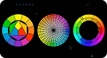
For a harmonious combination of colors, it is worth referring to the recommendations of Royce Kimmons, Associate Professor of Psychology and Instructional Technologies at Brigham Young University (USA). In his article "Color Theory for Experience Design," published in the collection "Research on Learning and User Experience," he outlines several principles that will help achieve the effective use of color in design. Understanding these principles will not only improve visual perception but also enhance the user experience. Color combinations play a key role in creating an emotional response and can significantly impact how information is perceived.
- Monochromatic — choose one color and use its shades as complementary colors.
- Analogous — choose a primary color and select colors close to it on the Itten color wheel as accent colors.
- Complementary — choose two colors opposite each other on the color wheel.
- Complex — use three or more colors that are equidistant from each other on the color wheel.
- Achromatic — use only black, white, and gray.
These recommendations are primarily suitable for the design of educational institutions’ websites, but online course developers can also use them. Royce recommends starting with the primary color and then using the color wheel to select complementary shades. This will create a harmonious and attractive color palette that will enhance the perception of content and improve website navigation. The right choice of colors also helps create a clear visual identity for the educational project, which is important for attracting and retaining users.
For those who are more cautious, a monochrome design is recommended. However, it's important to keep in mind that in some cases, this style may be too monotonous. For those seeking more vibrant solutions, analogous or complementary color schemes are suitable, which will add dynamism and expressiveness to the design.
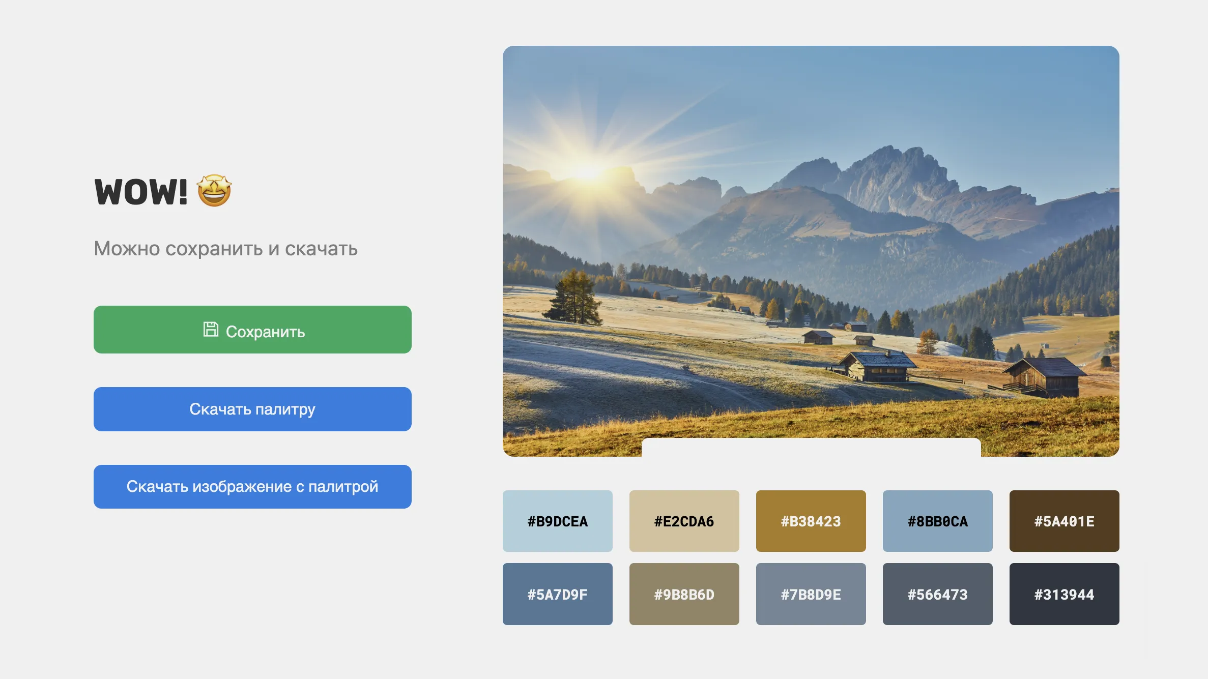
Royce Kimmons offers an interesting way to choose a color palette using a favorite photograph, preferably one depicting nature. To do this, it is recommended to upload the photo to specialized services that will help determine the color scheme. Russian users can use tools such as the services from the Skillbox Media "Design" editorial selection. These resources make it easy and quick to achieve a harmonious combination of colors that can be applied in various design projects.
Remember Color Associations
Color associations play an important role in information perception, especially in web design. For example, green is often associated with resolution and correctness, while red is perceived as a warning or error. However, it is important to note that certain color associations are formed by users during the process of interacting with various online services. Designers use color schemes to achieve specific goals, which impacts user experience. By considering these aspects, it's possible to create more effective and intuitive interfaces that promote positive perception and improve interaction with resources. Elena Tikhomirova notes that users often expect inactive elements on online resources to be gray, signaling their inaccessibility. Therefore, if an interactive button in a training presentation is gray, users may not understand that it needs to be clicked, perceiving it as a nonfunctional element. This highlights the importance of choosing the right color scheme for interactive elements to ensure intuitive interaction and improve user experience.
The Methodologist Profession from Scratch to PRO
You will improve your skills in developing curricula for online and offline courses. Master modern teaching practices, structure your experience, and become a more sought-after specialist.
Find out more