
Contents:

Try 4 top design professions. Free ➞ In 5 days, you will get acquainted with illustration, UX/UI, web, and graphic design. Add 4 cool cases to your portfolio and decide which direction to develop further.
Learn moreDark mode gained popularity in 2018 with the release of macOS Mojave. It attracted users thanks to its eye-catching design and a fresh take on familiar interfaces. Many appreciated its benefits in low-light conditions, making computer use more enjoyable. Since then, dark mode has been adopted by various operating systems and applications, becoming an integral element of modern design.
Creating a dark theme is a complex design challenge. It is necessary to choose new colors for the dark background while maintaining the overall recognizability of the interface and ensuring the readability of text. In this context, it is useful to study the principles and techniques that will help you develop a dark theme for your interface. Examples of such solutions can be found in the interfaces of Google, Apple, Microsoft, and VKontakte. By analyzing their approaches, we can identify key elements that contribute to the creation of a harmonious and functional design in a dark mode.
Why do we need a dark mode?
OLED displays differ from traditional screens in that they completely turn off pixels in the black area. This means that when displaying a black background and white text, the OLED display activates only the pixels needed for the text, which significantly reduces power consumption. As a result, the user receives rich blacks and the device's battery life increases. The use of OLED technology not only improves image quality but also contributes to more efficient power consumption, making such displays ideal for mobile devices.
A study conducted by PhoneBuff found that using a dark mode on devices can lead to battery savings of up to 30% on average. This finding highlights the benefits of a dark interface not only in terms of aesthetics but also in terms of increased energy efficiency. Users looking to extend the battery life of their devices may want to consider enabling the dark theme in Settings.
Research shows that for people with normal vision, there is no significant difference in the perception of text on a light or dark background. However, for people with cataracts and other vision problems, reading text on a dark background is more comfortable. This highlights the importance of considering the specific perception of information when choosing the color scheme of text materials. Optimizing content for different user groups can significantly improve their reading experience and reduce eye strain.
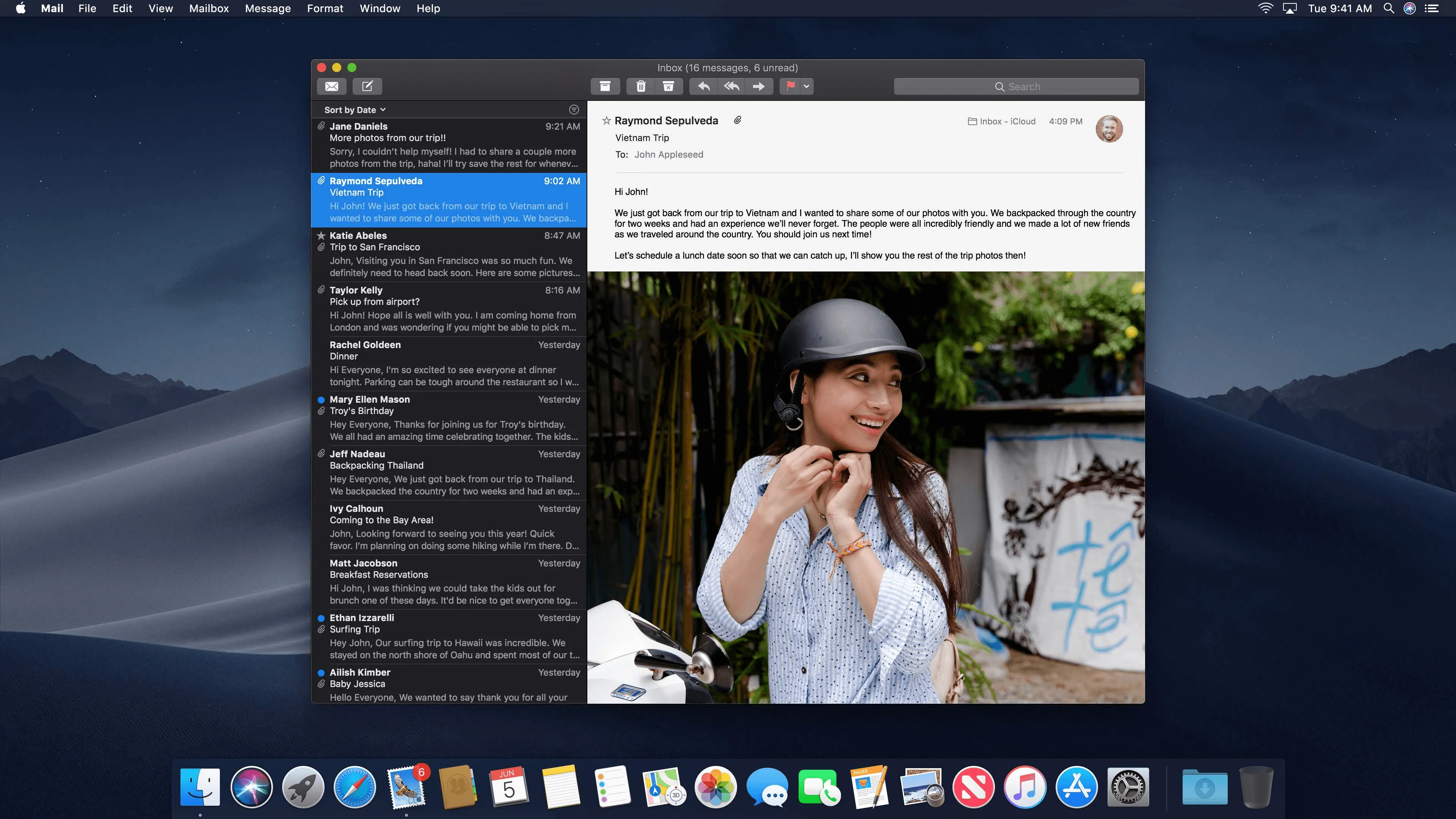
Light content on a dark background attracts attention and helps users focus on tasks within the app. For example, in the Mail app for macOS, emails stand out so much that they are impossible to tear your eyes away from. This contrast improves information comprehension and improves app performance. Using light text on a dark background is an effective design technique that improves user experience and makes content easier to perceive.
Users choose a dark theme for various reasons. For some, it looks more formal, others find it easier to read, and some simply want to change the color palette of their favorite app. While using dark mode is optional, it's important to give users the option to activate it. This will improve the user experience and accommodate a variety of preferences. Dark theme can also help reduce eye strain and save power on devices with OLED screens.
The results of this work are clearly displayed in the Finder sidebar.
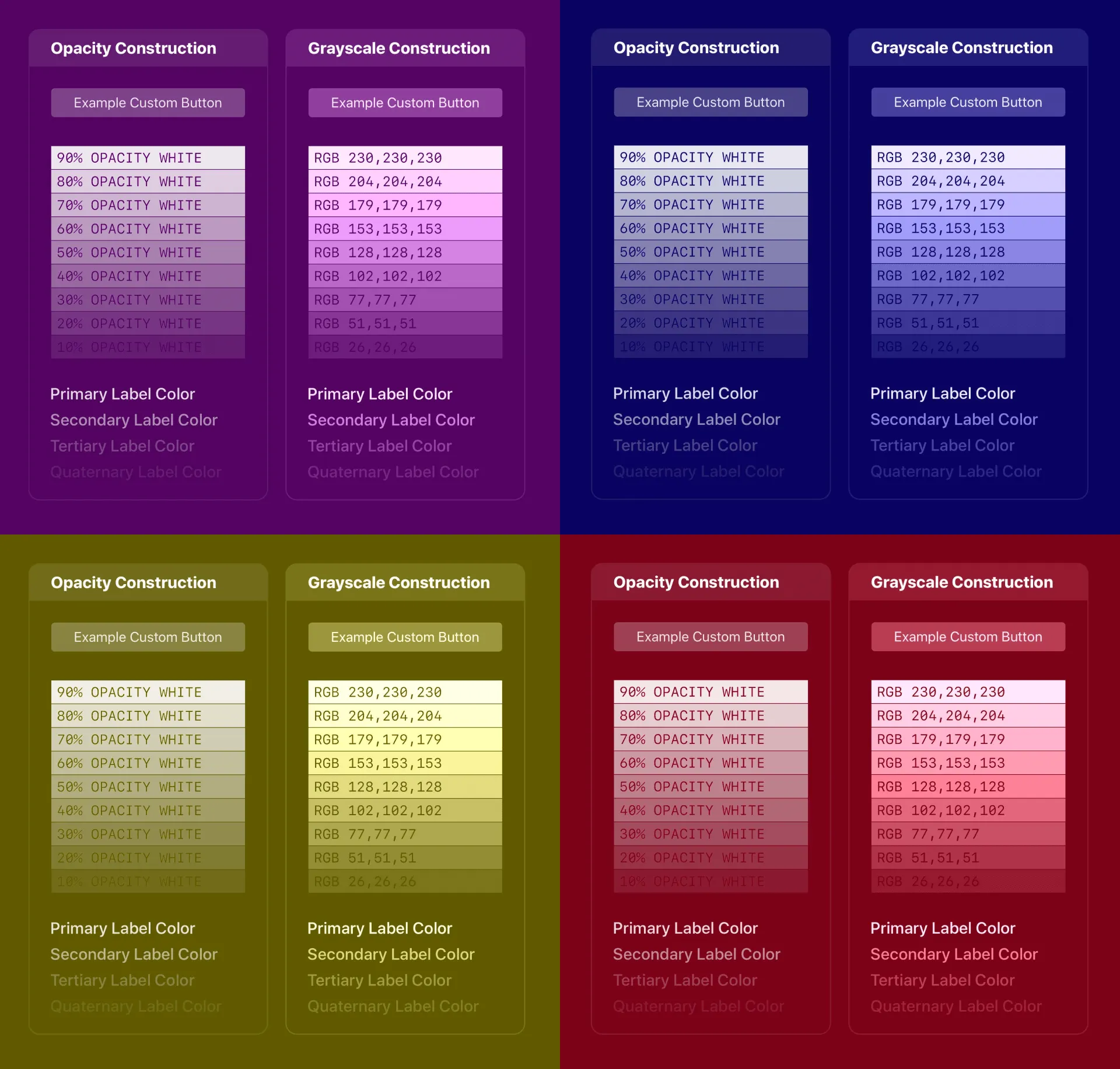
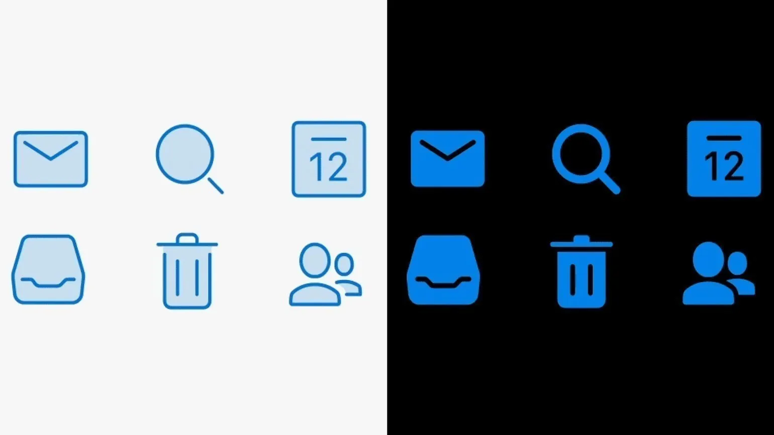
Contrast between text and background plays a key role in the usability of apps and websites with a dark theme. These interfaces must be accessible to all users, so choosing the right color combinations is important. Leading companies like Google and Apple follow the WCAG 1.4.6 standard, which states that visual displays of text and text in images should have a contrast ratio of at least 7:1. This ensures good readability and improves the user experience.
To evaluate the contrast of your colors, use the Web Aim resource. Enter the text color code in the Foreground Color field, and the background color in the Background Color field. For good readability, it is recommended to aim for the contrast ratio used by Google and Apple, 15.8:1. This will help you create an accessible and attractive design.
Icons for interfaces are often created using an outline style, where only the stroke outlines the form, leaving the interior space empty. However, when using this approach in a dark theme, the icons may appear too contrasting and visually disharmonious. It's important to consider that dark interfaces require more balanced solutions to maintain aesthetic integrity and improve user experience. Proper icon design can significantly impact the overall interface, so designers should pay attention to the choice of style and color palette to achieve the desired visual effect.
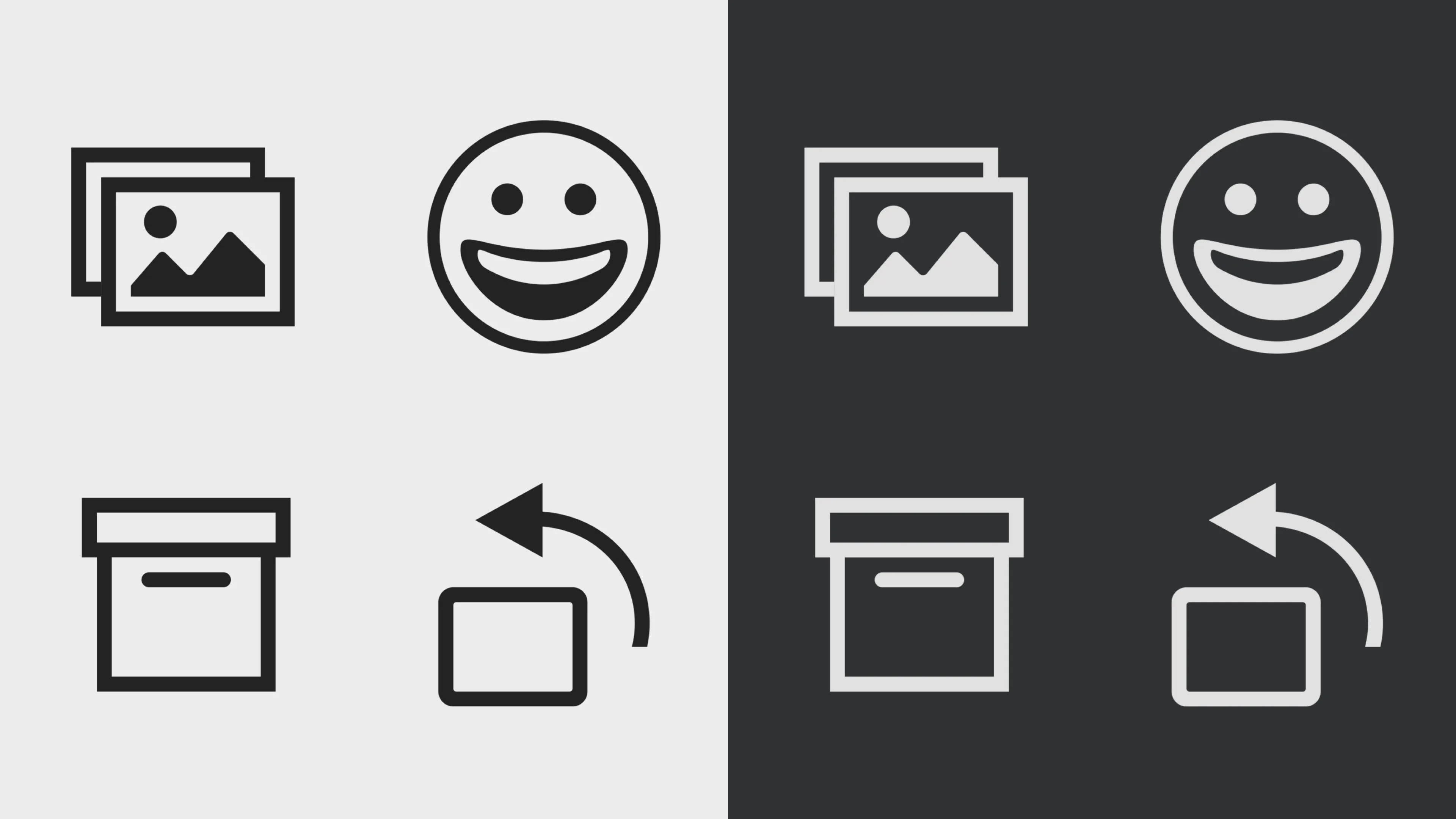
Apple has decided to change the standard approach to icon design in macOS to avoid a flat look that negatively impacts the shape of elements. In the new dark theme, all icons are now white, creating contrast and improving the visual perception of the interface. This approach not only inverts color but also opens up new opportunities for more expressive design, emphasizing the functionality and aesthetics of the operating system.
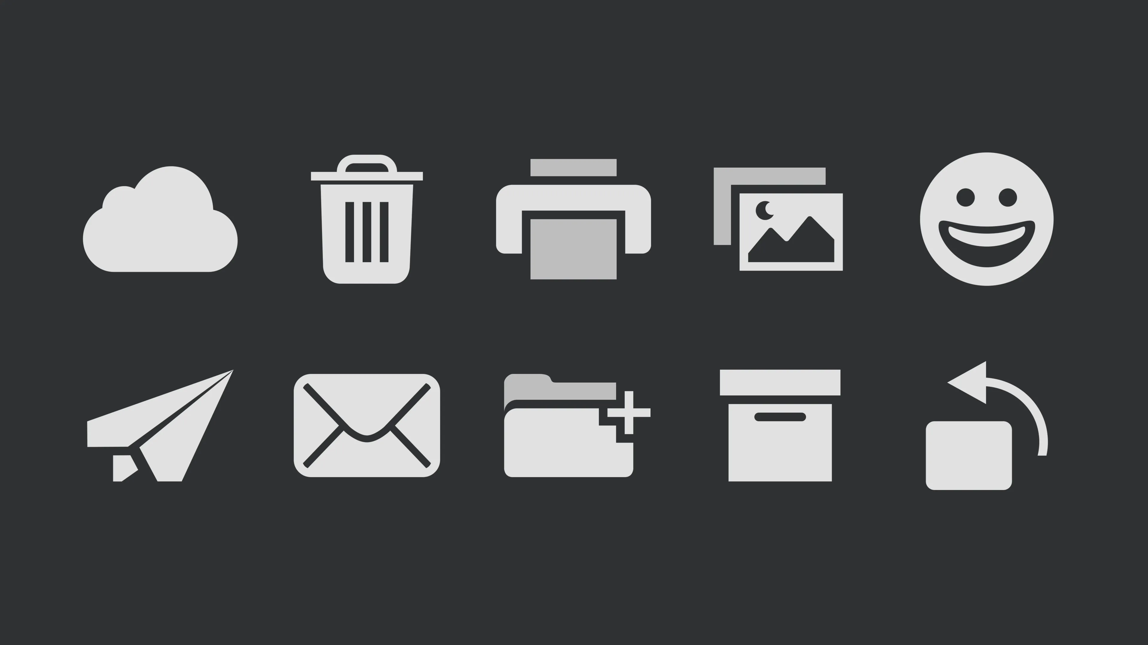
The designers of the mobile version of Office 365 also updated the icons, using a fill technique. This change improves the visual appeal of the interface and makes it more modern. The new icons not only look more aesthetically pleasing but also improve the usability of the application, which is an important aspect for users. The updated design facilitates easier perception of information and improves the overall user experience.
This approach ensures that icons retain their shape, remain clear, and have high contrast. This ensures high readability and visual appeal, which is especially important for user interfaces. Clear icons improve information comprehension and ease of website navigation.
Unfortunately, you have not provided the actual text for editing and SEO optimization. Please paste the text you want to change, and I will help you with its revision.
- Google: How to Design a Dark Theme Using Material
- Apple: Introducing Dark Mode
- Microsoft: Designing for Dark Mode
Profession: Graphic Designer PRO
You'll learn how to create branding elements and graphics for your business. You'll build a portfolio that reflects your style and demonstrates your design skills. You can start a career in a studio or as a freelancer.
Find out more