Try 4 top design professions. Free ➞ In 5 days, you will get acquainted with illustration, UX/UI, web, and graphic design. Add 4 great cases to your portfolio and decide on your next direction.
Learn moreVisual Weight of Objects
The visual weight of an object determines its ability to attract the viewer's attention. This aspect is influenced by various factors, such as the level of detail in the image. We tend to linger on detailed images because they arouse more interest. The location of the object also significantly influences visual weight: objects located in the center or highlighted against a background of ample white space attract more attention. Optimizing visual weight is an important aspect of design, allowing you to create harmonious and effective compositions.
Although objects may be equal in execution technique and compositional arrangement, this does not mean that they will be perceived by the viewer in the same way. There are two additional factors that significantly influence the visual weight of objects: size and color. However, their impact on perception isn't as straightforward as it might seem at first glance. An object's size can attract attention and create accents, while color can evoke emotional reactions and associations. Therefore, when creating visual content, it's important to consider all these aspects to achieve a harmonious and expressive result.

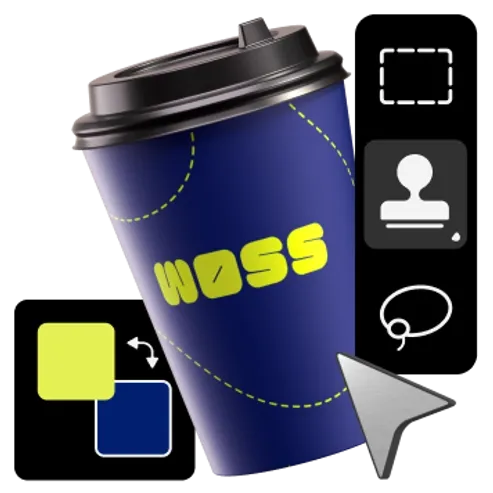
Color also has a significant impact on the visual weight of objects. When comparing two objects of the same size, the viewer is more likely to focus on the brighter and more contrasting element. However, what if objects have different initial characteristics but need to be visually balanced? In such cases, designers apply subtle color variations. An example is the use of three different shades of gray for the text, which helps to create harmony and balance in the composition.
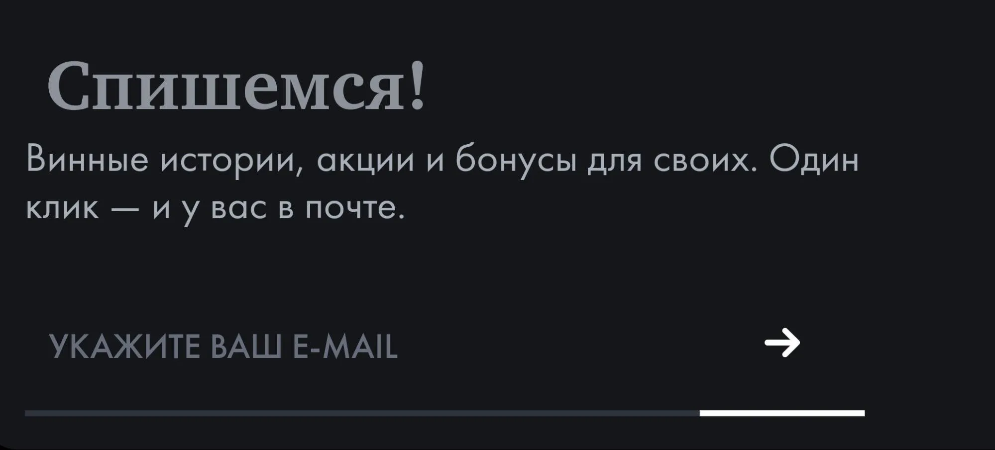
Note the difference in the colors of the text blocks. The darker color of the last line, "Enter your email," is used to prevent the input field from distracting from the newsletter information. If you look closely at the header and body text on a bright display, you'll notice that the paragraph text is lighter than the header. This is done to create visual contrast and make the information easier to read.
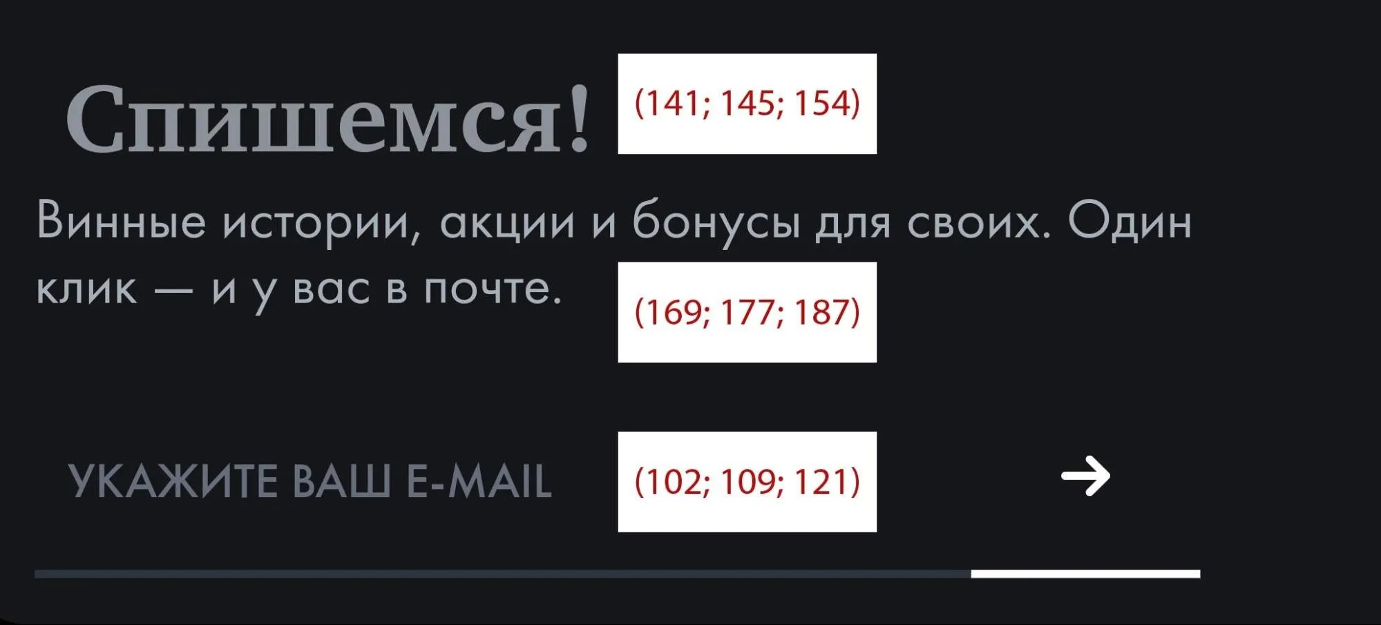
To ensure that the small text with a thin font does not get lost against the background of the large, bold heading, its contrast was increased in relation to the light background. However, the difference in colors may not be obvious because thin lines are perceived as having less contrast than thick ones. As a result, the heading and paragraph may appear similar in color if not given attention. This technique helps create optical balance and ensures better visibility of small text.
Optical Alignment
Our perception of shapes and spatial objects often deviates from strict mathematical precision. This also applies to the perception of the space in which these shapes are located. Designers don't simply arrange elements parallel or align central objects. They apply optical alignment, taking into account the characteristics of each shape. This approach helps create a harmonious and aesthetically pleasing space that is better perceived and evokes positive emotions in viewers. Optical alignment takes visual illusions into account and helps achieve balance and symmetry in design.
Let's consider how this looks in practice. One of the most famous and easily recognizable examples is the YouTube icon. This logo has become a symbol of video content and the everyday use of the platform for watching and uploading videos. The YouTube icon not only attracts attention, but also creates an association with high-quality and diverse content available to users around the world.
When studying this sign, there is no sense of disharmony - it seems that everything is in place. However, the triangle is noticeably offset to the left relative to the center of the red figure. This offset adds visual interest and draws the viewer's attention to the details of the composition, emphasizing the uniqueness of the design.
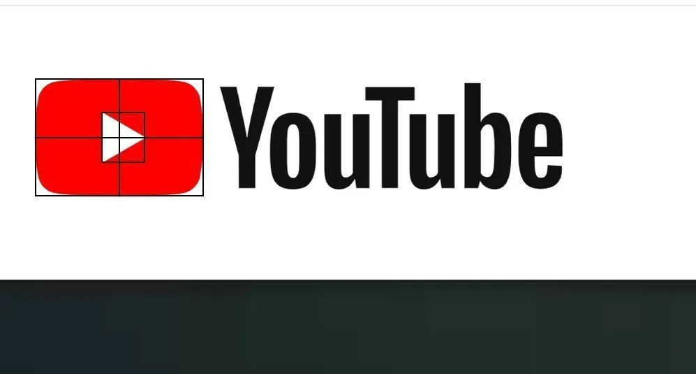
The triangle is best in its natural position. If it is placed in the geometric center, it will appear shifted to the left. This is due to the figure's asymmetry relative to the vertical axis: the visual weight of the left side of the triangle significantly exceeds that of its right tip. To achieve optical balance, the triangle's center should be shifted to the right. Correct placement of the triangle is important for visual perception, as it can affect the harmony and aesthetics of the composition.
Profession Graphic Designer PRO
You will learn how to create corporate identity elements and graphics for business. You will put together a portfolio that reflects your style and confirms your design skills. You can start a career in a studio or as a freelancer.
Find out more