Contents:
Top 4 design professions: a free course in 5 days!
Find out moreThe fusion of magenta and yellow: harmony in the interior
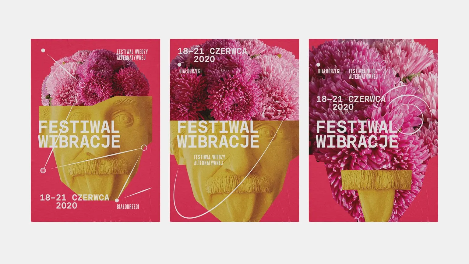
The vibrant identity of the alternative knowledge festival emphasizes themes of personal growth, self-development, and environmental awareness. The use of rich magenta shades combined with sunny yellow creates an atmosphere of openness and harmony, an important aspect in today's world. Effectively presenting these themes through visual style helps attract an audience interested in self-improvement and sustainable living. The festival becomes a platform for the exchange of ideas and experiences, which emphasizes the relevance of these issues in society.
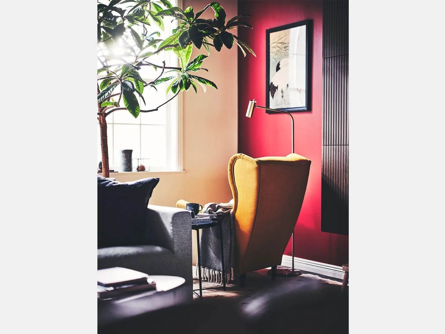
A sunny yellow armchair against a rich raspberry-red wall not only attracts attention, but also adds a minimalist style to the interior. This design technique creates harmony between brightness and simplicity, making the space more welcoming and inviting. The combination of bright colors helps highlight key elements of the interior and emphasizes its individuality. By using such contrasting shades, you can create a unique atmosphere that will delight both the owner and guests.
Interior trends for 2025 emphasize the use of bright and saturated colors, such as magenta and yellow. These shades not only remain in fashion, but also open up opportunities for creating unique color combinations that can attract attention and change the perception of space. Bright colors enliven the interior, adding dynamism and expressiveness, which is especially important in modern design solutions. Using such shades not only highlights individual decorative elements but also creates a cohesive, harmonious look. Given current trends, choosing bright colors will become a key factor in interior design, allowing you to create a cozy and stylish space.
In the CMYK color model, magenta, cyan, and yellow are the primary colors widely used in printed materials. These colors form a classic triangular color scheme, making them an excellent choice for creating vibrant and expressive visuals. Using these primary colors allows designers to achieve saturation and contrast in printed materials, which is especially important for advertising and marketing. The right combination of magenta, cyan, and yellow ensures high-quality printing and attracts the attention of the target audience.
If you are looking for inspiration for creating harmonious color combinations, we recommend studying our materials. We offer helpful tips and ideas to help you choose the perfect colors for your project.
Read also:
Interior Design Trends for 2025
In 2025, the world of interiors will continue to surprise with new directions and styles. One of the key trends will be eco-friendliness. Designers will use natural materials such as wood, stone, and textiles made from organic fibers. This will not only create a harmonious atmosphere but also help preserve nature.
The second important aspect will be minimalism. Simple forms, laconic lines, and the absence of unnecessary details will be trendy. This approach will create a space filled with light and air, which is especially relevant for small apartments.
Technology will also play an important role in the interior. Smart homes controlled by mobile apps will become commonplace. Integrating technology into everyday life will help make it more comfortable and convenient.
Color schemes for 2025 will lean toward warm and natural tones. Delicate pastels, soft beiges, and earthy tones will create a cozy and tranquil atmosphere in any space.
Don't forget about the versatility of furniture. In limited space, the ability to transform and adapt interior items to suit different needs is important.
By following these trends, you can create a modern and stylish interior that will delight you and your guests in 2025.
Yellow is a bright and cheerful shade that can add a sunny mood to any space. It pairs well with a variety of colors, creating harmonious and stylish combinations. In interior design, yellow combines beautifully with gray and white shades, giving the room a modern and fresh look. Yellow also looks good when paired with deep colors, such as navy blue or burgundy, creating contrast and highlighting the brightness of yellow. For more playful and light compositions, yellow can be combined with pastel shades, such as mint or peach. When choosing accessories and textiles, yellow can become an accent color in the interior or clothing, adding visual energy and optimism. Using yellow in clothing can also be a beneficial solution, especially when paired with neutrals like black or gray, creating a stylish and balanced look. Yellow has the ability to attract attention and lift the mood, so its use in various fields, from design to fashion, always remains relevant.
Magenta and blue: the perfect combination for a modern interior
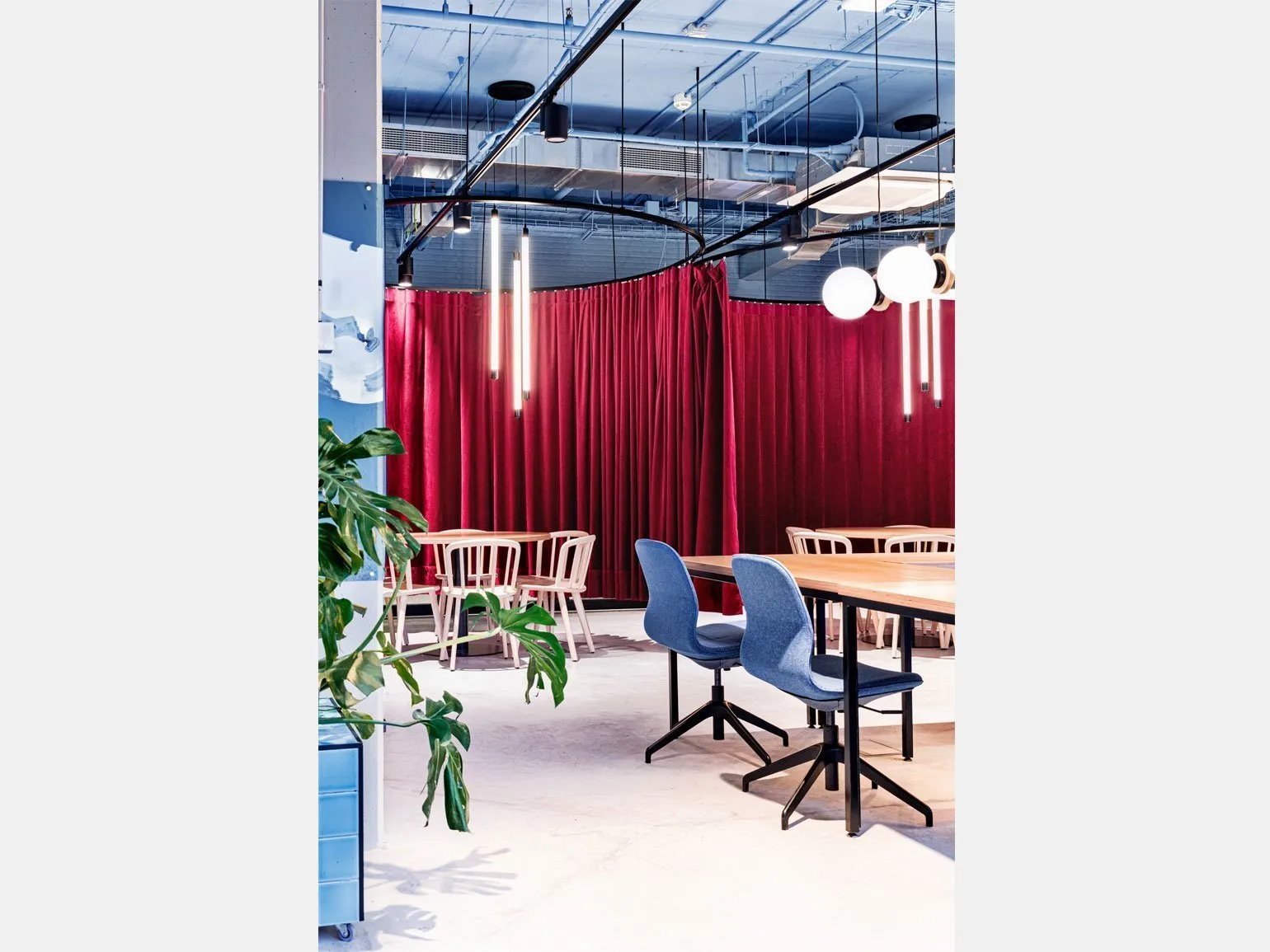
The combination of vibrant shades of magenta and blue has a significant impact on the perception of space. Light blue and light blue tones soften the drama of the rich crimson, creating a light and playful feel to the interior. This combination not only helps achieve harmony in the design but also adds a playful element, making the space more inviting and vibrant. Correctly chosen color accents can transform any room, creating a unique atmosphere.
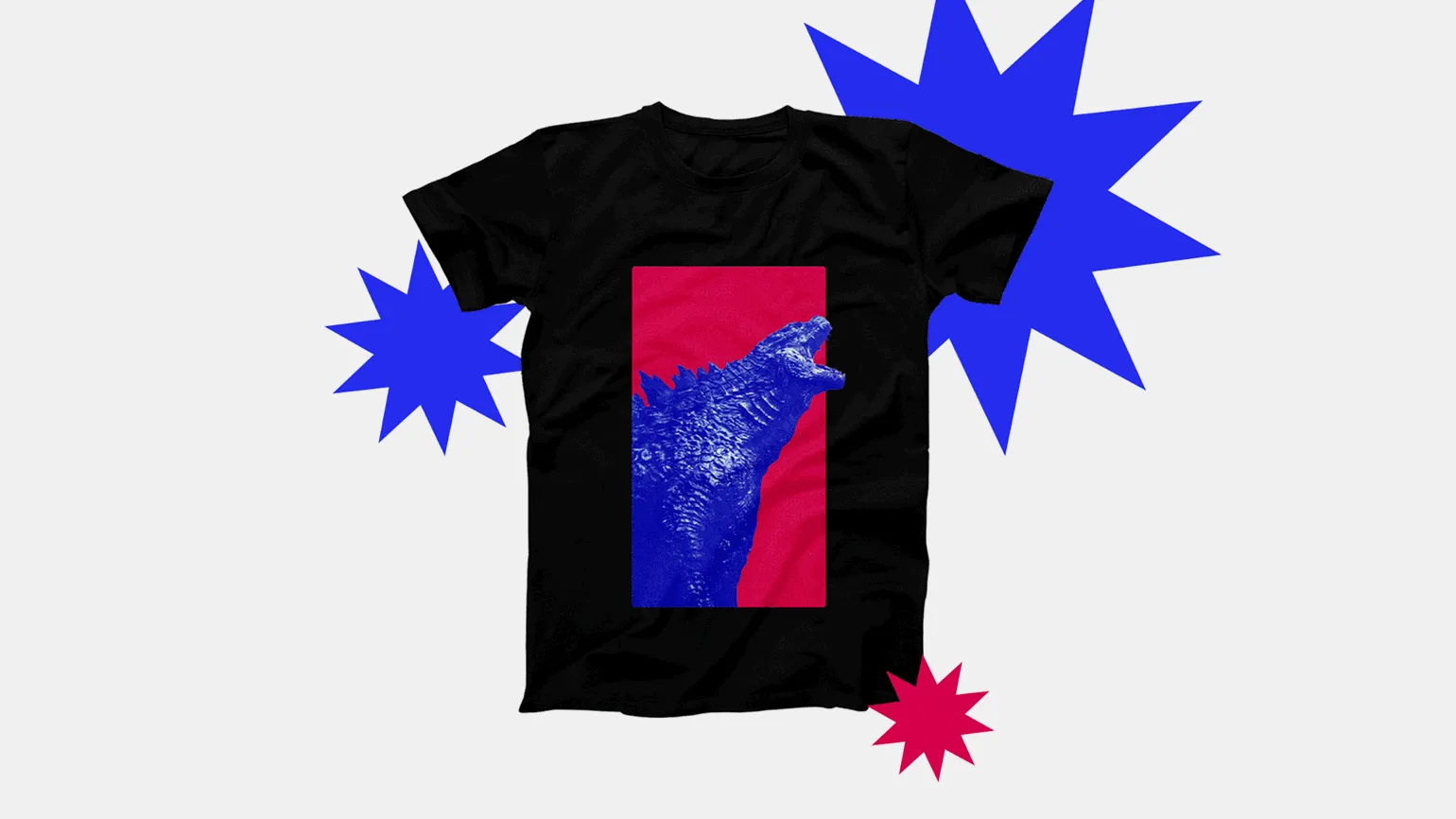
The Popsense Festival stands out in its branding with vibrant magenta and blue hues that represent Fun, pop culture, grandeur, and exoticism. This harmonious combination of colors not only attracts attention but also creates a memorable visual image, helping to create a unique atmosphere for the event. The vibrant palette highlights the festival's dynamism and creativity, appealing to a wider audience.
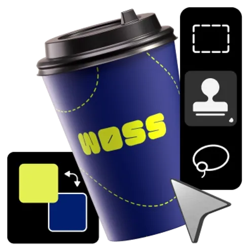
An interesting approach to the color scheme includes the use of magenta in a triad with night blue and grassy green. This combination creates a dynamic and fresh atmosphere, making it ideal for contemporary interiors. Magenta adds brightness and expressiveness, while midnight blue creates depth and tranquility. Grass green brings in elements of nature, harmonizing the space. This color scheme is perfect for creating a stylish and inspiring design that will attract attention and create a cozy atmosphere.
This color combination is ideal for event decoration, logo development, and the creation of promotional materials. Blue evokes trust and a sense of calm, while magenta brings brightness and creativity to the design. Using these colors in your projects will help attract attention and create a positive impression on your target audience.
Read also:
Blue is one of the most versatile and popular colors in the world of design and fashion. It pairs beautifully with many other shades, creating harmonious and stylish combinations. One of the classic combinations is blue and white. This combination adds freshness and lightness, ideal for nautical themes and summer looks.
Blue also complements gray well, adding elegance and sophistication to interiors or clothing. For brighter and more dynamic solutions, you can combine blue with yellow, which creates contrast and attracts attention.
When combined with green, blue fills the space with natural freshness, and with red, it adds drama and expressiveness. Blue also complements pastel shades, creating a soft and cozy atmosphere.
In interiors, blue can be combined with natural materials such as wood or stone, adding warmth and comfort to the space. It also looks great with gold or silver accents, adding luxury and style.
Thus, blue is an excellent choice for creating varied and attractive combinations, both in fashion and interior design.
Magenta and Pink: The Perfect Combination
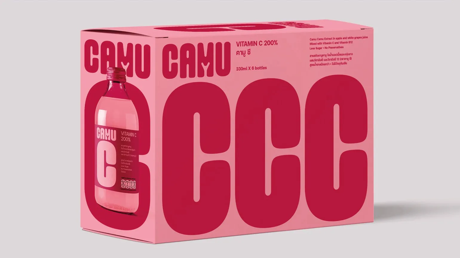
The vibrant packaging design of this vitamin drink, in which magenta and light pink are harmoniously combined, evokes associations with camu camu berries. These colors not only attract attention but also symbolize the naturalness and freshness of the product. Packaging in these shades effectively distinguishes the drink on store shelves and emphasizes its beneficial properties, making it attractive to consumers striving for a healthy lifestyle.
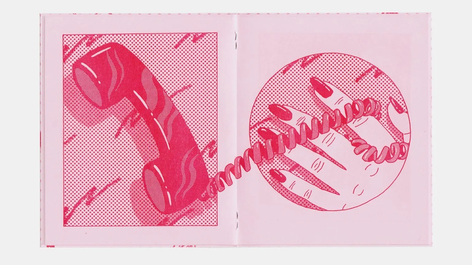
Risograph printing using magenta on pink paper adds vintage charm to designs. This printing method, popular among contemporary designers, allows you to create unique textures and color shades. Risography opens up new horizons in graphic design, allowing you to combine vibrant colors and unconventional materials. This approach attracts attention and creates original visual solutions, making risograph printing an ideal choice for unique projects.

If you are interested in printing, we recommend paying attention to this topic. Printing is an important aspect of modern business and creativity, which covers various technologies and methods. Learn about the different types of printing, such as offset, digital, and screen, and their applications across industries. Understanding the features and benefits of each technology will help you choose the best approach for your needs. Furthermore, learning about current trends in the printing industry will help you stay ahead of the competition and deliver your projects efficiently.
Analog Printing Renaissance: What is a Risograph? Learn about the capabilities and benefits of this printing method. A risograph is an innovative printing method that combines speed and cost-effectiveness. It is ideal for reproducing materials such as posters, brochures, and books. The main advantage of a risograph is its ability to produce high-quality prints with vibrant colors and crisp details. This method also boasts low printing costs, making it attractive for short and medium runs. Risography allows the use of eco-friendly inks and recyclable materials, contributing to sustainability. Dive into the world of risograph printing and discover new opportunities for your business or creative projects.
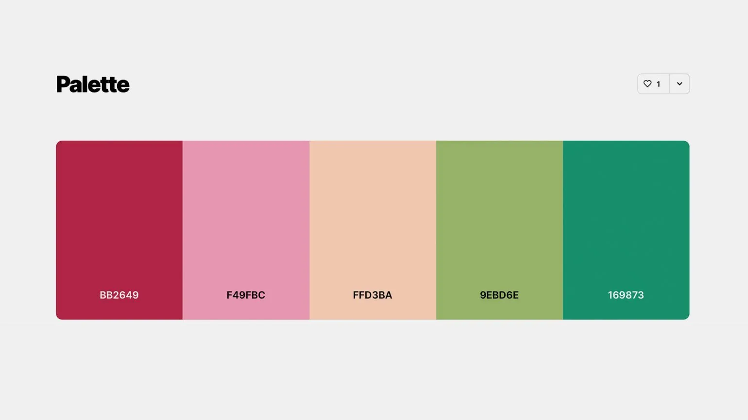
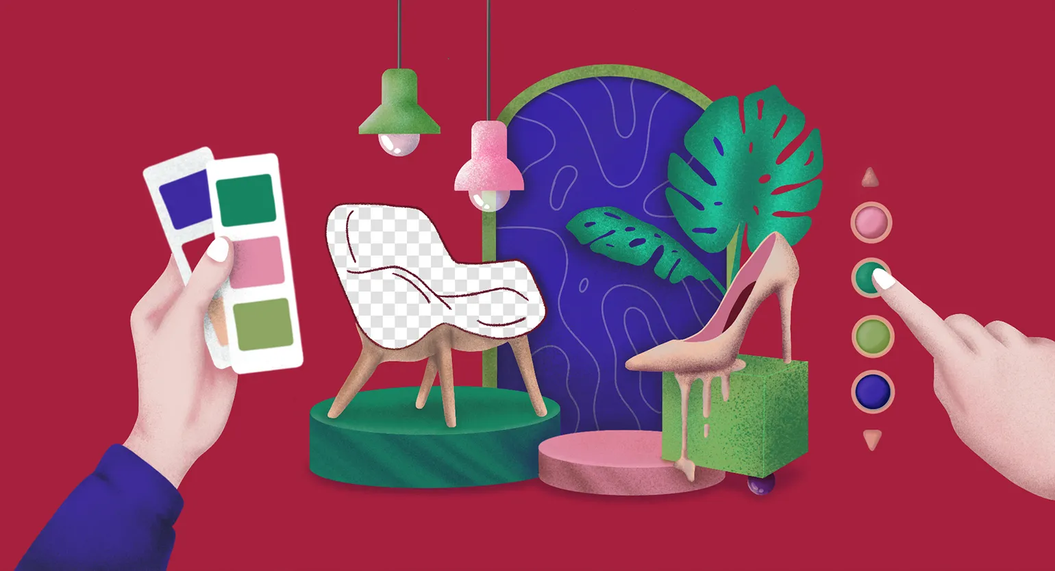
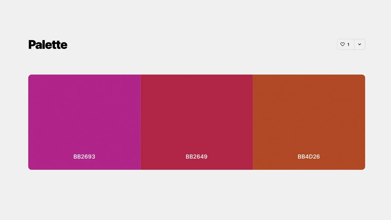
A color palette with a positive mood for website or app design includes raspberry red, plastic pink, Nude, light olive, and emerald shades. These colors create an inviting and welcoming atmosphere that fosters positive perception. Using this palette helps create a harmonious and modern visual style that attracts users and enhances their experience with the product. Choosing the right color combinations can increase engagement and create a positive impression of the brand.
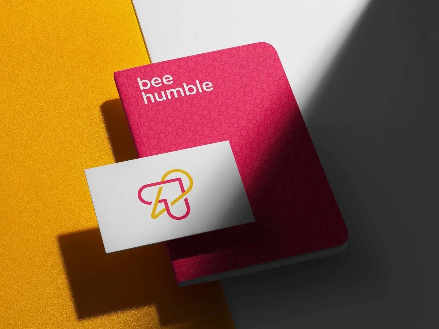
The combination of magenta and orange: a bright accent in design
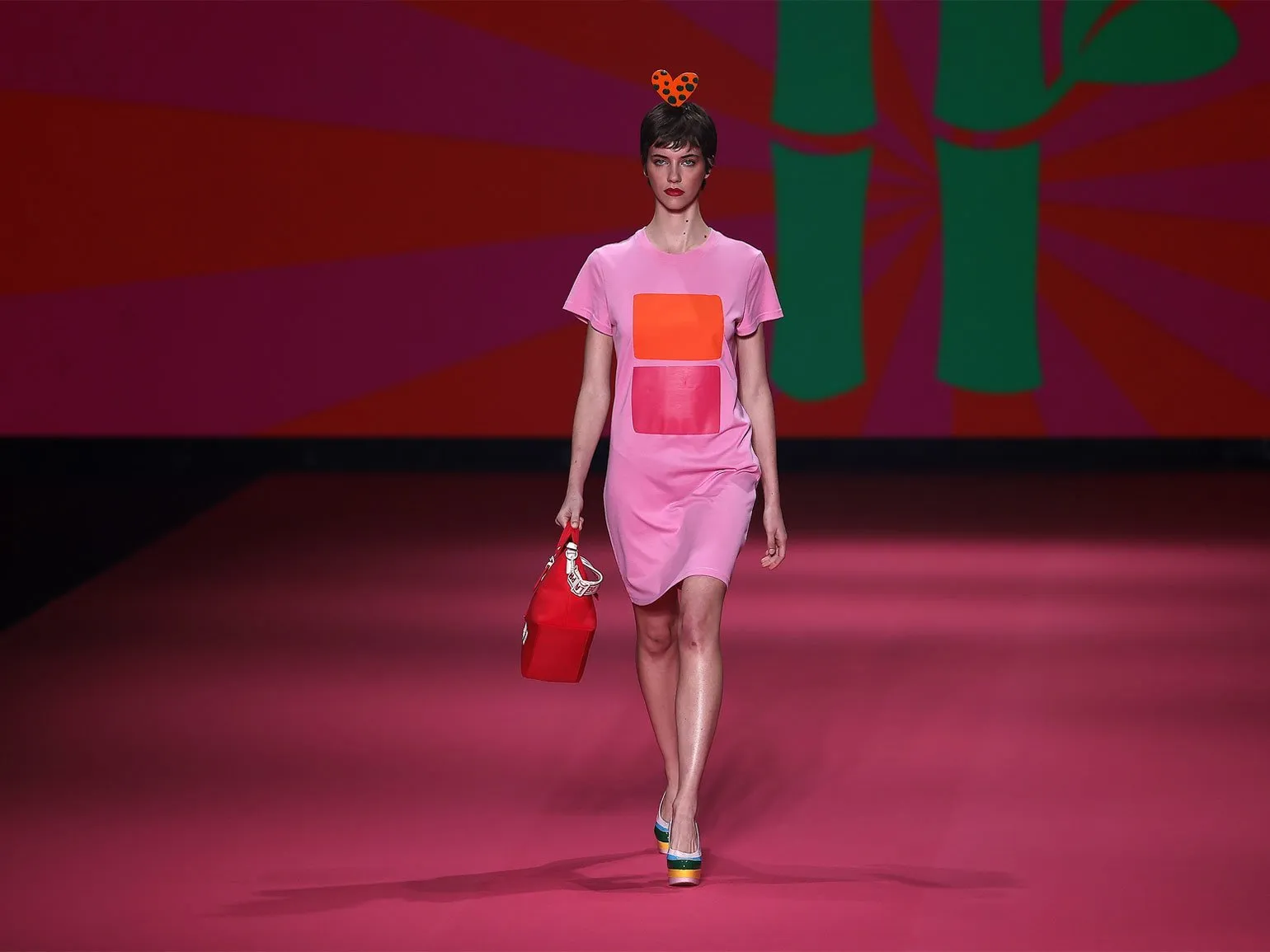
Magenta and orange are two vibrant and dynamic colors that can bring freshness and energy to any design. Their bold combination can serve as a standalone decorative element, even in the form of simple geometric shapes. Using magenta and orange in interiors or graphic design creates a visual accent that attracts attention and sets the mood. These colors are ideal for creating modern and stylish spaces, as well as for developing advertising materials, thanks to their high visibility and appeal. The combination of these shades can not only decorate but also transform any environment, making it more lively and interesting.
The optimal use of hot pink and orange in minimalist design allows you to create logos that are memorable and easily perceived. These colors not only enhance visual perception but also effectively attract the attention of the target audience, which helps to increase the interest of potential customers. Choosing the right color palette in logo design can significantly increase its recognition and create a positive brand image.
A bold combination of cool fuchsia, harmonious magenta, and rich orange is an ideal choice for effective branding. This color palette is perfect for promoting healthy foods, specialty coffee shops, and experimental sparkling wines. Bright and memorable colors not only attract attention but also create associations with quality and uniqueness, which is especially important in a competitive environment. By creating a visual style based on this palette, brands can emphasize their individuality and attract their target audience.
Additional resources are an important element for deepening knowledge and expanding capabilities in various fields. They can include articles, research, videos, and online courses that will help you better understand the topic you are studying. Using additional resources allows you not only to enrich your knowledge but also to improve your qualifications. It is important to choose high-quality and relevant sources so that the information is reliable and useful. Incorporating such materials into your learning process encourages deeper analysis and critical thinking. Remember that a variety of sources can greatly enhance your understanding of a topic and provide new perspectives. Orange: Perfect Pairings and Inspiration for Your Project. Learn which colors orange pairs with to create attractive and stylish combinations. Explore the possibilities of pairing orange with neutral shades like white and gray, as well as vibrant colors like blue and green. These combinations will help you create a unique and memorable design. Let orange become the main element of your project, giving it energy and a positive mood.
Magenta and Black: The Perfect Combination in Design
The visual style of the website of a studio specializing in e-commerce app development is based on the contrast of a deep black background and bright, warm pink accents. This design makes the site not only visually appealing but also modern, which plays a key role in attracting customers and building a positive brand image. Using this color scheme helps you stand out from the competition and creates a memorable user experience, which is especially important in the e-commerce industry.
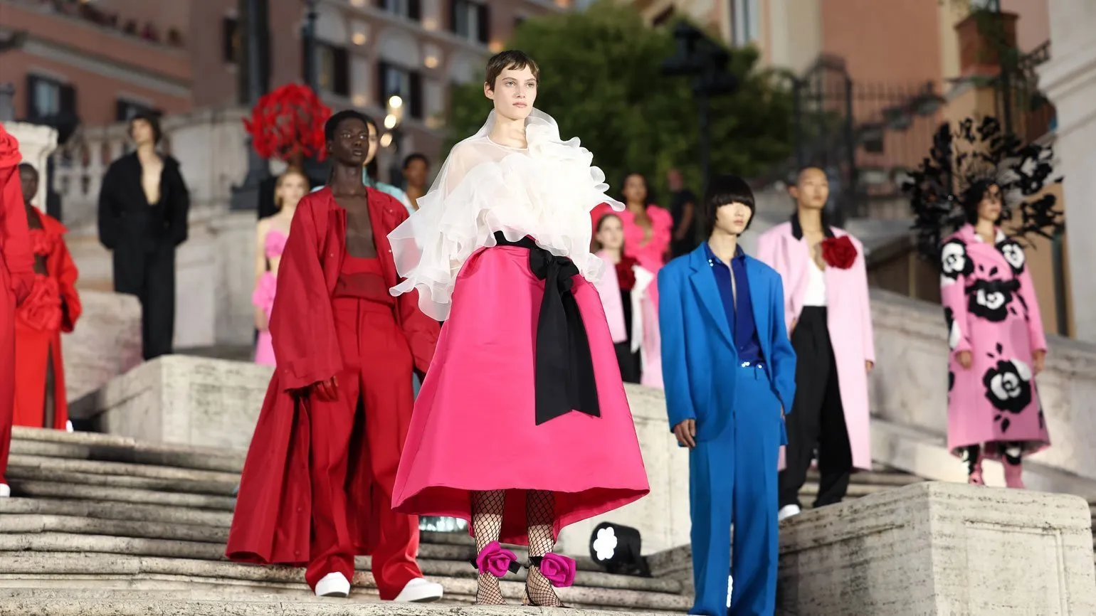
The color palette featured in this look evokes vivid associations with the princess from the classic film Roman Holiday. A rich pink skirt paired with a lightweight white blouse and a crisp black belt creates a unique style that exudes elegance and sophistication. This ensemble not only emphasizes femininity, but also becomes a symbol of timeless classics, inspiring modern fashionistas to create their own looks.
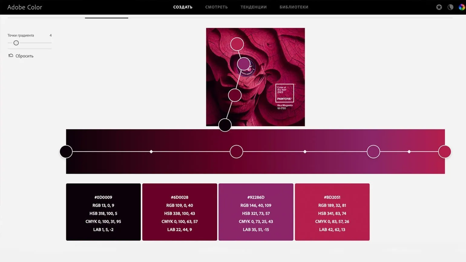
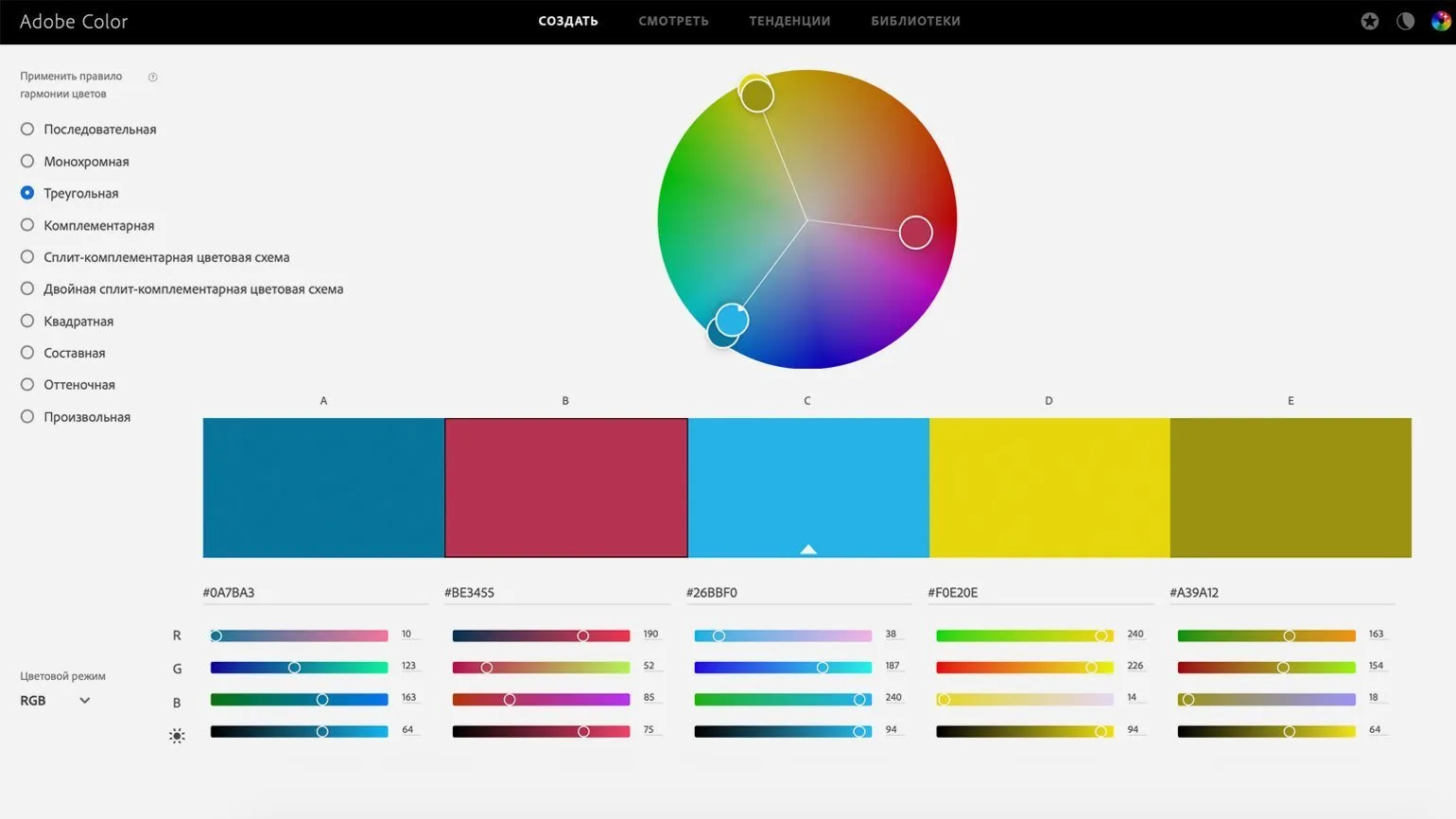
Use the free Adobe Color tool to create unique color schemes. For example, a surreal illustration dedicated to Viva Magenta reveals harmonious combinations of near-black plum, deep raspberry, cool lilac, and vibrant magenta. This tool helps designers find inspiration in any image and create original palettes for their projects. Adobe Color is an indispensable resource for those striving for harmony in color and design.
Subscribe to our Telegram channel to stay up-to-date on current trends and receive new design ideas. We regularly share useful information to help you create unique and modern projects. Don't miss the opportunity to be inspired and expand your design knowledge.
For an in-depth study of color combinations, we recommend checking out our articles. They will help you better understand how to choose the right colors and create harmonious compositions.
- Pink color combinations: how and what to wear?
- Purple in the interior: ideas and tips
- Brown color: how to create a harmonious space
- Green color in design: trends and recommendations
- Red color: how not to make a mistake in combinations
Graphic Designer PRO: 5 Steps to a Successful Career
Want to become a graphic designer? Learn 5 key steps for a successful start in your career!
Learn more