Table of Contents:

UX/UI Designer: A Practical Course for a Successful Career
Learn MoreEffective Headings: How to Organize Information
To improve user experience, it is necessary to structure information in such a way that they can quickly and easily find the data they need in the application. Headings play an important role in this process, as they allow the user to instantly identify the necessary information. Correct use of headings improves navigation and contributes to a better perception of content. Effectively organizing information with headings not only makes it easier to find but also enhances the overall user experience.
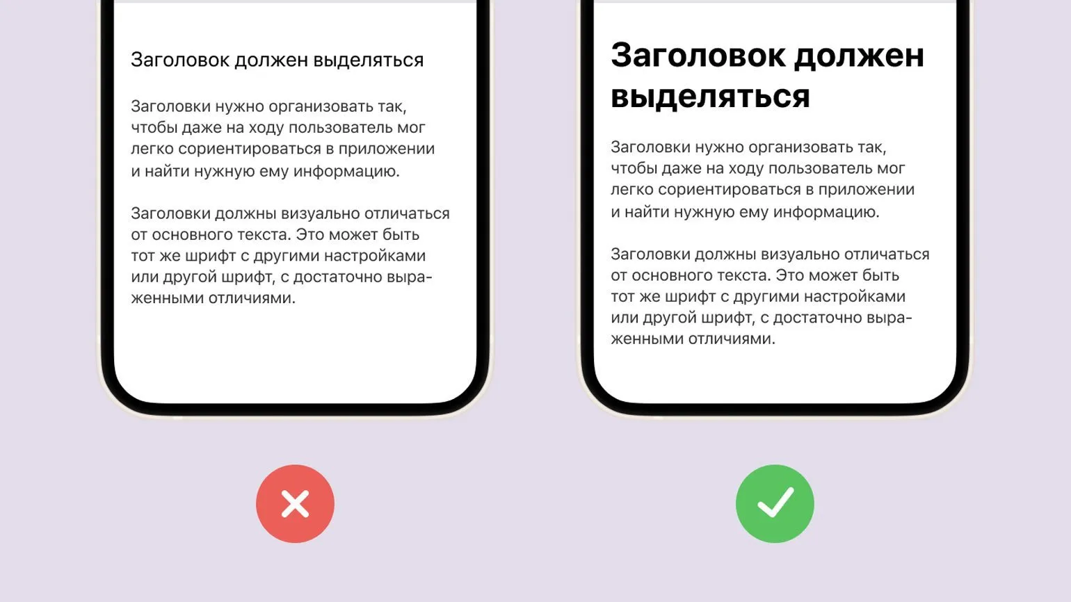
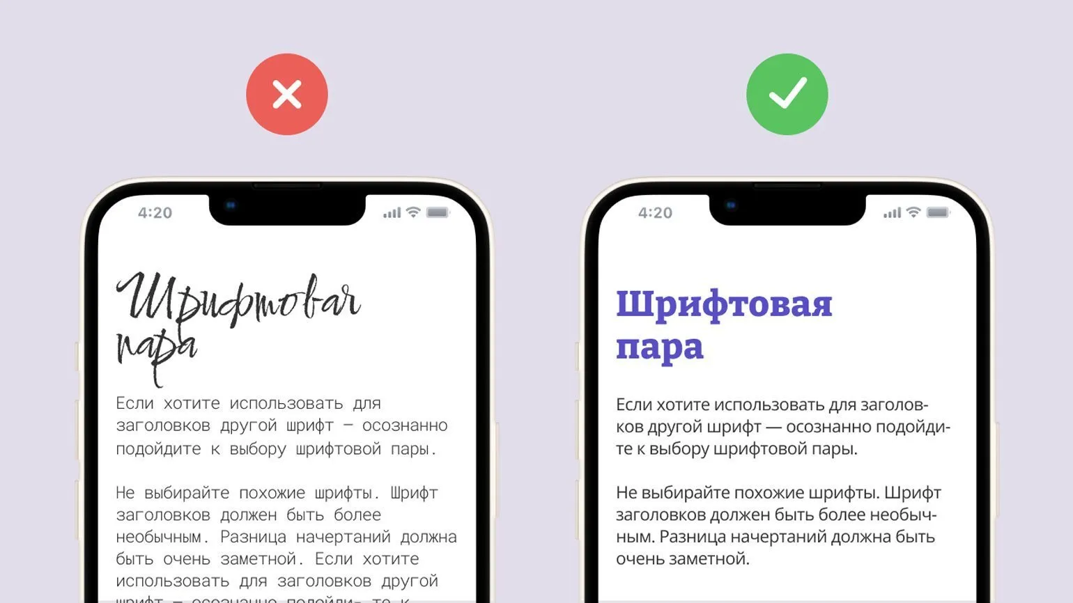
When choosing fonts for headings and body text, it is important to consider their harmonious combination. The right combination of fonts can significantly improve the readability and perception of content. It's recommended to consider the style and tone of fonts to ensure they align with the overall theme of your project. To create contrast, choose a serif font for body text and a sans-serif font for headings, or vice versa. Font sizes should also be considered: headings should be more prominent than the main text to attract attention. Experiment with different fonts, but keep in mind the consistency of style and legibility to ensure comfortable perception of the information.
- Choose fonts with different styles. For example, calligraphic or experimental fonts are suitable for headings, while the main text should remain simple and legible.
- Fonts should be harmonious with each other. It is better if they have similar features, but at the same time, noticeable differences. For example, one font can be serif, and the other - sans.
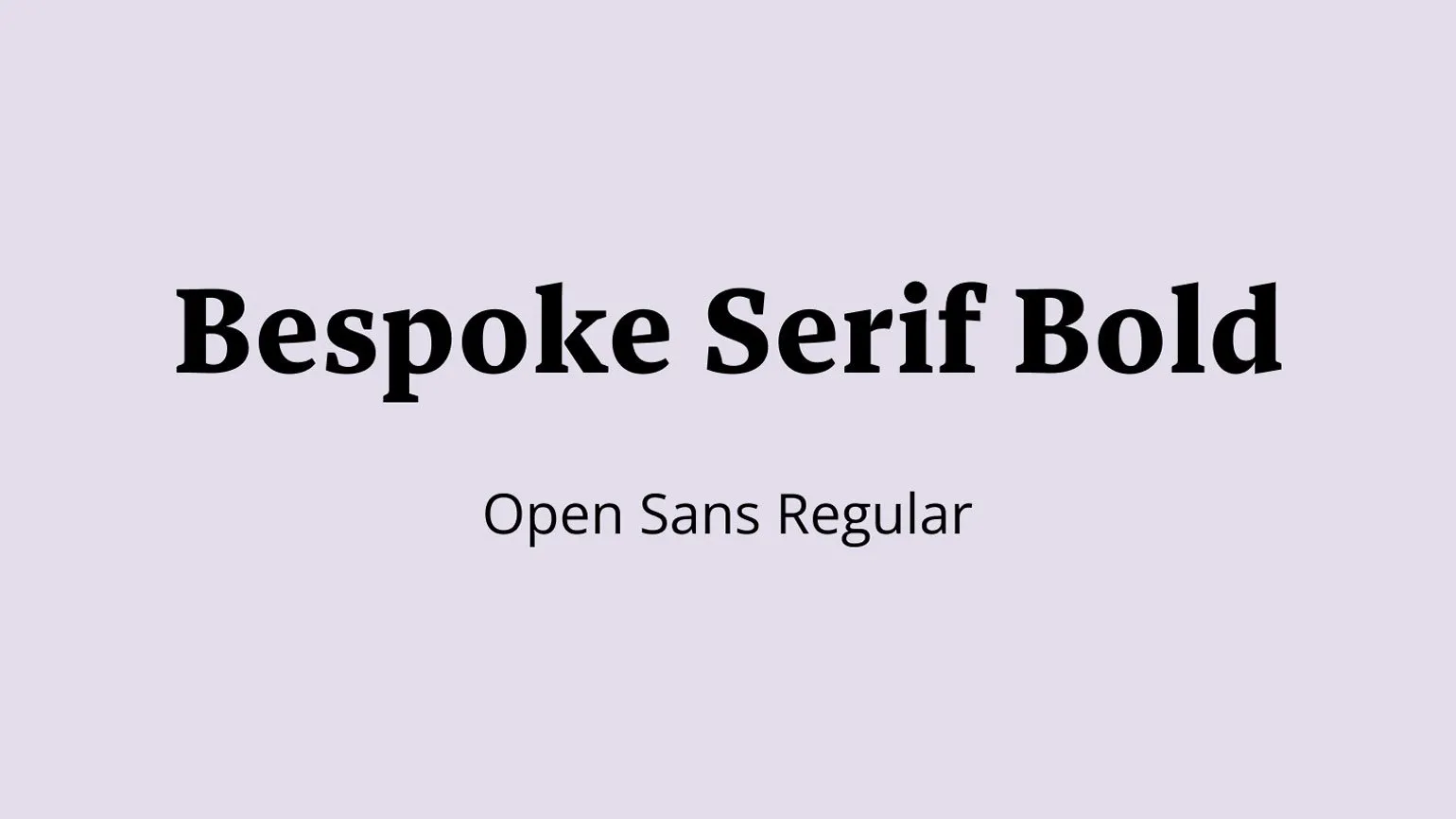
Both fonts can be sans serif, but differ in proportions. One font can have an elongated shape, while the other is rounded. Such differences in font design allow for the creation of a unique visual style, which is especially important in graphic design and web design. The choice of font, taking into account its shape and proportions, can significantly affect the perception of the text and the overall aesthetic aspect of the project.

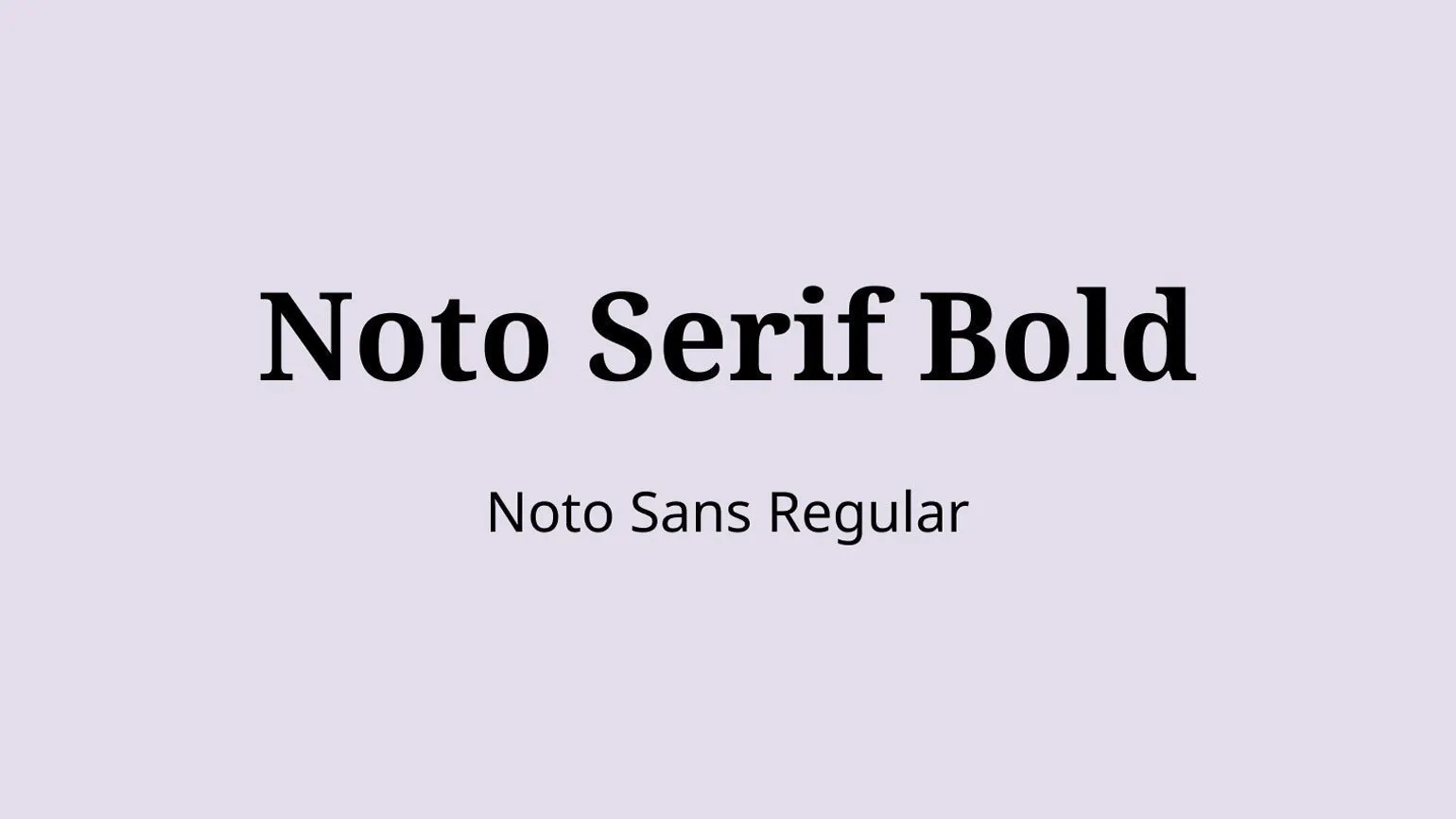
- Try to select pairs of fonts from the same superfamily. For example, Roboto Slab for headings and Roboto for text, Noto Serif and Noto Sans, PT Sans Narrow and PT Sans - such fonts are created for successful combination.
- If you find it difficult to choose a font pair yourself, use Online services. For example, Fontpair offers a gallery of various font combinations, and Fontjoy is a pair generator based on Google Fonts.
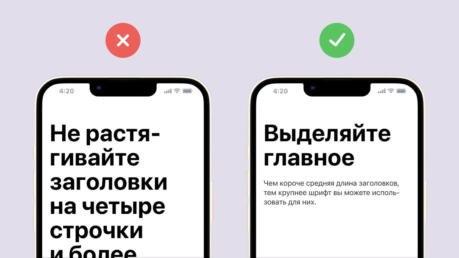
Headings should take up no more than three lines. If your headline exceeds this limit, it's recommended to shorten it or change the font size. Otherwise, it may negatively impact the readability of the text. Concise and clear headlines help readers absorb information more quickly and improve the page's SEO.
Optimizing Indents and Fonts for Better UX
Indents and font sizes, while they may seem unimportant, are essential to a good user experience. Proper typography and structure help users quickly find the information they need on your website or app, creating a sense of order and consistency. Optimizing these elements improves content perception and increases user satisfaction.
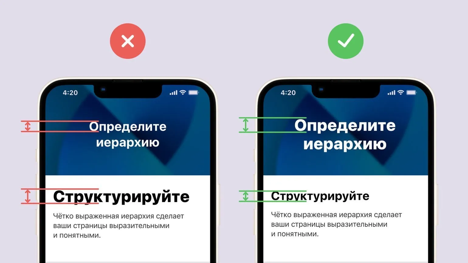
It's important to pay attention to spacing both within and between blocks. According to proximity theory, elements placed close together are perceived as related. This is especially true for headings, which should be placed close to the corresponding text. This arrangement promotes better information comprehension and a clear page structure. Proper use of spatial relationships between elements helps improve user experience and increase content readability.
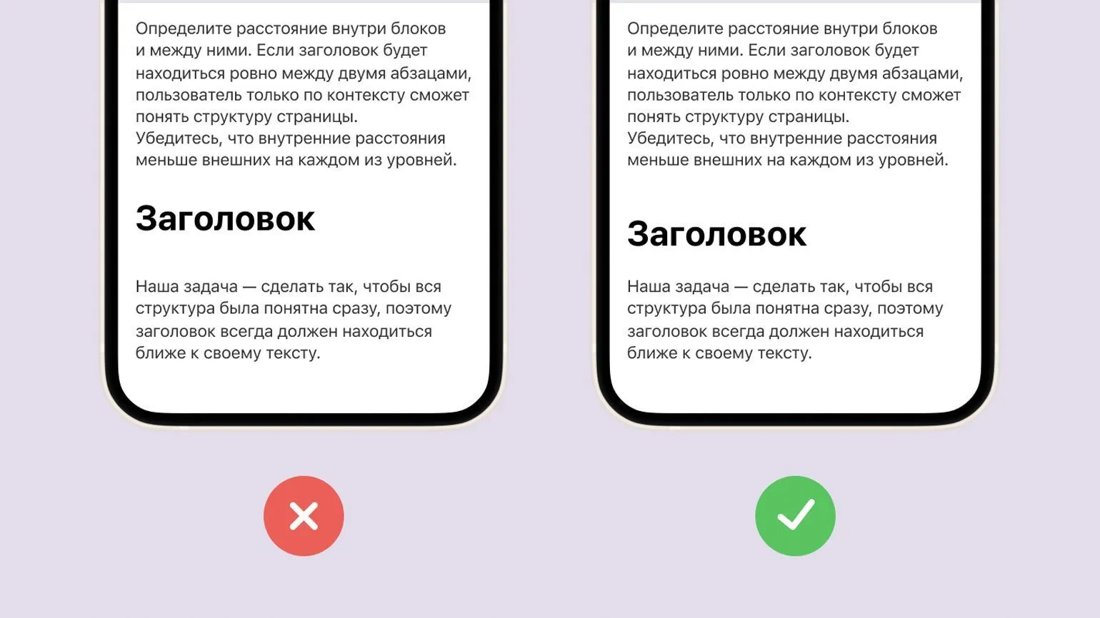
Optimal internal margins should always be smaller than external ones. For example, the margin between the heading and the main text should be greater than the margin between the heading and the subheading. This rule promotes a clear content hierarchy, which improves user perception and has a positive impact on the page's SEO ranking. Proper use of indents not only improves readability but also helps structure content, an important aspect of web design and user experience.
We recommend following the principle that external indents should be equal to or greater than internal indents. This rule helps create a visually appealing and structured layout, which improves the overall perception of content. Proper indentation helps organize information better and facilitates comprehension, which is especially important for user experience and SEO optimization.
To enhance the expressiveness of the text, we recommend limiting the number of styles used. Highlight key font sizes and set them in a fixed format. Typically, using four or five different font sizes is sufficient to create a harmonious and readable design. Proper use of fonts improves the perception of information and makes the text more attractive to the reader.
- Primary headings - key information that should be in the foreground.
- Secondary headings or subheadings - serve as navigation within the pages.
- Body text - narrative blocks that should be easy to perceive.
- Additional information and footnotes - smaller text that can be ignored without losing the essence.
- Additionally, you can add another style, but do not get carried away.
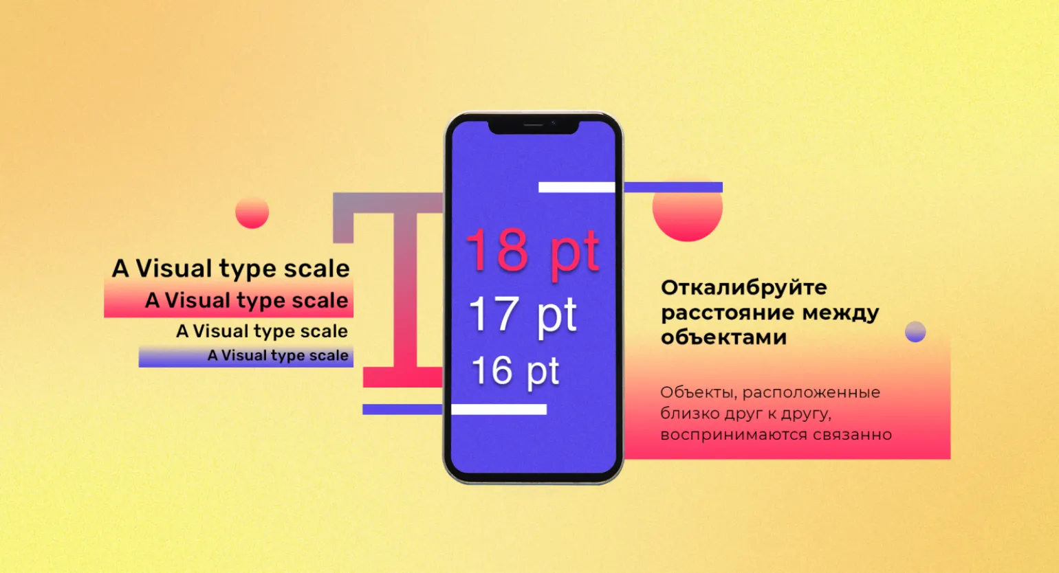
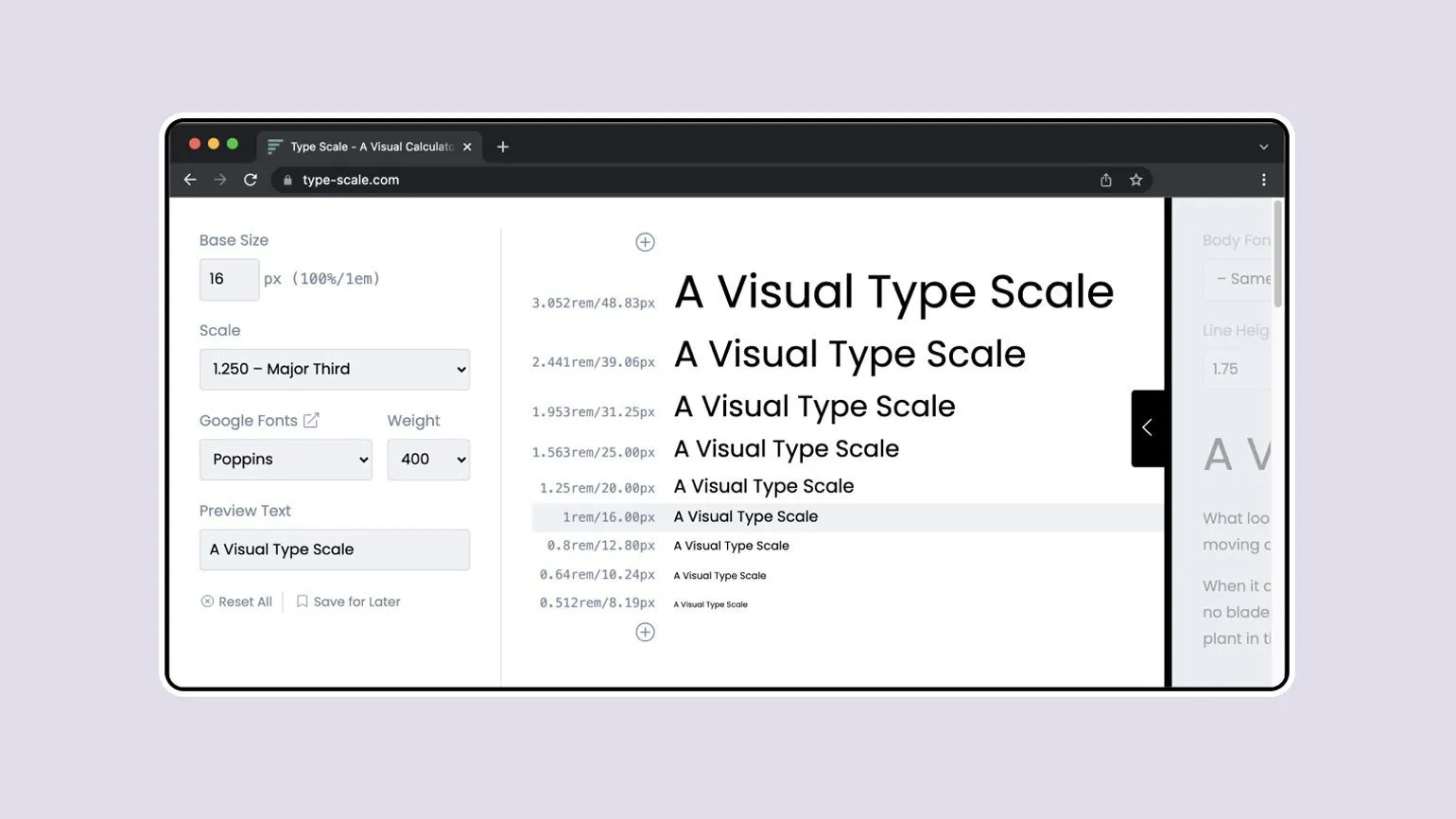
To effectively select fonts and their sizes for different text blocks, use the following guidelines. The selection of font size plays a key role in the perception of information, so it is important to consider not only the size but also the style of the font. The optimal font size should ensure good readability and fit harmoniously into the overall design of the page. For body text, a font size of 14 to 16 pixels is recommended for comfortable reading. Headings can be emphasized with a larger font size, starting at 18 pixels and up, depending on the importance of the heading. Keep line spacing at 1.5 to 2 times the font size to prevent the text from appearing too dense. Use these guidelines to achieve optimal visual perception of your content.
- Main text — 16 px.
- Key phrases and accents — 16 px × 1.2 ≈ 19 px.
- Subheadings — 19 px × 1.2 ≈ 23 px.
- Headings — 23 px × 1.2 ≈ 28 px.
- Additions and footnotes — 16 px × 0.833 ≈ 13 px.
For automated font selection, we recommend using the Type-scale service. This tool provides the necessary values in both pixels and rem, which significantly simplifies the work of both designers and developers. Type-scale helps create harmonious typographic systems, which makes your content more readable and attractive to users. Optimizing fonts with this service improves UX and enhances the overall quality of web design.
Using Capital Letters and Spacing in Design
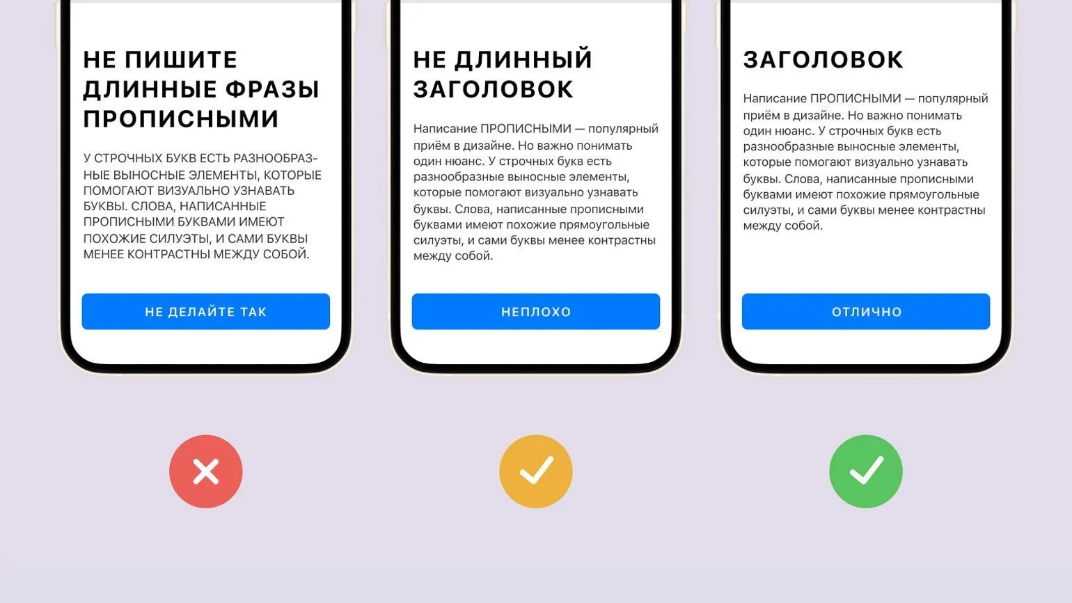
Using capital letters has become a common technique in modern design. However, it's important to consider an important aspect: lowercase letters have multiple ascenders and descenders, which aid their visual identification. Unlike uppercase letters, lowercase letters have a variety of shapes, making them more contrasting and easily distinguishable. Lowercase letters can improve the readability of text and create a more friendly, modern style. The correct combination of uppercase and lowercase letters in design creates harmony and enhances the effectiveness of information transfer.
Reading text written in uppercase letters is significantly slower. To facilitate comprehension, it is recommended to avoid long phrases in this format. Using lowercase letters makes text more readable and promotes better comprehension. Remember that optimizing your text for readability is important for effectively conveying information.
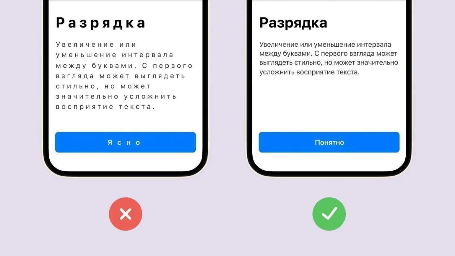
Text spacing is the spacing between characters, which is typically applied to an entire paragraph. Proper use of spacing can significantly improve the perception and readability of text. Optimal spacing helps highlight key points and makes the text more engaging for the reader. Proper spacing helps create a harmonious visual flow, which in turn increases interest in the content. It's important to keep in mind that too little or too much spacing can negatively impact the text's perception, so finding a balance is essential for achieving the best results.
Avoid excessive spacing in lowercase text. For example, using a format such as "Just because it's hard to read" makes information more difficult to perceive. High-quality fonts already have optimal spacing, and interfering with this process can negatively impact readability. Proper text formatting promotes better perception and understanding of the content, which is an important aspect for creating readable materials.
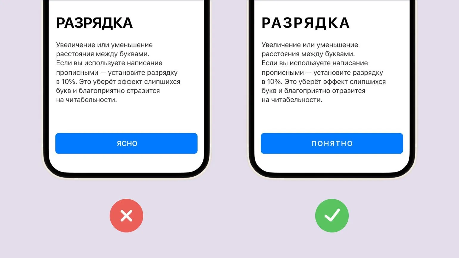
When using capital letters in headings, it is recommended to set the spacing at 10%. This will help to avoid merging letters and significantly improve the readability of the text. Clear and readable headlines are key to capturing readers' attention and increasing their interest in the content.
Color: Basics and Recommendations
Choosing the right color is an important design element. The contrast between text and background affects not only the visual appeal but also the accessibility of content. To ensure compliance with accessibility standards, it is recommended to use contrast checking tools such as WebAIM. These tools help ensure that the contrast ratio is at least 7:1 for body text and 3:1 for accent elements. Proper color selection improves readability and creates a comfortable environment for users, which is an important aspect of web design. Figma plugins make choosing contrasting colors much easier, allowing designers to focus on creative work. Using such tools, you can quickly find harmonious color combinations, improving the visual perception of your projects. This saves time and effort, allowing you to create higher-quality and more attractive designs. Creating a limited color palette effectively increases brand recognition and improves information comprehension. Using fewer colors helps reduce visual noise and distractions, making content more accessible and understandable. An optimal color scheme helps create a unified style and creates a harmonious perception, which is especially important for successful brand promotion in the digital space.
Learn effective methods of working with color by reviewing the materials presented. This will help you improve your skills in the field of color perception and application, which is a key aspect in design and art. The correct use of color can significantly enhance the quality of your projects and attract the attention of your target audience. Don't miss the opportunity to deepen your knowledge and master new techniques that will make your work more expressive and professional.
- How to choose colors: 8 simple tools
- Gradients: a comprehensive overview
- Itten's color wheel: secrets of harmony
- Color spaces: in-depth analysis
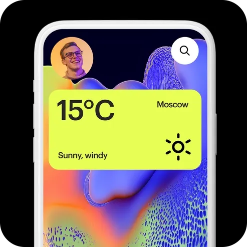
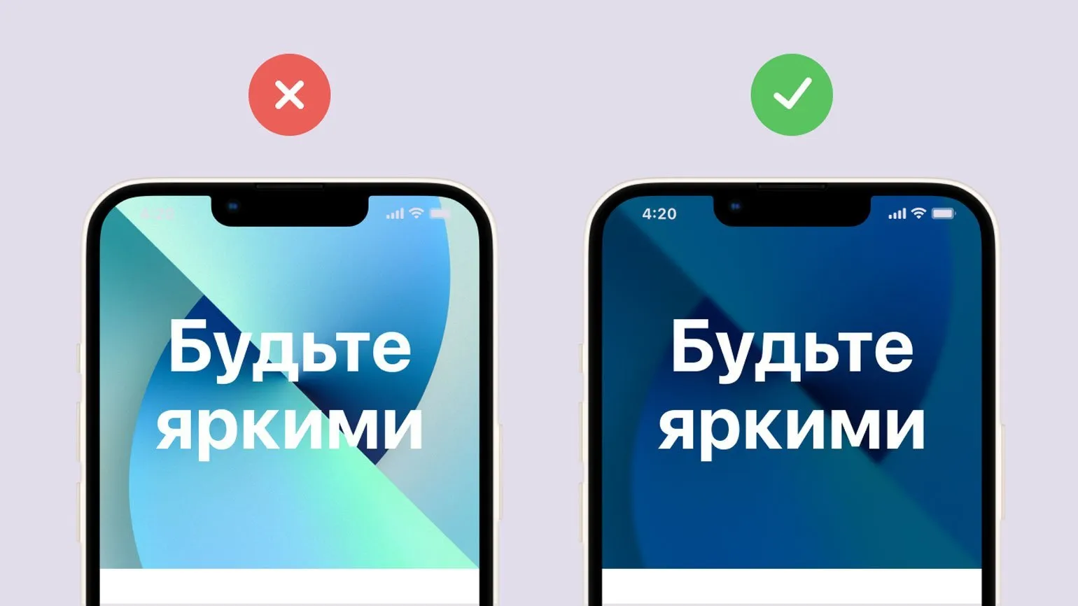
Text on images should be clearly legible. To improve readability, it is recommended to use translucent color panels located above the images. Additionally, it's worth experimenting with overlays and blurs, which will help improve the perception of text and make it more noticeable against the background of the image. Proper formatting of text in images contributes to better perception of information and improves the overall visual style of the content.
Subscribe to our Telegram channel to stay up to date with the latest news and updates in the field of design. We share useful information that will help you stay on trend and develop your skills. Don't miss out on the latest design tips and inspiration!
Deepen your knowledge of typography and layout by exploring these key topics:
- Ethnic Fonts: Cultural Peculiarities in Design
- The Basics of Good Typography: Principles and Tips
- Font Licensing: Everything You Need to Know
- Modular Systems in Graphic Design: The Basics of Swiss Layout
UX/UI Designer: 5 Steps to a Successful Career
Want to become a UX/UI designer and increase your income? Learn 5 key steps in our article!
Learn more