Contents:

Top 4 Design Professions: Free 5-Day Course
Find out moreTransition from Traditional to Modern Typography
In today's information-saturated world, users need effective ways to perceive text. Given the limited time to get acquainted with the material, reading speed and visual perception become decisive factors. In response to these demands, current approaches to typography are undergoing changes aimed at improving readability and accelerating the process of information comprehension. Optimizing fonts, using appropriate spacing, and properly formatting text play a crucial role in creating user-friendly and understandable content. It's important to consider these aspects to achieve maximum impact when presenting information. Jan Tschichold, a renowned graphic designer, argued that traditional typographic solutions were aimed at readers capable of devoting time to thoughtful reading. In the past, typography emphasized aesthetics and originality, while functionality often remained secondary. This approach reflected the values of a time when the visual appeal of text played a key role in information perception. Modern trends in typography require a more balanced approach that combines both aesthetic and functional characteristics to meet the needs of the modern reader.
Tschichold emphasizes that traditional typographers often emphasized aesthetics and decorative elements, ignoring legibility. This phenomenon is rooted in the history of typography, which began in the mid-15th century, when the emphasis on the development of typefaces and ornamentation trumped the desire for clarity and legibility in printed materials. Over the centuries, typography has evolved, and modern designers increasingly recognize the importance of balancing visual appeal with the functionality of text. Creating legible fonts and using space wisely are becoming key aspects of successful design.
Modern designers must focus on simplicity and conciseness, constantly asking themselves: "Does my style meet the functional requirements of the product?" This approach allows you to create an effective and user-friendly interface that is not only aesthetically pleasing but also as functional as possible for users. It is important to remember that design should serve a purpose, not distract from it.
Tschichold emphasizes that form cannot exist in isolation; it must be determined by function, material, and construction. He argues that the basis of the new typography is minimalism and functionality, as well as the desire to eliminate excesses. This concept emphasizes the importance of harmony between aesthetics and practicality, which makes design more effective and modern. As a result, typography becomes not only visually attractive, but also serves its main purpose - improving the perception of information.
Tschichold argues that typography, like architecture, must free itself from outdated patterns and approaches to create functional forms. Architecture is moving toward simpler, more concise facades, and typography should follow suit, abandoning excessive ornamentation. It is important that typographic solutions are relevant and meet modern requirements, ensuring not only aesthetic appeal but also functionality. Modern design trends emphasize the need for simplicity and clarity, which allows for better communication of information and improves the perception of text content.
Modern research emphasizes the importance of typography, which should consider not only visual appeal but also the ease of perception of text in a digital environment. According to the Nielsen Norman Group, users devote only 10-20% of their time to careful reading, while most of their time is spent scanning information. This emphasizes the need to create texts with a clear structure, clear headings, and easy-to-read fonts, allowing users to quickly find the information they need. Proper typography is becoming a key factor in increasing the effectiveness of content and improving the user experience.
The transition to new typography is a necessity driven by changes in information perception. Effective typography should combine aesthetic appeal and functionality, allowing users to absorb information faster and more easily. Modern trends require designers to create texts that not only attract attention but also improve readability and comprehension of content. It is important to consider that high-quality typography plays a key role in the perception of information and can significantly improve the level of interaction with users.
Basic Principles of New Typography
Clarity is a fundamental principle of modern typography, as Jan Tschichold notes. In an age of information overload, when we are confronted with a multitude of texts daily, priority should be given not to aesthetic appeal, but to readability. This is especially true for web content, where readers expect quick information processing. Proper selection of fonts, indents, and spacing helps create text that is easy to read, which in turn facilitates better information absorption. It's important to remember that clarity not only improves user experience but also has a positive impact on SEO, increasing the chances of attracting and retaining an audience.
Symmetry can make text difficult to read, as it often disrupts its compositional structure. Tschichold notes that symmetrical design and predetermined formal schemes contradict the principles of new typography. This typography should be based on the functionality of the text, highlighting keywords and maintaining a logical flow.
Typographers must be aware of how readers perceive text. Reading typically occurs from top to bottom, so it is critical that the semantic blocks of the text are arranged in an appropriate order. Proper typography not only improves the appearance of the text but also facilitates its perception. Effective placement of headings, paragraphs, and other elements helps readers quickly navigate content and absorb information. By paying attention to structure and consistency, typographers can significantly improve readability and communication effectiveness. Tschichold argues that asymmetrical forms have a more powerful visual impact than symmetrical ones. These forms symbolize the dynamism and changeability of our lives. However, chaos in composition must be avoided to maintain harmony and integrity of visual perception. The correct combination of asymmetry and organization can create effective visual solutions in design and art. Bad examples of typography illustrate how chaos in design hinders the perception of text and understanding its structure. As Tschichold notes, the desire for order can be realized through asymmetrical construction, which often more effectively conveys natural order. Correct typography contributes to improved readability and information comprehension, which is a key aspect of successful content. Effective text design not only attracts attention but also helps the reader easily navigate the material, which significantly increases its value.
To achieve harmonious text design, Tschichold offers a number of recommendations. First, no more than five different font sizes should be used to avoid visual clutter. Second, it is necessary to ensure contrast between headings and the main text, which improves readability and highlights key points. Third, the use of white space should be considered an important design element, as it helps organize information and facilitate comprehension. These principles will help create aesthetically pleasing and functional text that promotes better interaction with the reader.
- Use up to five different font sizes with noticeable differences.
- Headings should be larger than the main text.
- The contrast between the size and importance of the text should be obvious.
White space plays a key role in composition and design. As Tschichold notes, new typography reveals the expressive potential of white space, which was previously perceived only as a background. Correct use of white space can significantly improve the perception of the text and visual balance, as well as improve readability. It helps highlight key elements and creates a harmonious structure, making content more engaging for the audience. Optimizing white space in design can be an important step toward creating effective and modern visual solutions.

Tschichold criticizes excessive ornamentation, which distracts the reader from the main idea of the text. He argues that true beauty lies in a form devoid of unnecessary embellishment. This design approach promotes a clearer perception of information and helps focus on the content, emphasizing its importance.
In conclusion, to successfully apply the principles of new typography, it is necessary to take into account contrasts. They play a key role in highlighting important elements and creating a harmonious visual perception. Contrast in typography helps direct the reader's eye, improving legibility and perception of information. Using different fonts, sizes, and colors helps create a dynamic and attractive design that attracts and holds attention. The correct use of contrasts not only improves the aesthetic component but also helps effectively convey key messages.
Modern Trends in Color and Font in Typography
In the age of digital technology and visual culture, typography has undergone significant changes. Jan Tschichold, one of the founders of new typography, emphasizes the importance of the functional use of color. Unlike traditional approaches, where color was used only for decorative purposes, modern typography uses it to control perception and create compositional balance. This not only improves the readability of texts but also effectively conveys information, creating harmonious and attractive visual solutions. Color becomes a tool that helps highlight key elements and direct the reader's attention, which is especially important in today's information-intensive environment.
White is characterized by its ability to reflect light, creating a luminous effect and visual lightness. Red, on the other hand, is perceived as more intimate, imparting a sense of depth and richness. Black, being the darkest color, creates a sense of distance and is often associated with elegance and mystery. These color features play an important role in design and art, influencing the perception of space and the emotions of viewers.

Tschichold emphasizes that white is the preferred color, but the choice of shades should be based on the specifics of the printed product. For example, for business cards, it is optimal to use no more than three colors, while for posters, multi-color solutions are appropriate. The correct choice of color palette plays a key role in the perception of printed products and their effectiveness.
Tschichold argues that pure and saturated colors such as red, yellow, and blue are the optimal choice. He recommends avoiding mixing these colors with black, but in certain cases, the use of mixed shades is permissible. Color purity plays a key role in the perception of visual content, so it is important to choose the right palette to achieve the desired effect.
Tschichold emphasizes that grotesque fonts are most suitable for modern design. He believes that such fonts meet the requirements and spirit of the times. In his book "New Typography," Tschichold actively uses grotesque fonts, emphasizing their importance in modern typography. Grotesque fonts are characterized by clear lines and conciseness, making them ideal for various design solutions, from web design to printed materials. The choice of grotesque in modern design is due to its versatility and ability to adapt to various styles and concepts.
Bold grotesque fonts do not always provide good readability in body text. A more suitable option for body text is serif, which ensures clarity and ease of perception. Bold grotesque fonts are best used to highlight accents and draw attention to key elements. The correct combination of fonts improves the visual structure of the text and promotes better perception of information.

Among modern fonts, Tschichold highlights Sorbonne, Nordic Antiqua, and French Antiqua. These fonts are ideal for a wide range of printed materials, providing high legibility and aesthetic appeal. Using such fonts in design allows for the creation of a harmonious and professional layout, which is especially important for advertising publications, books, and magazines.
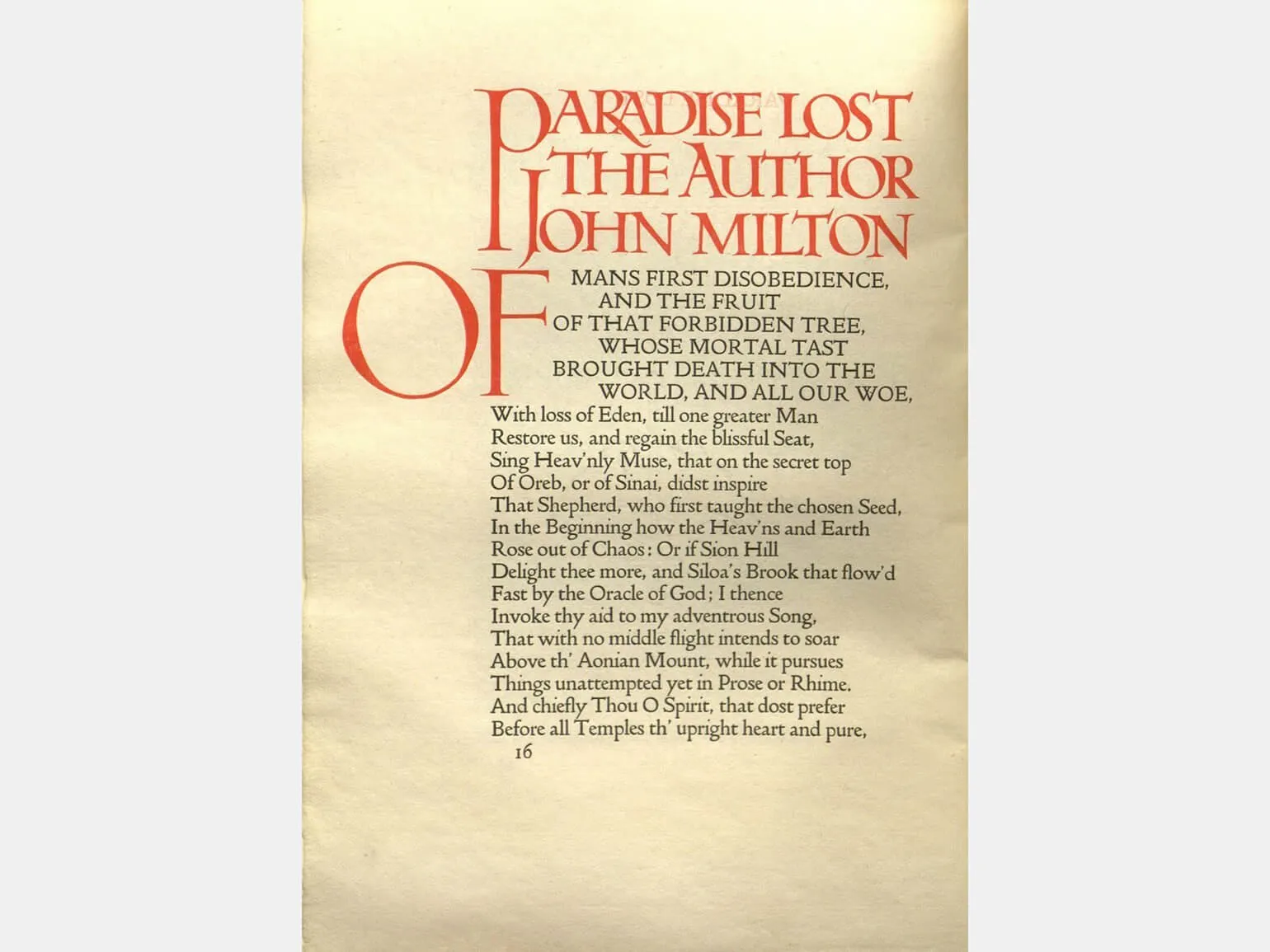
Gothic fonts, according to Tschichold, should only be used in cases where it is important to attract the reader's attention or to create a parodic effect that references historical traditions. The use of Gothic fonts can be an effective design tool when it is necessary to emphasize the atmosphere of a certain era or generate interest in the content. However, it's important to remember that such fonts can distract from the main message, so their use should be thoughtful and targeted.
Every modern printed publication should reflect current features and trends, not simply copy past examples. This statement by Jan Tschichold emphasizes the importance of an innovative approach to the design and content of printed materials. In a rapidly changing world, successful publications must adapt to new audience demands and expectations, incorporating modern elements that will help attract readers' attention and make information more accessible and understandable.
These principles remain important in modern design, where it is necessary to combine visual elements with the functionality of typography. Successful design requires a balance of aesthetics and readability, allowing users to easily perceive information and interact with the content. Proper use of fonts, sizes, and spacing not only improves readability but also creates a harmonious perception, which is crucial for effective communication.
Working on Typographic Mistakes: Lessons from Jan Tschichold
Jan Tschichold, a recognized authority in the world of typography, emphasizes the need for a harmonious combination of form and content. His critical analysis of modern typographic solutions reveals a number of common errors that are important to consider when creating designs. By paying attention to these aspects, designers can significantly improve the quality of their work and achieve more effective communication with their audience.

Tschichold identifies the first mistake in design - imaginary constructivism. He emphasizes that many advertisements are simply images composed of letters, lacking a deep connection to the content. In true typography, forms should be organically linked to the text's content, not created arbitrarily. A proper approach to typography requires that visual elements reflect the essence of the message, not be a random assortment of symbols.
The typesetter is guided by an external formal concept and structures the text accordingly. The typographic format should be organic and develop from the content of the text, which emphasizes the importance of integrating form and content to achieve harmony in design.
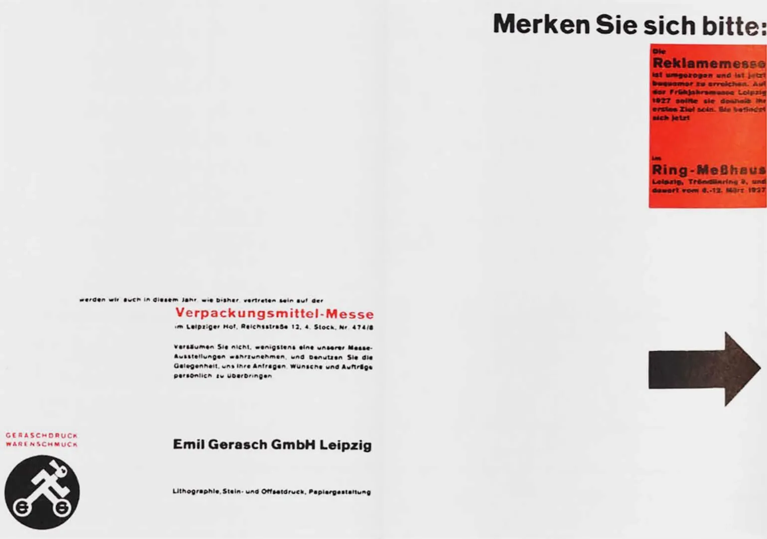
This example of a two-color invitation to collaborate demonstrates a violation of the logic of text design. Low color contrast creates a pale and inexpressive composition, which negatively affects the perception of information. Proper use of contrast and structuring of the text contribute to a clearer and more attractive presentation of the proposal, which increases its effectiveness.
When reading a letter, it is often difficult to determine which line to continue. As Tschichold notes, typography in this regard can resemble some aspects of abstract painting, but it is important to remember that typography and painting are different fields. Proper typographic work should ensure clarity and readability of the text, which is especially important in letters and other text materials.
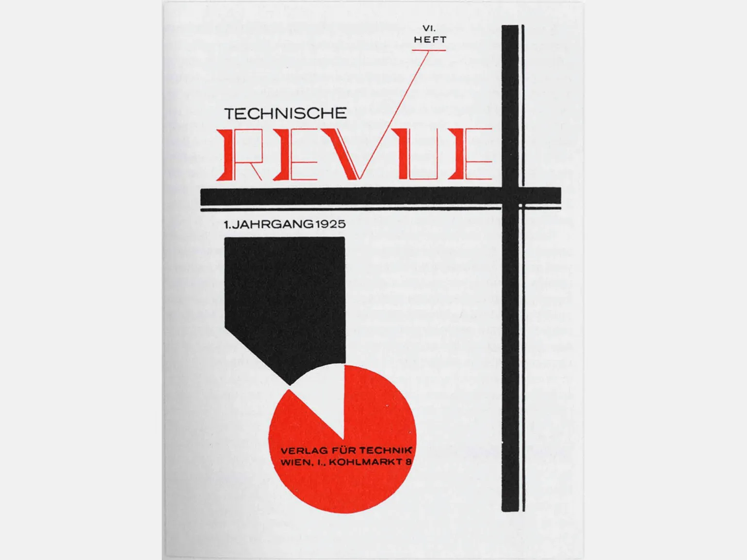
In this example of a magazine cover, it is noticeable that the form does not correspond to the content. Tschichold emphasizes that creativity should be based on functional tasks and not limited to visual appeal alone. This is important for creating a harmonious and effective design that fulfills its primary purpose - to convey information and attract the audience's attention.
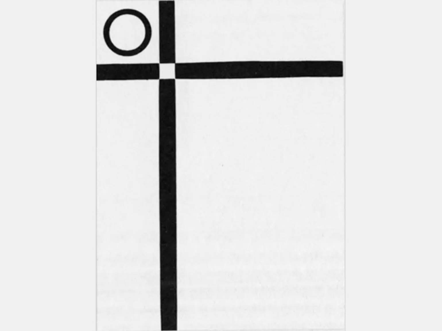
The word "revue" is written in an illegible and complex font. Abstract forms and intersecting lines are used thoughtlessly, purely for decorative purposes. The paper background does not significantly contribute to the composition. The principles of new typography are not understood here. Tschichold emphasizes that such typography does not meet modern requirements for legibility and functionality in design. Inappropriate use of decorative forms can be observed in situations where a square placed on an angle is used instead of a circle. This is an attempt to add an element of sophistication to the design, but, according to Tschichold, such a form does not comply with the principles of constructive typography. It is important to remember that typography must remain functional and clear, and the use of inappropriate geometric shapes can be distracting and disrupt the harmony of visual perception. Choosing the right forms in design is the key to creating effective and aesthetically pleasing typography.
For a deeper understanding of typography and design, we highly recommend checking out several books that will significantly enhance your skills and knowledge in this field. These resources will help you master the fundamental principles and techniques necessary for creating effective and aesthetically pleasing design solutions. Reading specialized literature will enrich your experience and inspire new ideas in the world of typography and design.
- "Information Presentation": Basic Rules of Data Visualization
- "Typography": The Influence of Shape and Color on Letters
- "Modular Systems in Graphic Design": The Basics of Swiss Layout
- "About Font": Simple Principles of Good Typography
- "The Art of Color": Optical Effects That Work in Design
- "The Art of Form": Abstraction, Rhythm, and Sensual Understanding of Things
- "Interface": The Basics of Designing User-Friendly Systems
Graphic designer PRO: 5 steps to a successful career
Want to become a graphic designer? Learn 5 key steps to creating a portfolio and launching a career!
Learn more