Contents:

Try 4 top design professions. Free ➞ In 5 days, you will get acquainted with illustration, UX/UI, web, and graphic design. Add 4 great case studies to your portfolio and decide on your next direction.
Learn moreSkillbox and Moscow-based coffee roaster "Cherny Kooperativ" organized a competition for the best packaging design. Participants had the opportunity to showcase their creativity by developing a packaging concept for a limited edition coffee. The winning entry will be put into production, and the authors of the best projects will receive a coffee subscription from "Cherny Kooperativ" and certificates for Skillbox courses. The competition was a great opportunity for designers to showcase their skills and contribute to the development of a unique product.
What went wrong? Top 4 Packaging Design Mistakes
Nadezhda Parshina, a packaging design instructor at Skillbox and founder of the Ohmybrand branding agency, shares her experience and knowledge in packaging design. Packaging plays a key role in product perception and brand development. Good packaging design not only attracts consumer attention but also conveys the product's value and uniqueness. In the packaging design course at Skillbox, we cover important aspects such as material selection, color schemes, and the impact of packaging on consumer behavior. Successful packaging can significantly enhance a product's competitiveness in the market.
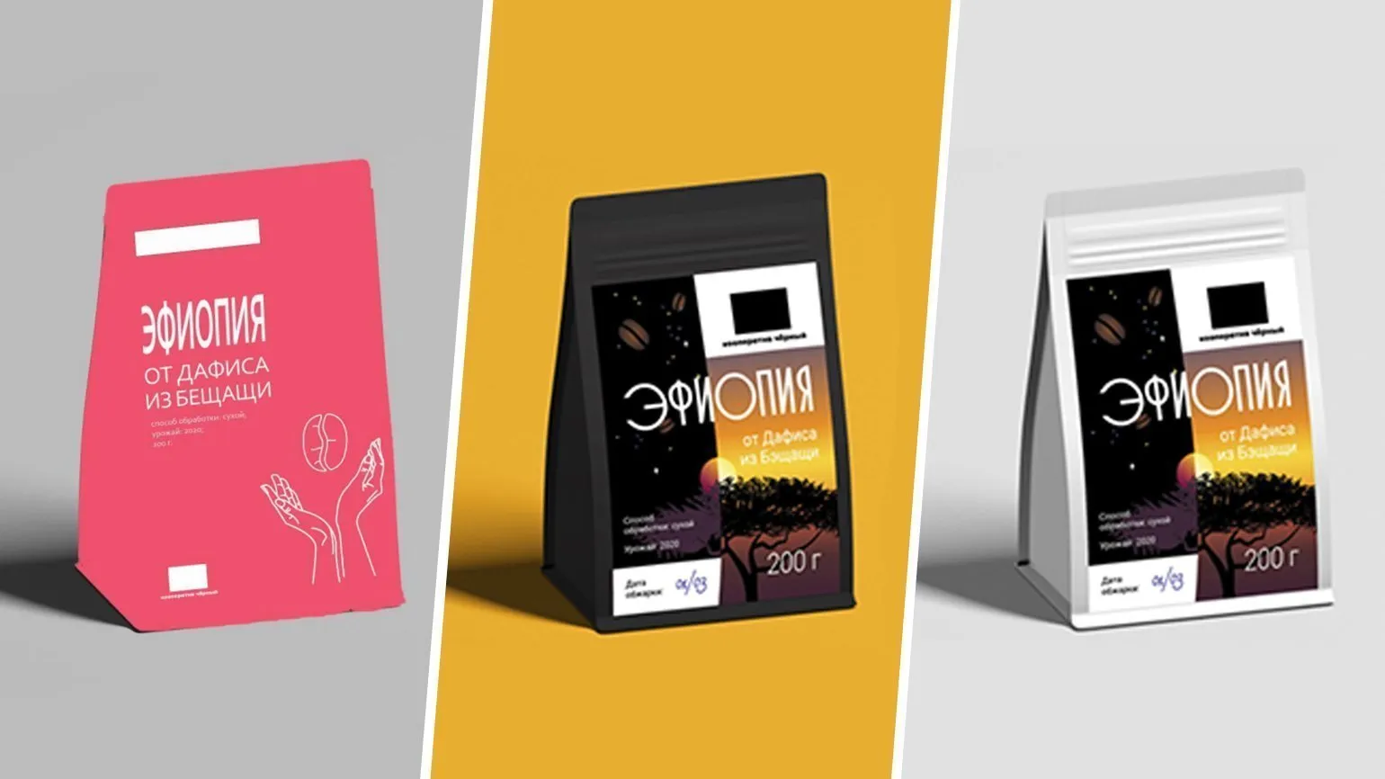
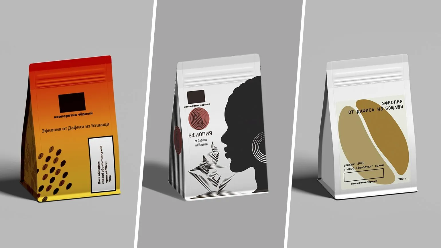
About 170 people took part in the competition, presenting a variety of approaches to the brief and demonstrating varying levels of elaboration of their concepts. However, several of the most common mistakes encountered by participants can be identified.
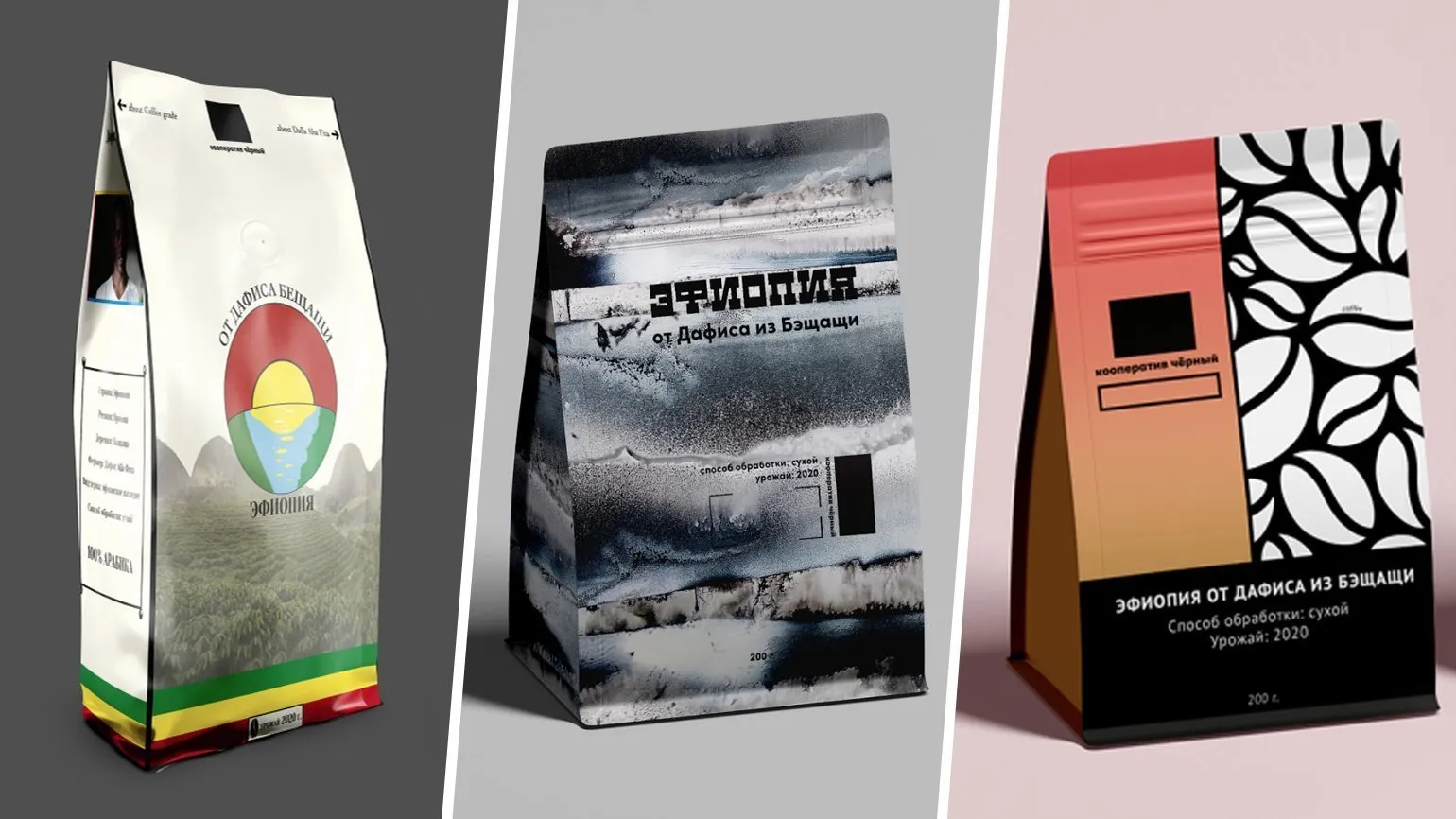
I placed all projects that featured only abstract "beauty" that had no connection to the Black Cooperative brand or specific products at the very bottom of the ranking. It's important that visual design enhances the brand's image and emphasizes the uniqueness of the product, rather than being merely an aesthetic element without any meaningful meaning.
Packaging is an important aspect of commercial activity, serving not only to protect the product but also to promote the brand. It should reflect the manufacturer's philosophy and concept, not become a platform for artistic expression. This mistake is often made by novice designers who become carried away by new graphic techniques, failing to understand that each visual feature should be used purposefully to emphasize the product's core idea and meaning. Effective packaging not only attracts consumer attention but also creates a positive brand perception, facilitating its successful promotion in the marketplace.
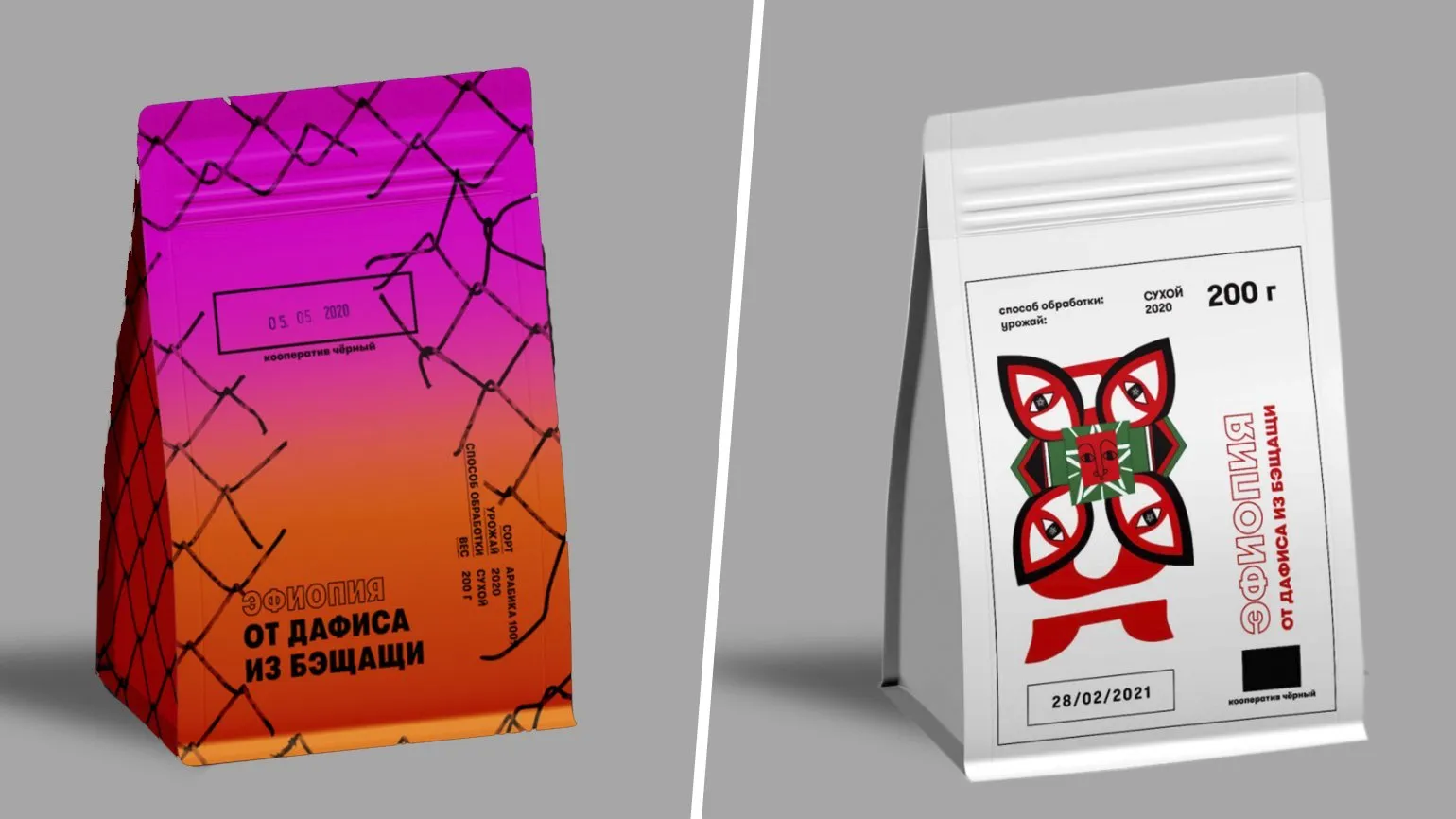
Limited editions offer a wide variety of designs and can differ significantly from the graphics of the main line. However, each version must retain elements that allow customers to easily recognize the parent brand. This is a fine line that only a few manufacturers have successfully navigated. It's important that the uniqueness of a limited edition doesn't overshadow the core characteristics and values of the original product. This way, customers will appreciate both the novelty and the continuity, strengthening trust in the brand and its products.
Many designers participating in the competition failed to consider the target audience for the packaging, failing to consider who exactly would use it and what might interest them. Understanding the product and its buyers is key, especially when it comes to "Black" coffee—high-quality coffee intended not for the mass market, but for true connoisseurs. This is a product that only an experienced connoisseur familiar with different coffee varieties can appreciate. For such buyers, there is no need to explain what coffee is or demonstrate its appearance. They are interested in the taste, origin, and history of the product, and it is for these aspects that they are willing to pay a premium price.
Product packaging plays a key role in attracting customer attention in a store. However, it must also fit harmoniously into the consumer's everyday environment. It is important to consider how the packaging will look in the average person's home. It should fit into his usual environment, not create a feeling of alienation and be easily recognizable on the shelf among other goods. The aesthetics and functionality of packaging influence the purchasing decision, so it is worth paying attention to its design and ease of use.
Poor typography, poor font selection, poor packaging composition, and the use of low-quality illustrations all negatively impact product ratings. Premium coffee requires appropriate packaging design, which must be executed to a high standard with an emphasis on detail. High-quality design not only attracts attention but also emphasizes the uniqueness and value of the product, which is important for creating a positive image in the market.
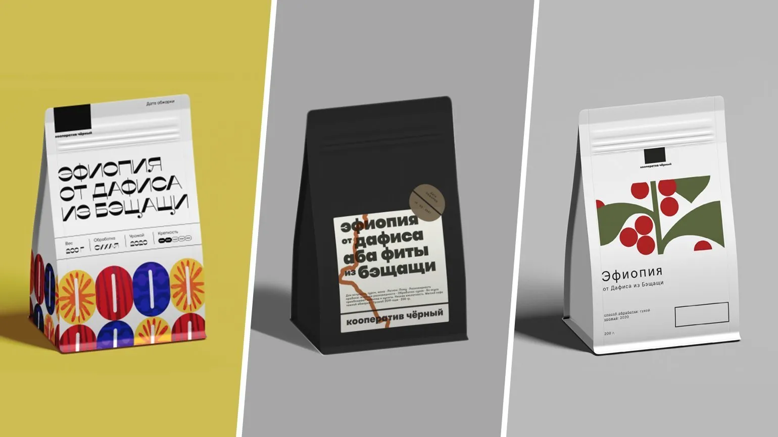
Works in which authors rely on obvious ideas and use simple first-order associations constitute a significant portion of the total volume of literature. Such approaches can be useful for attracting a wide audience, but they often do not delve into more complex and multi-layered concepts. However, primitive associations can serve as a basis for further analysis and interpretation, opening new horizons for discussion and reflection.
Don't act superficially, friends. In any project, it is important to expand the horizons of thinking by exploring history, geography, and other factors related to the product. An idea that seems obvious can only rarely be successful. In most situations, it is necessary to discard initial associations and delve deeper into analysis. This approach will allow you to create a truly unique and valuable offer.
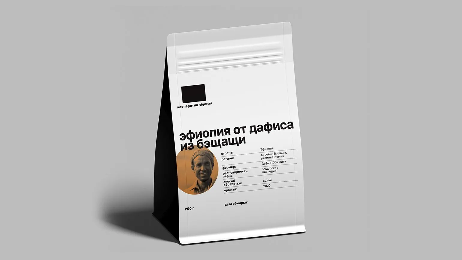
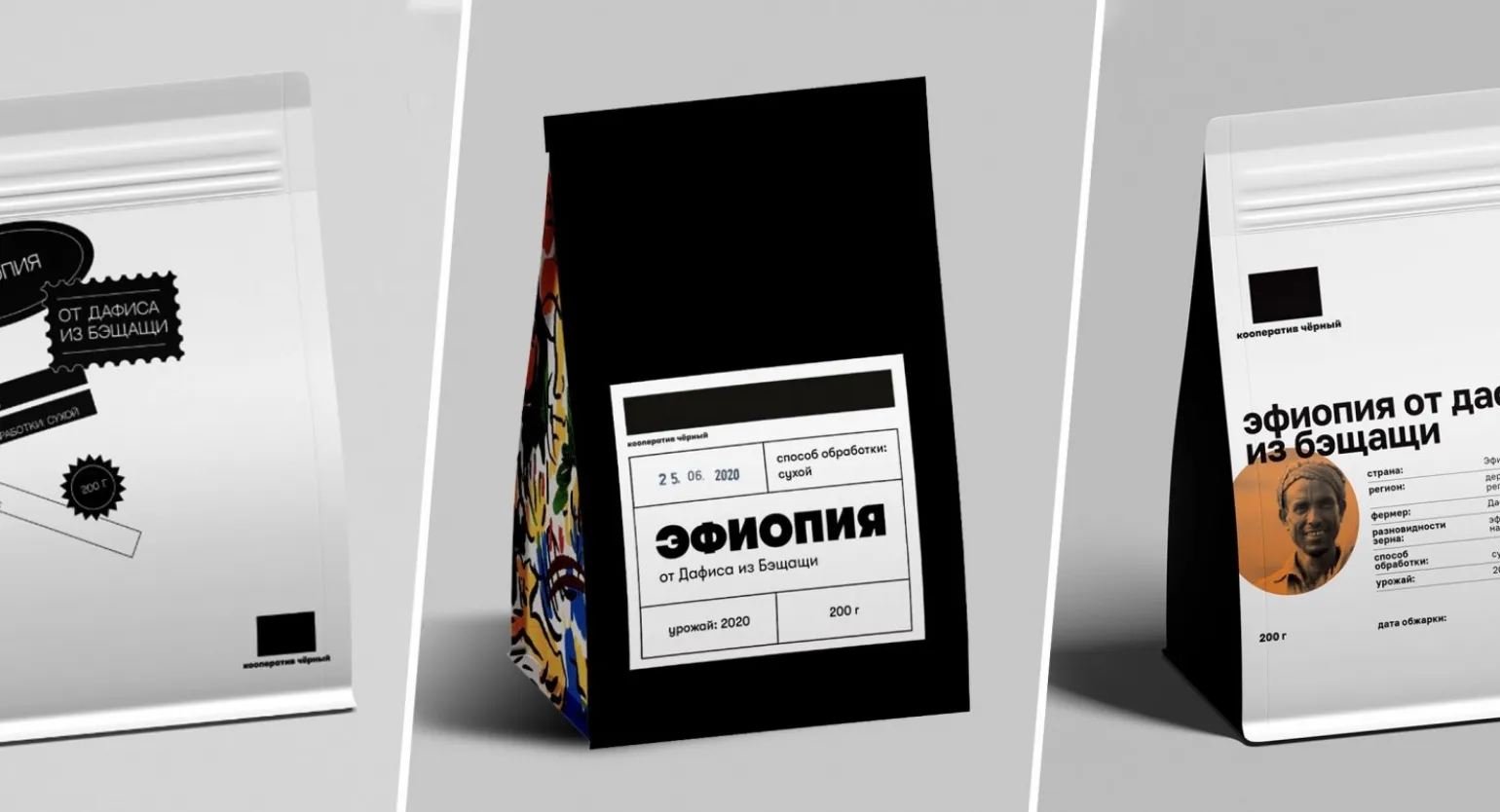
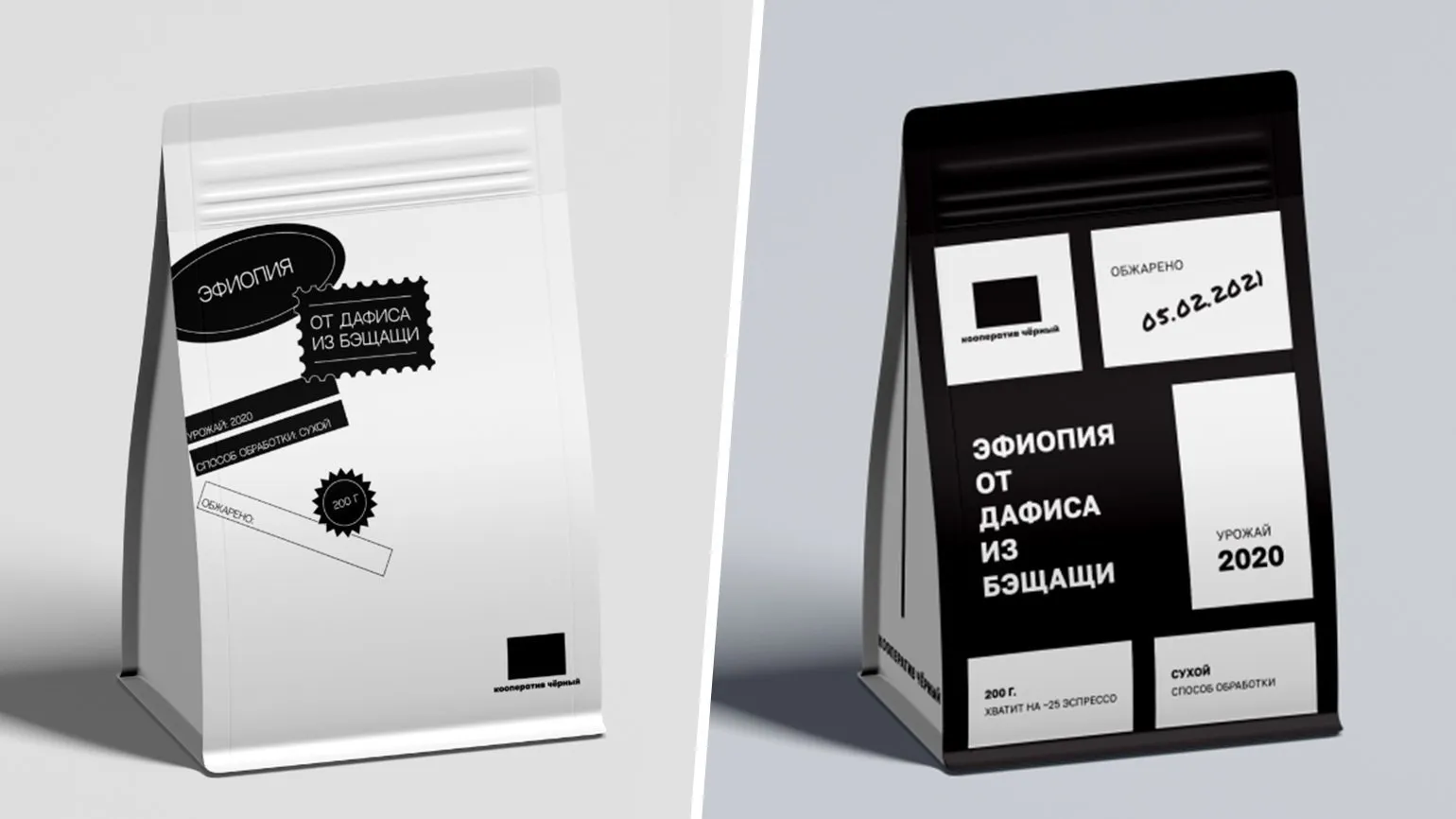
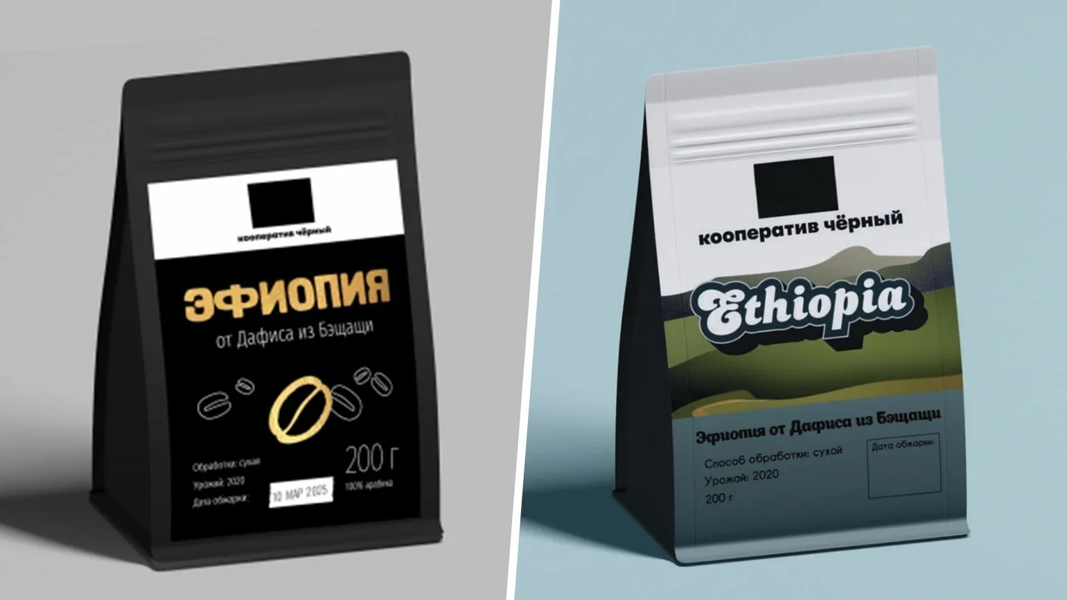
Nadezhda: This option is one of my favorites. It eliminates unnecessary elements, such as coffee beans or Ethiopian silhouettes, which are of no interest to our target audience. Instead, the emphasis is on information about the origin and processing methods of the coffee, which is executed to a high standard. The packaging looks like a professional product passport, underscoring the quality and professionalism of the Black Cooperative. Attention to detail is evident at every stage, and the logo fits harmoniously into the overall composition.
Artem: I liked this work by the same participant the most.
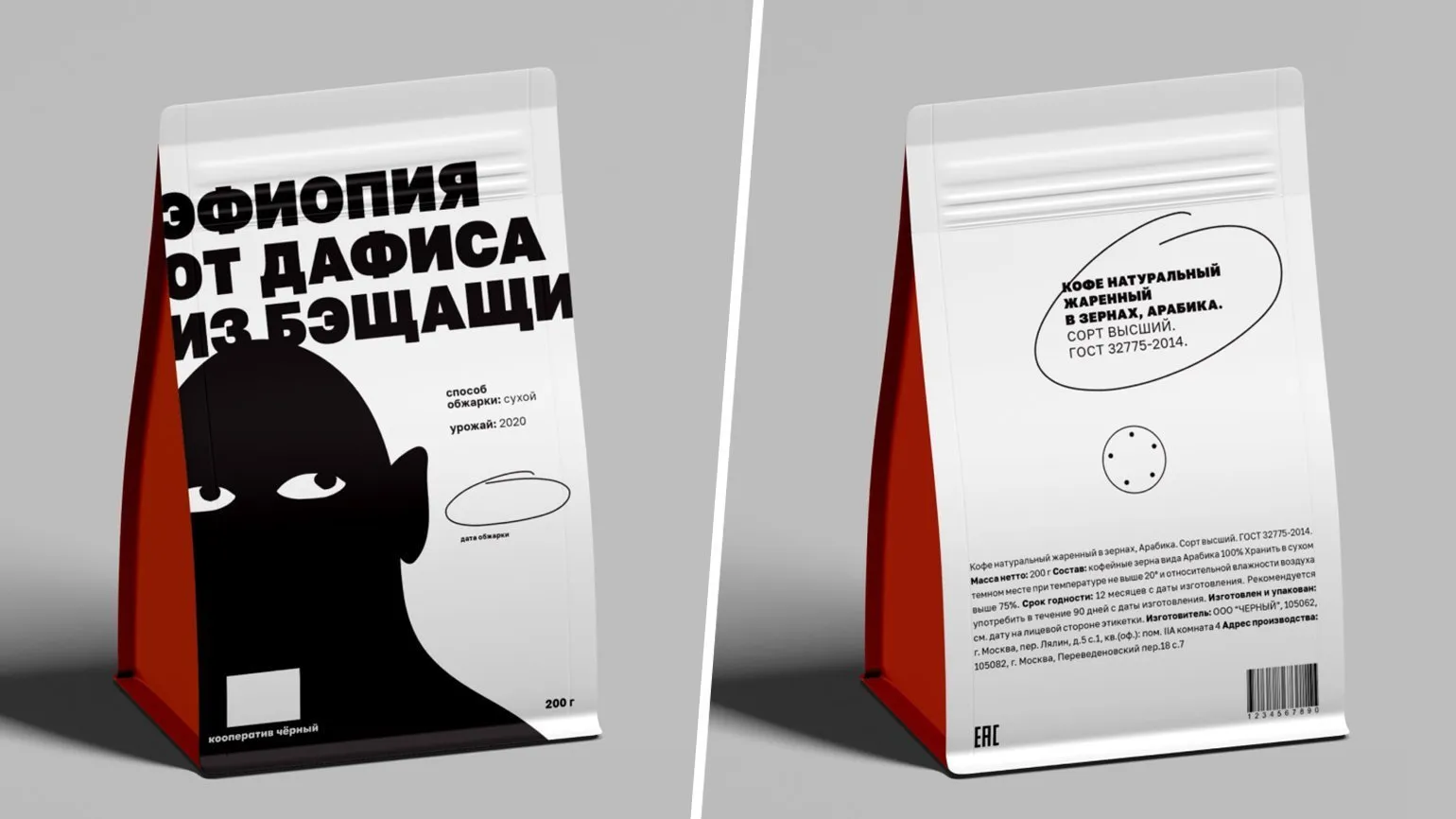
Our brand packaging evokes vivid associations and attracts attention, which perfectly matches our concept. It features a monochrome front and punk-inspired elements, further underscoring the uniqueness of our project.This work presents an interesting and multifaceted approach to presenting information. The coffee name is prominently displayed, allowing the focus to be on the product rather than the country of origin, as is often the case in other materials. The remaining information is also organized intelligently and logically. Particularly noteworthy is the roasting date, which appears to have been circled in pen, emphasizing the individual approach to production. This is a successful solution that adds value to the product and creates an atmosphere of handmade work.
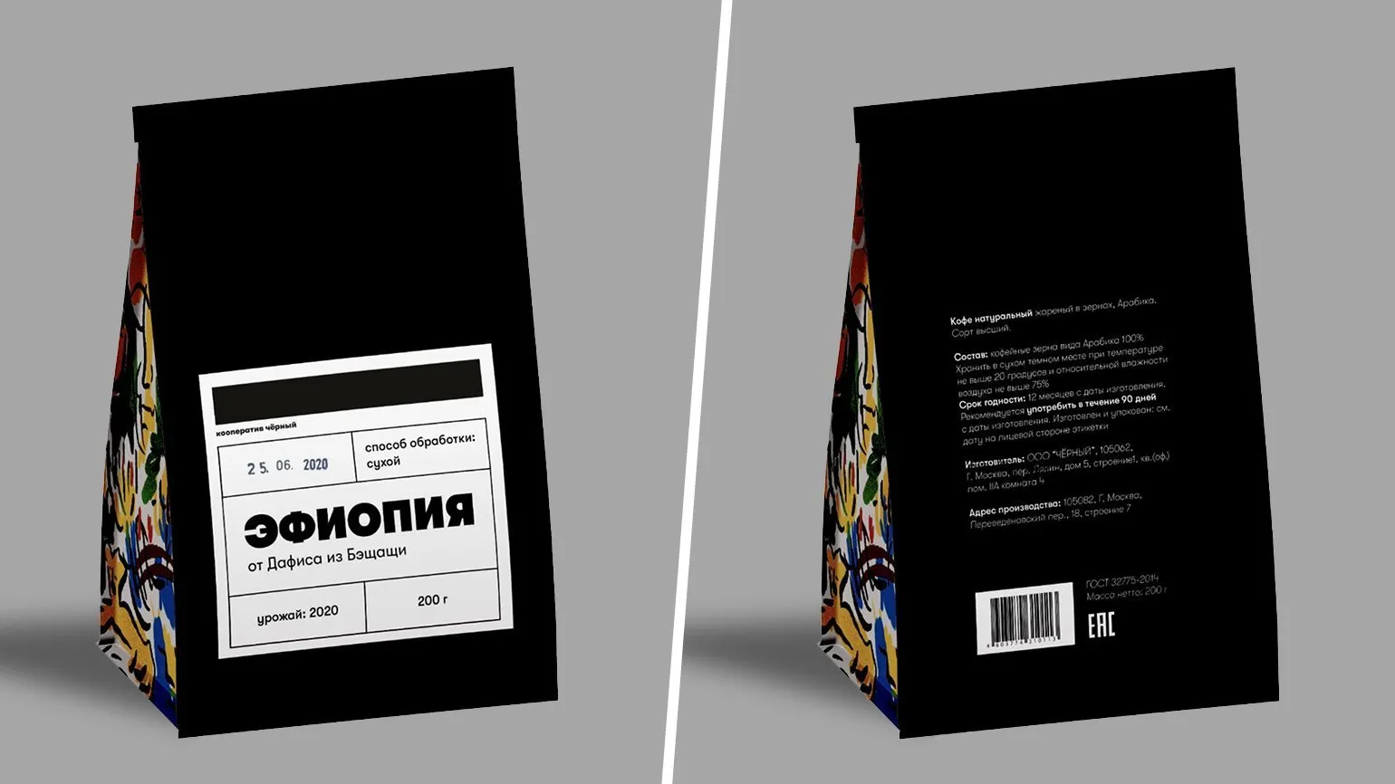
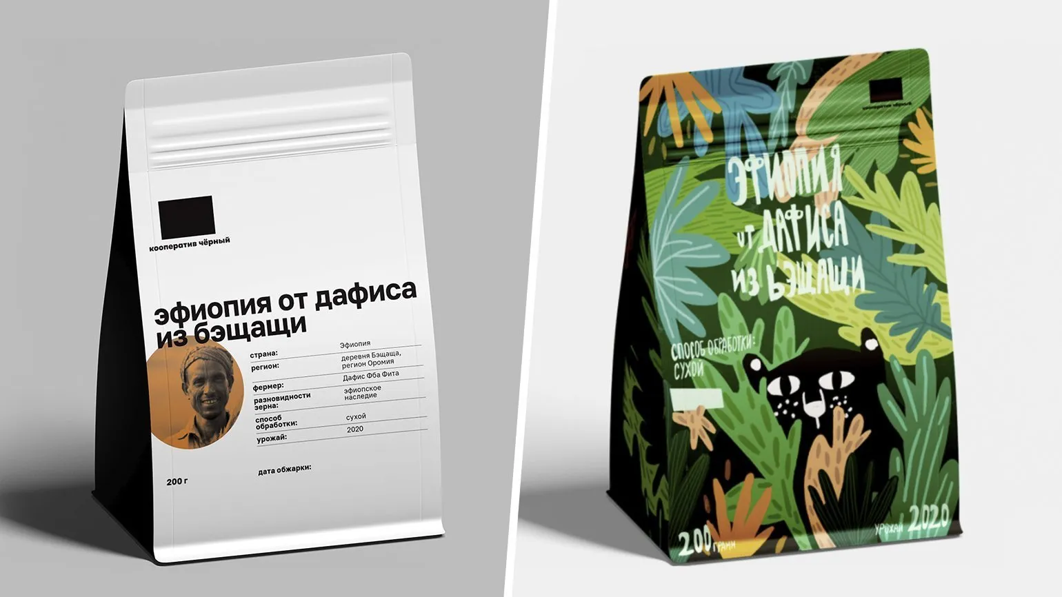
Nadezhda could not remain indifferent to Anna's research, in which an interesting detail was discovered. If a person has a lot of coffee bags in their cupboard, which is often the case with true coffee lovers, then when they open the cupboard they see the bags at the end. Thus, it is by the end of the packages that owners will be able to easily identify their favorite coffee.
Highlighting the end of the packaging with a bright illustration in the style of African drawings is an excellent solution that attracts attention. This design creates a contrast with the rest of the packaging, which is designed in calm tones. This balanced combination emphasizes the uniqueness of the product and matches the cooperative's style. The calm design of the main surface of the packaging helps focus attention on the bright edges, making the product more memorable and appealing to consumers.
Artem: Anna carefully designed the packaging, emphasizing the side, which really catches the consumer's eye. However, it should be noted that on the shelf, the product is most often presented with the front side, not the side. It is also important to emphasize that the brand is not emphasized, and instead the country name is highlighted in large font. This can reduce brand recall and reduce its recognition among competitors.
Five years ago, we used a similar front design on one of our packages, where the text was presented in a similar format. At the time, minimalism and industrial style were perceived as modern and original. However, this approach has now become widespread, as there are many cocoa, chocolate, and coffee packaging with similar designs on the market. As a result, the participant's score was reduced for originality.
Profession Graphic Designer PRO
You will learn how to create corporate identity elements and graphics for business. You will put together a portfolio that reflects your style and confirms your design skills. You can start a career in a studio or as a freelancer.
Find out more