Contents:

Yana Masyukovich
Lead Designer of Skillbox CIS
Graphic designer, manages the team of Skillbox designers and is engaged in visual support of the brand on the Internet and offline points. Develops guides to create a unified style across all Skillbox channels.
Graphic designer, manages the team of Skillbox designers and is engaged in visual support of the brand on the Internet and offline points. Develops guides for creating a unified style across all Skillbox channels.
Where Design Is Heading
Every era brings new heroes, tastes, and trends. This also applies to the evolution of design. Trends can quickly change in the opposite direction in an instant.
For example, the 2010s saw the flat look of Windows 8 and mobile operating systems. A departure from the colorful MTV clips, banner and teaser ads, and the "amateur" websites of the 2000s. Well-designed interfaces emerged, where soft gradients, symmetry, and realism became the standard. Perfectionist design at its finest.
The 2020s turned everything upside down. First, TikTok burst into our lives. It set the trend for short, unedited videos and bright, amateur effects, straight out of the nineties.
In 2023, six decades after its first appearance, the movie "Barbie" caused a stir. It painted everything pink for several months. This happened in parallel with the active development of AR, VR, and metaverses.
Society was tired of sleek interfaces and prim style on the internet, advertising, and interiors. The 2020s became the era of the avant-garde in web development and digital art. They brought a bit of chaos and bright experiments to the industry.

Design websites and apps after the Web Designer course
Learn more10 Design Industry Trends to Watch in 2024
In 2024, the internet brought together fashion, typography, architecture, digital, and fine art. Thus, one trend can simultaneously capture different spheres.
No. 1. Minimalism with accents
Laconic interfaces and minimalist interiors are still relevant. But in 2024, the fashion for bright colors has returned. Brands are simultaneously releasing new collections with bright looks. Even the line of business men's suits from Hugo Boss has many models in pink, deep blue and yellow.
The trend is also supported by technology companies. For example, the strict apple.com website is now diluted with bright contrasting interface elements and neon gradients.
You can't do without expressive accents and references to the pop culture of the second half of the 20th century. Here's how this manifests itself in different areas:
- Interior.In a minimalist or Scandinavian interior, vintage modernist chairs or armchairs, textiles in mint, lemon, and soft pink shades can become a bright accent. Andy Warhol-style acid paintings, which take us back to the funky 1960s and 1970s, also don't go unnoticed.
💡 Andy Warhol is an American artist, producer, designer, and writer. He became a prominent figure in the history of the pop art movement and contemporary art.
- Web design, typography and mobile development.The trend is manifested by the use of simple forms, sans-serif fonts and imitation of the visual style typical of magazines of the 70s and 80s.
- Advertising.Laconic banners with a minimum number of elements and bright accents help draw the viewer's attention to the main message or product.
Exemplary examples of minimalism in advertising and packaging are shown by brands Beats by Dre, Gap, Reebok. Here are a few more examples of minimalist websites that make good use of bold accents:
No. 2. Neo-Brutalism
Neo-Brutalism is a design movement that transferred the ideas of architectural brutalism to web development and typography. The name comes from the word "brut", which is translated from French as "raw".

The style appeared as a contrast to the "perfect" interfaces in which designers work on every pixel. They strive for smooth transitions, symmetry, and a harmonious combination of colors. Neo-brutalism pursues other goals:
- A combination of contrasting colors. For example, deep black, red, blue;
- Using sharp gradients;
- Asymmetry in the placement of buttons and labels on them;
- Bold, noticeable frames and contrasting isometric shadows;
- Raw photographs;
- Chaotic, overlapping interface elements and images;
- Using basic HTML styles with a simple background;
- Simple and easy-to-read sans-serif fonts;
- Pixel graphics and fonts.
Neo-brutalism continues to develop. It can look like MS-DOS computer interfaces and 8-bit games from the eighties, or like magazines and advertising prints from the nineties.
Neo-brutalism is a different perspective on design. It rejects the vision established in 2010. The movement is a sharp contrast to the monotony of perfectionist websites and apps. It is eye-catching and original. Therefore, it is suitable for creative industries and niches where it is necessary to emphasize difference, innovative approach, and boldness.
💡 Neo-brutalism should be used with caution. It is easy to cross the line between aesthetics and unattractive design.
After all, the style violates the rules of design psychology. Contrasting colors, dark backgrounds and light text, pixelated fonts—all of these create a high cognitive load and interfere with concentration. This is impractical if the page contains a lot of information to be studied.
Examples of sites that use neo-brutalism in design:
✅ Gumroad
✅ katesnap
No. 3. Retro and Vintage
Collecting antiques has always been fashionable. But a widespread interest in vintage emerged with the development of popular culture in the 20th century. Films, music, book and magazine designs, even architecture—references to the past are everywhere.

In 2024, retro design in interiors, printing, and the internet will experience another rebirth. Vintage evokes nostalgia for the past.
This year, don't expect a particular trend in retro design to dominate. At the same time, the following are relevant:
- Advertising aesthetics of the 60s and 70s in a pastel palette with laconic fonts and vintage symbols;
- Bright neon elements of the 80s with an unexpected combination of colors;
- Reimagined Art Deco in interiors, popular in the 1920s and 1930s;
- Ergonomic furniture, decor, chandeliers in the shape of flying saucers, and other elements from the 60s.
Vintage styles help designers create vibrant images that are memorable and stand out in TikTok and Instagram feeds. Large publishing houses and luxury clothing brands, including Cartier and Dior, also embrace vintage aesthetics. Rockstar Games also won the love of gamers thanks to their nostalgia for the past.
✅ An example of a retro-style website is hackaday.io.
№4. Eco-design
Eco-friendly style and natural motifs have been popular since the mid-2000s. Eco-design touches on various areas:
- Packaging. Packaging can be inspired by natural forms, made of environmentally friendly materials. For example, from bamboo or recycled paper;
- Advertising and marketing.Companies create advertising that calls for caring for nature, using recycled materials;
- Architecture. Natural materials are popular in the interior: plywood, wood, natural stone, textiles.
The combination of natural colors and gradients or images of wildlife inspire trust in the audience. The brain perceives such patterns as safe. Cognitive load is reduced and it is easier to present new information to the audience. This approach attracts people who adhere to the philosophy of conscious consumption and care about the environment.
Eco-trends are used by major brands. Apple, Samsung, and Xiaomi sell smartphones in compact packaging made from recycled cardboard.
H&M advertises accessories or clothing surrounded by flowers or wildlife.
No. 5. Dynamic Typography
Not all business areas require bright accents, symbols, and illustrations. But if there is only text on the page, it is difficult to hold the visitor's attention. In this case, instead of static headlines in advertising and web development, you can use dynamic graphics. It allows you to focus the eye on the text message. Makes the site interesting and memorable.

Examples from film and television: running lines and sliding credits. But there are many animation options:
- Phrases or individual words appear and disappear, as if in fog;
- Rotating, moving, popping out from the side, zooming in from afar;
- Changing transparency and color, blurring;
- The phrase explodes, turns to dust, disintegrates into pixels;
- The word is assembled from a chaotic cloud of letters;
- The text turns into a shape or a new phrase.
These are just popular examples of dynamic typography. HTML5 and JavaScript allow you to implement almost any animation in web applications. In video advertising, there are no limits, thanks to the capabilities of After Effect, Cinema 4D, and Maya.
💡 After Effect is a program for working with animation and video. It is used by graphic designers, video makers, and video game developers.
💡 Cinema 4D is a tool for 3D modeling, rendering, and animation. The program is used in design, the film industry, and advertising.
💡 Maya is an application for creating 3D graphics and visual effects in video games, apps, animations, and films.
№ 6. Gradients and Glitches
Contrasting gradients and bright colors were not long ago considered an example of bad "schoolboy" design. A glitch is simply an error or interference that we see on a TV screen during a thunderstorm or in old computer games. But "schoolboys" have grown up. And the point is not that the generation of designers who grew up on the pop culture of the 80s and 90s was able to defend their vision. They managed to develop the direction, making it aesthetically pleasing and harmonious.
Complex gradients with a bold combination of colors add depth and volume. They are used not only for block backgrounds, but also as independent elements. Bright colors add dynamism, make the design expressive, evoke nostalgia for the past.
Glitch art has developed into an entire art form in web design, graphics, and painting. The direction is suitable for various tasks:
- Enhances the emotional response;
- Make the viewer look at the object from a different angle;
- Combines different directions in art.
Gradients and glitches convey the innovativeness of a company or product, and the desire for hi-tech, through design. They add dynamism and expressiveness to minimalist posts. Similar techniques are used not only by tech companies, but also by clothing brands. For example, Adidas and Moncler, Baldinini.
Usage examples:
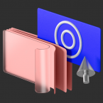
№ 7. 3D and Augmented Reality
3D graphics have become available to small and medium businesses. New models of virtual and augmented reality headsets are released one after another. Everything it takes to make 3D design mainstream.
As designer and photographer Michael Kus put it: "3D design is huge, and we'll see a lot more 3D this year. There are so many possibilities even in free tools."
Large brands have long since moved beyond using 3D graphics in advertising. Zalando, Prada, and Warby Parker are testing virtual AR fitting rooms where you can remotely try on a dress, watch, or necklace.
Small companies are also mastering 3D graphics:
- 3D showcases where you can examine an accessory, electronics, or household appliances from different angles;
- Surreal characters and 3D illustrations on TikTok and Instagram allow you to stand out and attract the attention of your audience;
- 3D infographics. Graphs, diagrams, and symbols become more visual in volumetric form;
- Three-dimensional fonts on a website or app make the interface “three-dimensional” and memorable.
3D graphics in web development, advertising, and marketing continue to gain momentum. They improve user experience, make publications more vibrant, and inspire trust.
№ 8. Neural Networks
Neural networks are actively developing and open up many opportunities for designers. As John Randall, an employee of Magpie Studio, said: "In 2024, graphic designers will rely on AI assistance. Creative workers need to embrace neural networks and integrate the tool into their workflows." Many creative agencies have done so. Among them are Huge, Magpie Studio, Ghost Note Agency, Maison Meta.

Randall also noted that neural networks can serve not only as inspiration: "The ability to generate anything from just one hint opens up an incredible world of exploration and creativity."
Artificial intelligence allows you to expand the boundaries of your imagination by offering new ideas. Neural networks help create original projects and stand out from the crowd of similar designs. The tool simplifies your work. For example, it can remove the background, improve lighting, and eliminate defects in one click. While it still requires human intervention, many routine processes are a thing of the past.
№9. Art Collage
Along with minimalism, maximalism and art collage are increasingly common in 2024.
💡 Art Collageis interfaces and images assembled from many elements. These elements look like they were cut out of newspapers, magazines, or paintings.
Bright images with an abundance of elements have become a contrast to minimalist Instagram posts and perfect websites. And they also evoke nostalgia for the past.
Art collages are suitable for the creative sphere, typography and entertainment. Such "cocktails" of images "cut out" from different places and eras create a relaxed atmosphere. By using familiar characters, references to events or memes, you can evoke certain emotions and attract attention. Large brands, such as Cartier and Under Armour, also use the style.
No. 10. Palette of 2024
Color engages the subconscious from the first second. Even before the visitor sees the text or image. With the help of a color scheme, you can prepare a person to perceive content in the right tone, evoke certain emotions, make references to the past or the future.
And if you want to stay modern, hold the audience's attention, show brand flexibility, you need to know popular palettes.
✅ Peach Fuzz — peach fluff
In first place is the main color of the year, chosen by the PANTONE Color Institute. According to Leatrice Eiseman, the head of the company, this color is best suited to this period in history. A delicate pastel shade symbolizes healing, mutual support and humanity.
The color is used by fashion houses, smartphone manufacturers, and accessory manufacturers. It looks good in interiors: wallpaper, curtains, and furniture in a soft pastel shade create a cozy, calming atmosphere.
Peach fluff also works well as a background for social media and videos. It evokes trust and positive associations with a product or brand.
You don't have to make the entire site peach. You can add text, buttons, widgets, or post a few images on Instagram. People see peach fluff everywhere, and it evokes positive emotions on a subconscious level.
✅ Millennial pink
The color of bright bubble gum takes us back to the Y2K era - to the childhood and adolescence of the audience, who are now 30-45 years old. The color's popularity peaked in the second half of 2023, triggered by the release of Barbie. But it is still used by many designers.
Color allows you to add lightness and optimism to the interface, contrast with the boring corporate world and become closer to the audience. Suitable for use in application and website interfaces, and as a background for images on social networks.
✅ Nude in Nizza
The color of the year according to paint manufacturer Tikkurila, created in collaboration with interior designer Marie Olsson Nyland. Reminiscent of Peach Fuzz, but this is a slightly different shade, adapted for interiors. Associated with kindness and playfulness. : It inspires trust and positive associations with the brand.
✅ Digital noir
Melancholic shades: from pale gray to charcoal are also on trend. They look strict, but interesting in their own way. They allow you to present the brand as strong, robust and technological.
✅ Citrus shades
Barbie fever has caused nostalgia for everything bright. And in 2024, not only shades of pink are popular, but citrus fruits too. The palette is extensive: from balanced orange and cheerful yellow to acidic light green.
Bright colors help emphasize the delight of the product. They even appear in such areas as finance and industry.
✅ Royal shades
Saturated purple, royal blue, red - and all this in combination with gold. In 2024, design experiments continue. Shades are used by fashion houses, such as Versace, app creators and even confectionery factories.
Royal shades are associated with quality and exclusivity. But by using them, companies must be ready to confirm their status.
Useful materials from the editors of Skillbox.by
Design trends are fickle. New technologies, images, and techniques appear. Designers find new combinations and color palettes. But while accepting the new, people do not abandon memories of the past. It is important to feel your audience, take into account their interests and needs. Then it will be easier to catch new trends and set trends.
To help you learn more about design, trends, and the influence of different styles and color palettes on audience perception, the editors of Skillbox.by have compiled a list of useful blogs and articles.
- 10 web design trends in 2024;
- Creative Bloq;
- 15 Top Design Trends To Watch Out For;
- The design trends you need to know about for 2024;
- Design Trends 2024 - TOP 20 Graphic and Web Design Trends;
- 9 Color Trends for 2024;
- Best Color Combinations and Schemes for Websites 2024;
- Glitch art - what is this style: the art of digital interference;
- Graphic design trends for 2024;
- 10 Graphic Design Trends That Will Dominate 2024;
- Top 13 Graphic Design Trends for Cutting Edge Design in 2024 | Looka;
- 24 of the Biggest Graphic Design Trends for 2024;
- Dentsu Creative 2024 Trends Report;
- 7 Design Trends For 2024;
- Neo-brutalism is taking over the Internet;
- Neo-brutalism in web design — Rupixel Blog;
- Neo-brutalism is taking over the Internet — UXPUB.
Choose your profession in the catalog of design courses
Courses are taught by experienced practicing teachers. During your studies, you will complete independent projects that will form the basis of your portfolio. Curators will help you overcome any difficulties. After completing the course, you will become a professional and be able to find a job.
Get access