Contents:
Try 4 top design professions. Free ➞ In 5 days, you'll get acquainted with illustration, UX/UI, web, and graphic design. Add 4 compelling case studies to your portfolio and decide which direction to take next.
Learn moreTypography is an important area of design where trends are clearly evident, although they don't change as quickly as in interior design or fashion. Fonts and typography play a key role in modern branding, reflecting cultural ideas and helping projects and messages stand out from the crowd. New solutions are constantly emerging in this field, some of which become iconic, while others revive and adapt traditional approaches. Effective use of typography can significantly enhance brand perception and uniqueness in the marketplace.
We've analyzed the typographic landscape and identified nine key trends for 2023. These trends won't appear on every website, book cover, and poster at once, but you'll see them with increasing frequency in the near future. Their influence is expected to gradually increase, changing visual aesthetics and design approaches across many industries. Be prepared to adapt to new styles and integrate them into your projects to achieve a modern and attractive look.
Reading is an integral part of development and education. It not only enriches our inner world but also helps expand our horizons. By immersing ourselves in books, articles, and other materials, we gain new knowledge and ideas. Reading also improves communication and critical thinking skills, which are especially important in today's world. Don't miss the opportunity to explore different genres and topics to enrich your knowledge and improve your quality of life. Read more and discover new horizons.
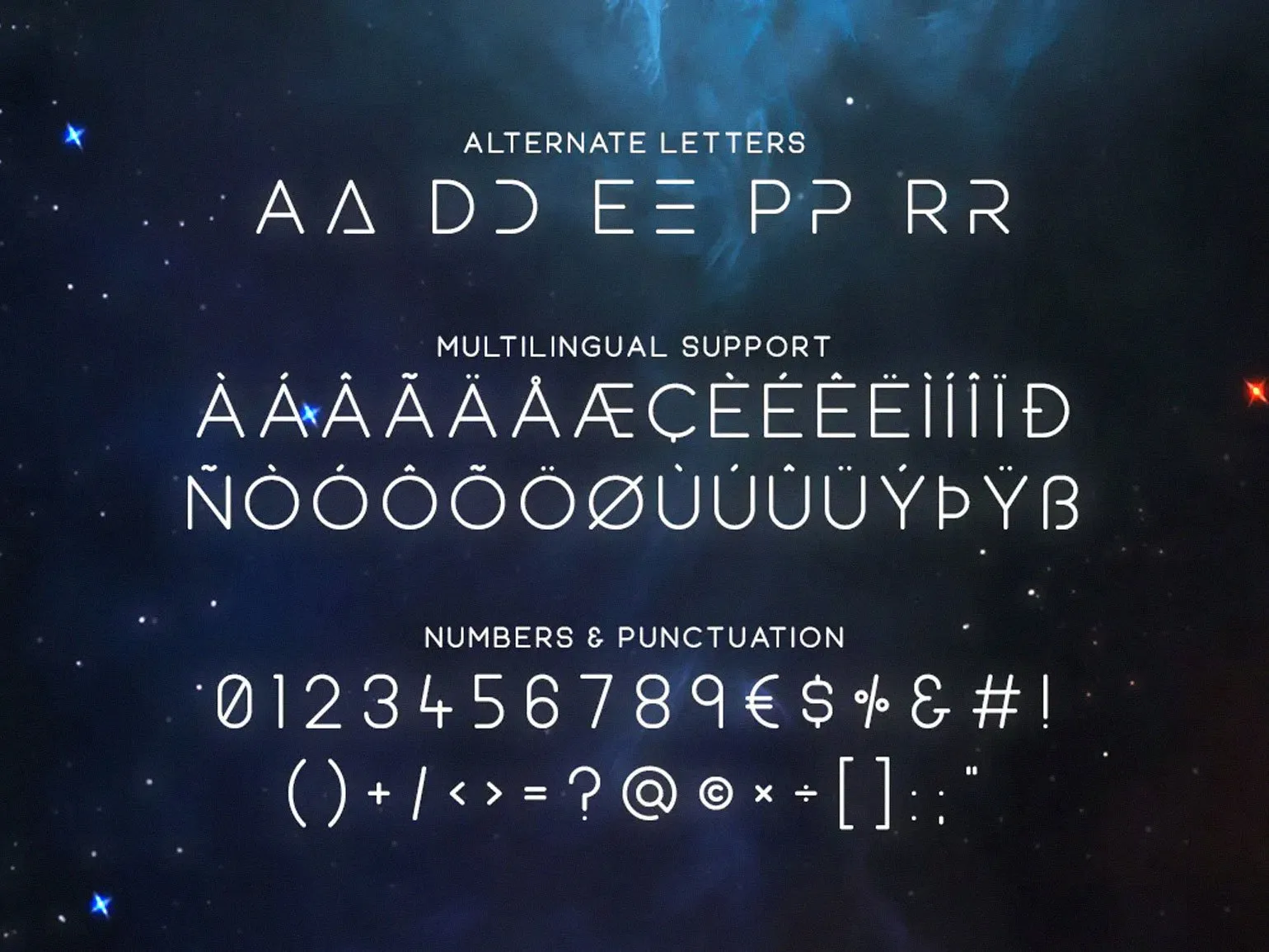
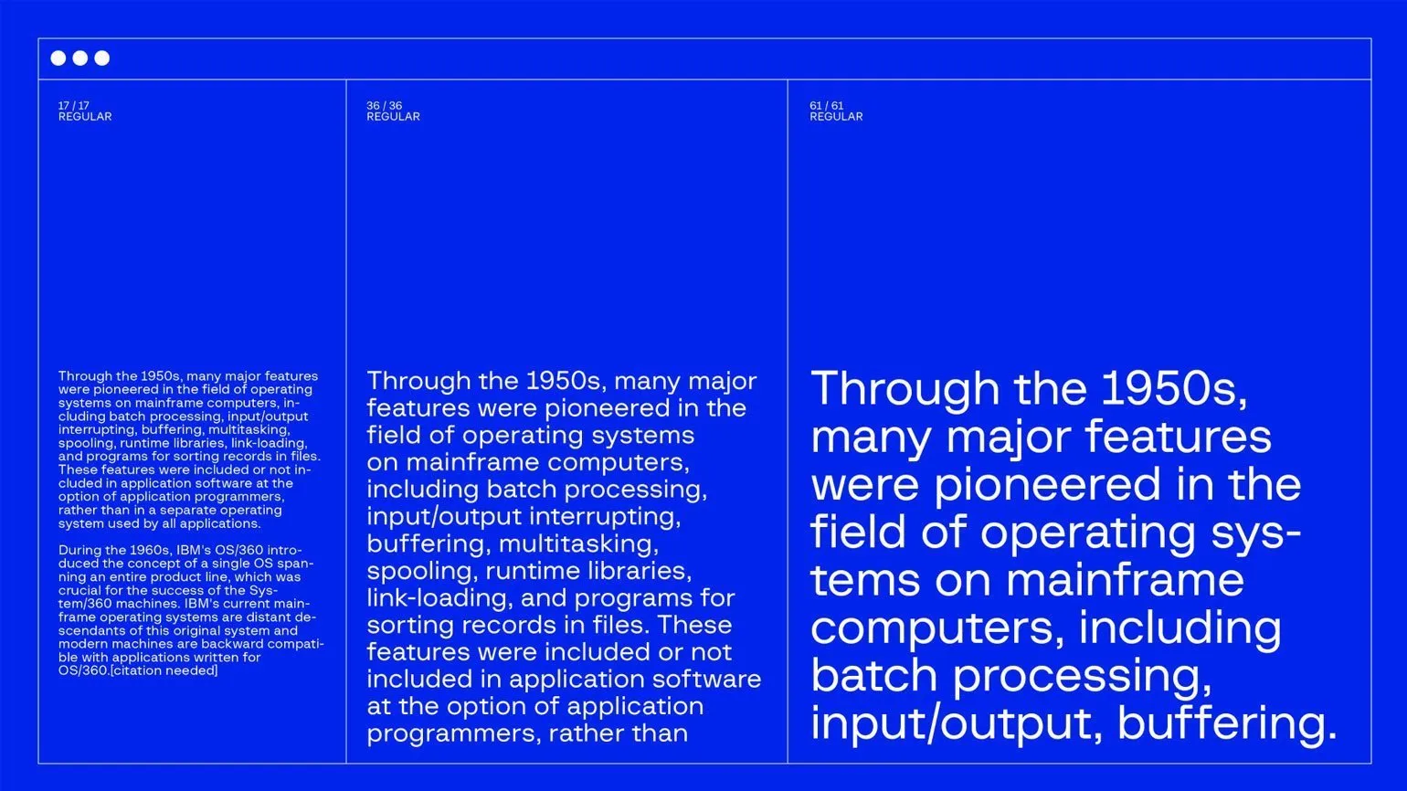
Typography is the art and science of text arrangement and plays a key role in design. It includes the choice of fonts, their sizes, style, line and letter spacing, and the overall layout of the text on the page. Good typography not only improves the visual perception of information but also contributes to the ease of reading, which in turn affects the user experience.
The importance of typography in design cannot be overstated. It helps create visual hierarchy, highlights important elements, and conveys the mood and style of a brand. Properly chosen fonts can significantly enhance the message you want to convey to your audience. Typography also impacts SEO, as search engines consider the readability and structure of text when ranking pages.
It's important to remember that typography should be consistent with the overall design concept and target audience. By paying attention to details such as contrast, alignment, and spacing, you can create harmonious and attractive visual content. Ultimately, high-quality typography helps increase user engagement and improve conversions.
3D Fonts
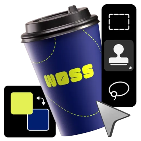
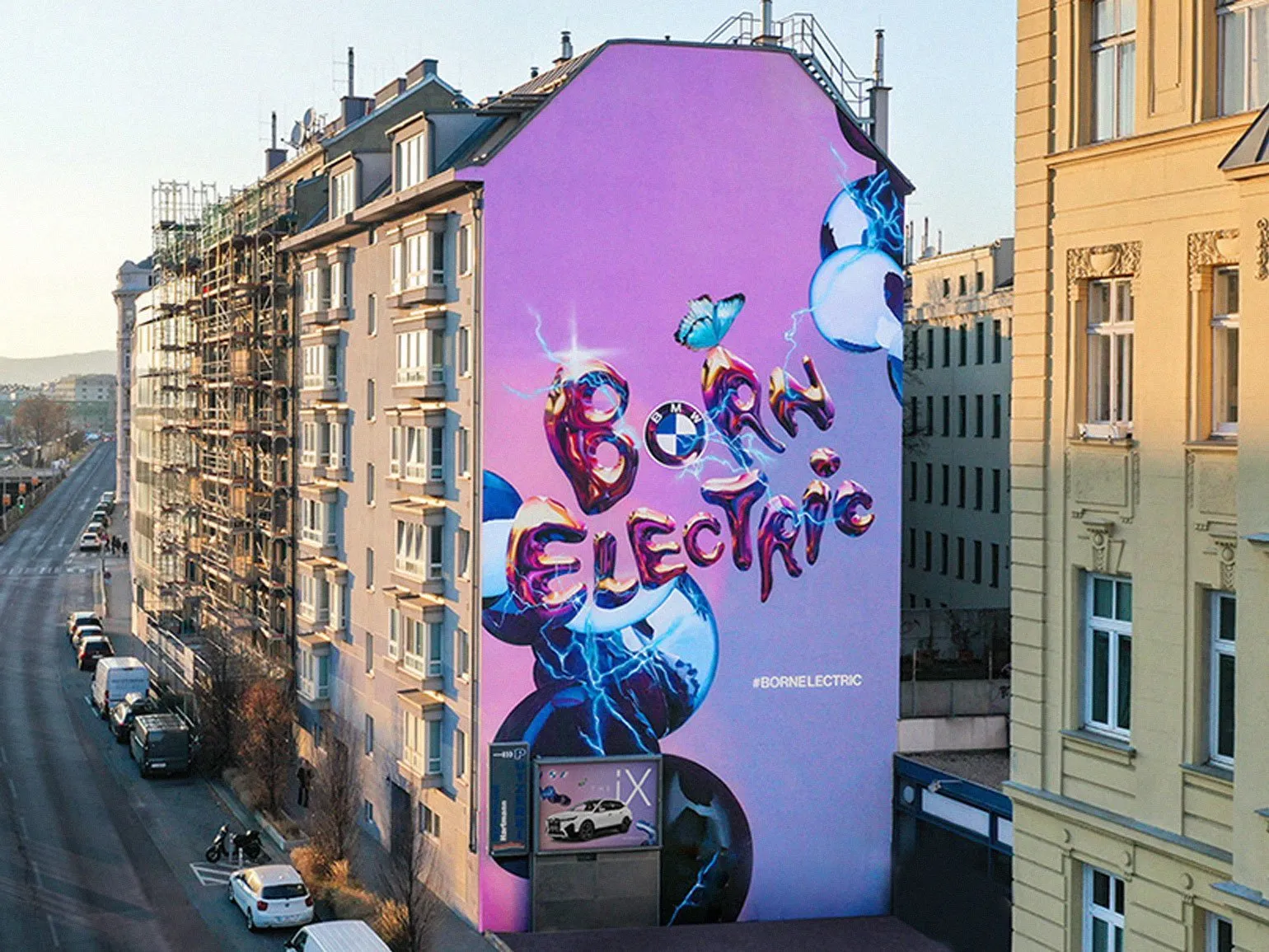
The text is presented in the form of expressive 3D illustrations, where the letters acquire volume and dynamics. They have light reflections, which gives them a realistic effect. The shapes of the words vary from soft contours, reminiscent of predawn clouds, to flowing lines similar to thick streaks of jam on a table. This approach creates a unique visual experience and draws attention to the text content.
The essence lies in combining classic fonts and dimensional lettering, as well as 2D graphics and 3D effects, in a single typographic solution. Fonts with a three-dimensional and dynamic effect are able to convey the metaphor and mood of the text more quickly and accurately. At the same time, "regular" fonts used in combination with dimensional ones not only clearly convey information but also emphasize the expressiveness of 3D letters. This allows you to create visually appealing and informative designs that effectively attract attention and enhance the perception of the text.
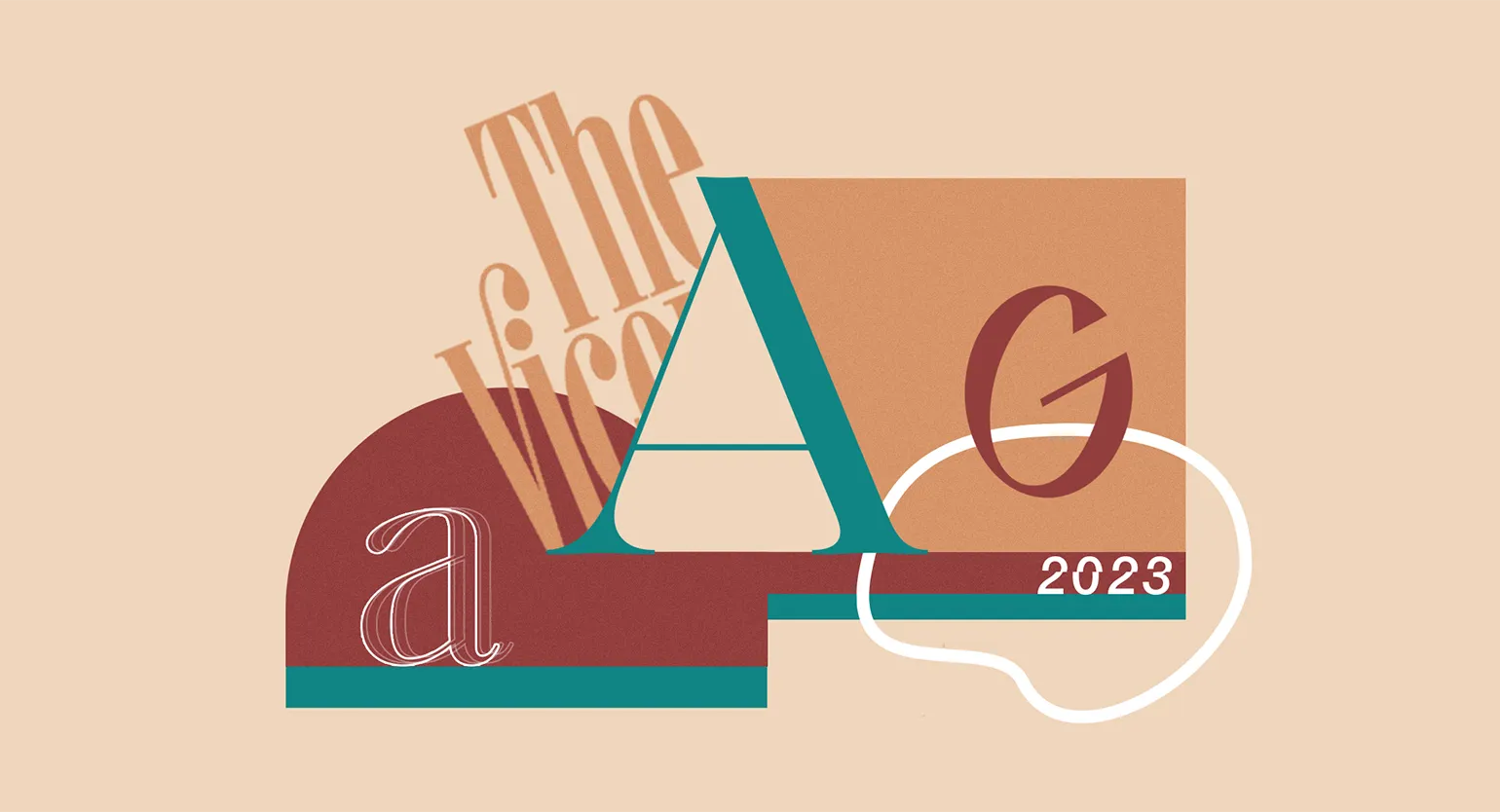
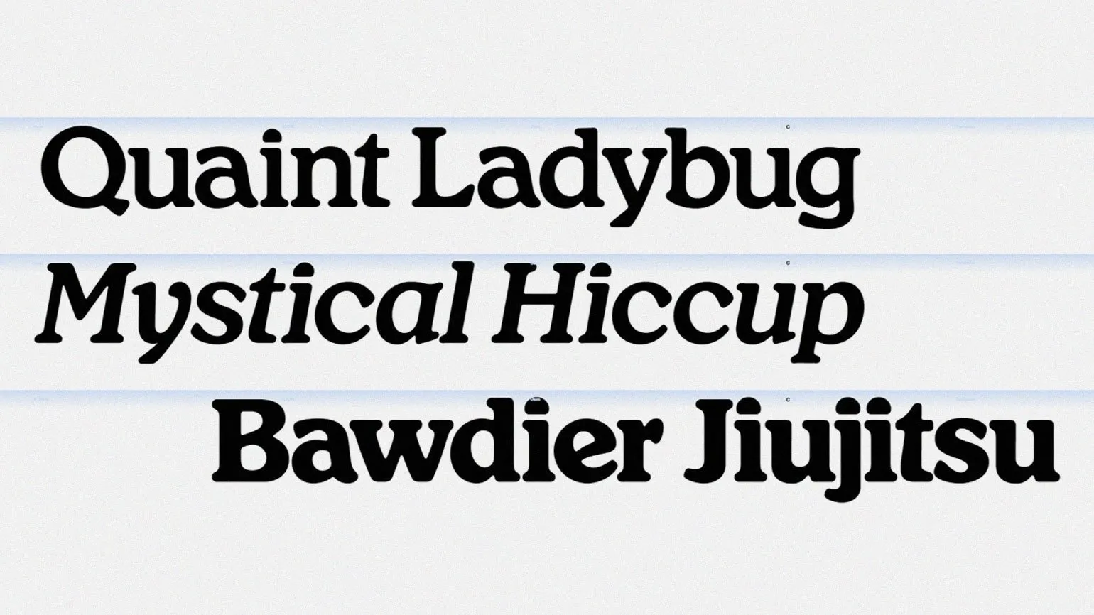
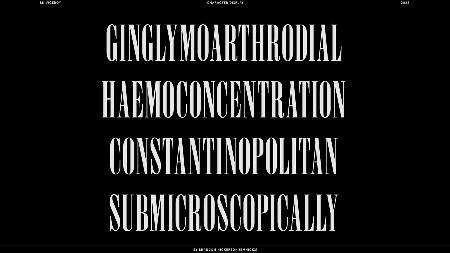
Elegant Antiquas
Trendy antiquas are classic serif fonts that do not have a pronounced historical style. These fonts combine elements of Venetian calligraphy of the Renaissance and Swiss geometry of the 20th century. The eclectic design of serifs allows for typography that is relevant for both printed materials and web interfaces. Thus, trendy serifs are becoming a universal tool for designers striving for harmony between classic and modern visual solutions. Serifs are becoming increasingly graceful and distinctive, like the favorites of kings. Serifs on letters become more pronounced, and contrasts reach such a degree that fine lines virtually disappear. As a result, typography creates a sense of lightness and spaciousness, making text more readable and engaging. This trend in type design emphasizes the importance of visual hierarchy and harmony, which is especially relevant for modern graphic design and layout.
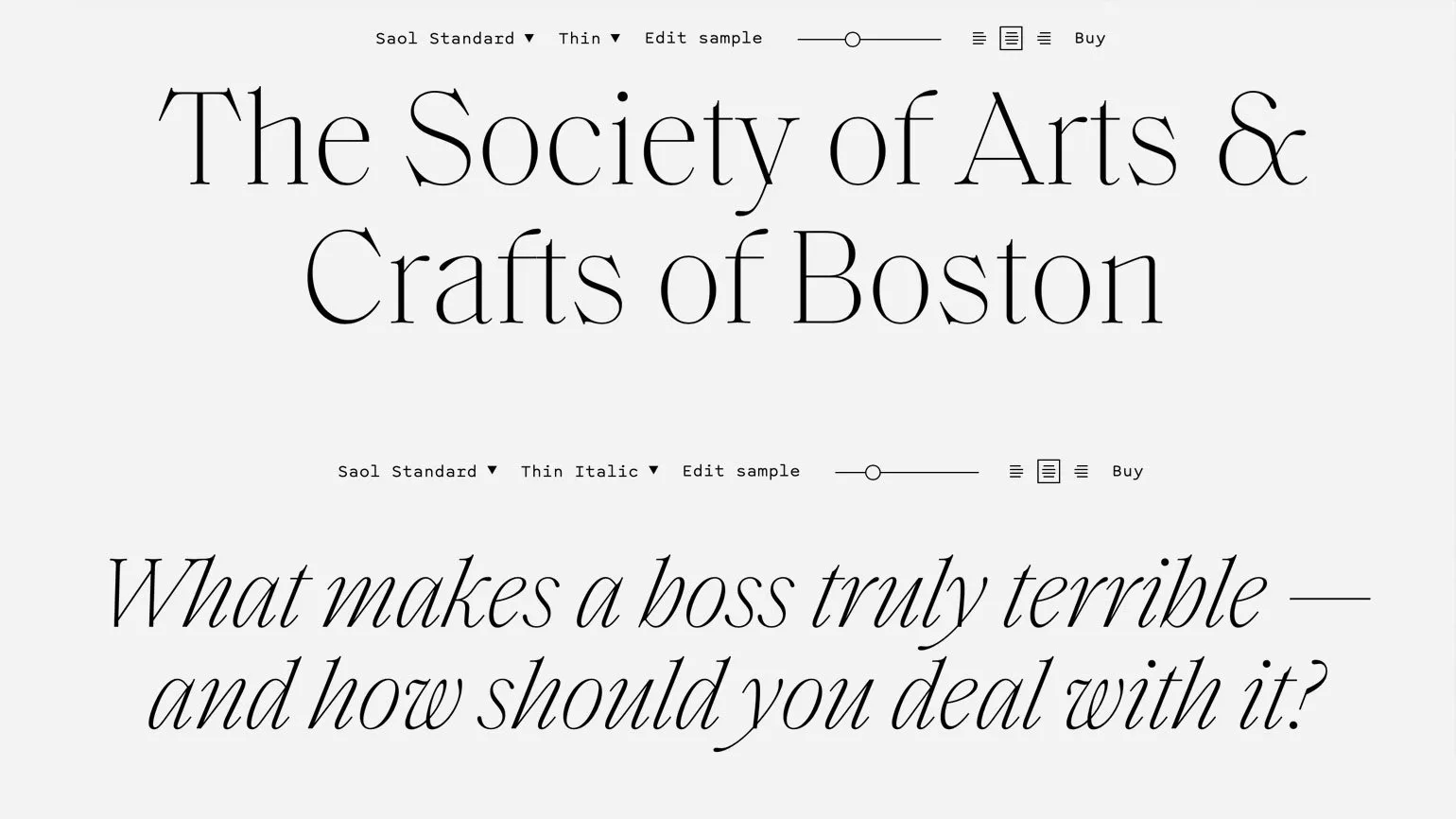
Original historical fonts aren't always suitable for web design or apps. In a digital format, they can appear dated, which negatively impacts typographic harmony. To effectively use such fonts in interfaces, they are interpreted with modern trends in mind. The irregular elements of the fonts highlight geometric shapes, giving them a contemporary feel rather than detracting from the overall design. This allows you to create a more harmonious and attractive visual solution for users.

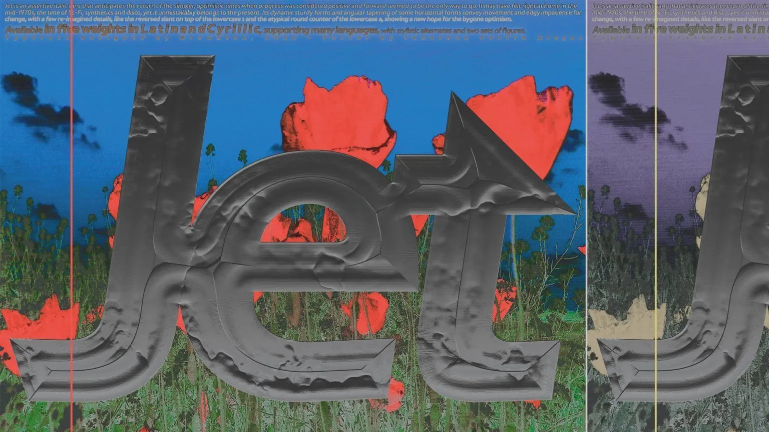
Flared letters and entasis
Antique design reaches a new level. The serifs of these fonts resemble strongly flared sleeves, while the entasises, or pronounced curves of the strokes, combined with the contrast of the lines, give these fonts the appearance of ornate pen-and-ink lettering. This style creates a unique atmosphere, emphasizing the elegance and artistic expressiveness of the text.
The extravagance of serif fonts takes on a utilitarian meaning in the context of minimalist typography. Bright text colors against muted backgrounds create an attractive visual contrast. The serifs and flowing strokes give these fonts a fairytale-like and friendly character, making them ideal for contemporary design solutions. Using such fonts in minimalist design allows you to achieve harmony between expressiveness and simplicity, attracting attention and creating a cozy atmosphere.


Read also:
Typography in modern posters: effects and techniques
Typography plays a key role in the design of modern posters, giving them uniqueness and expressiveness. Effective use of fonts, their sizes, and styles helps convey the desired message and attract the attention of the target audience. Contemporary designers are actively experimenting with various techniques, such as combining fonts, using contrasting colors, and creating a visual hierarchy to highlight key elements.
Choosing a font is important; it should match the overall style of the poster and its theme. For example, more artistic fonts are used for cultural events, while clearer and more legible options are suitable for advertising products. It's also worth considering that font size affects the perception of information: large headlines attract attention, while smaller text can be used for additional details.
Effects such as shadows, gradients, and overlays can add depth and dynamism to typography, making it more appealing. However, it's important to maintain balance to avoid overloading the visuals. Techniques such as alignment and leading also play a significant role in creating a harmonious and readable design.
Modern posters often use typography as a primary element, emphasizing its importance in visual communication. Effective typography not only conveys information but also creates an emotional connection with the audience, making it an indispensable tool in modern design.
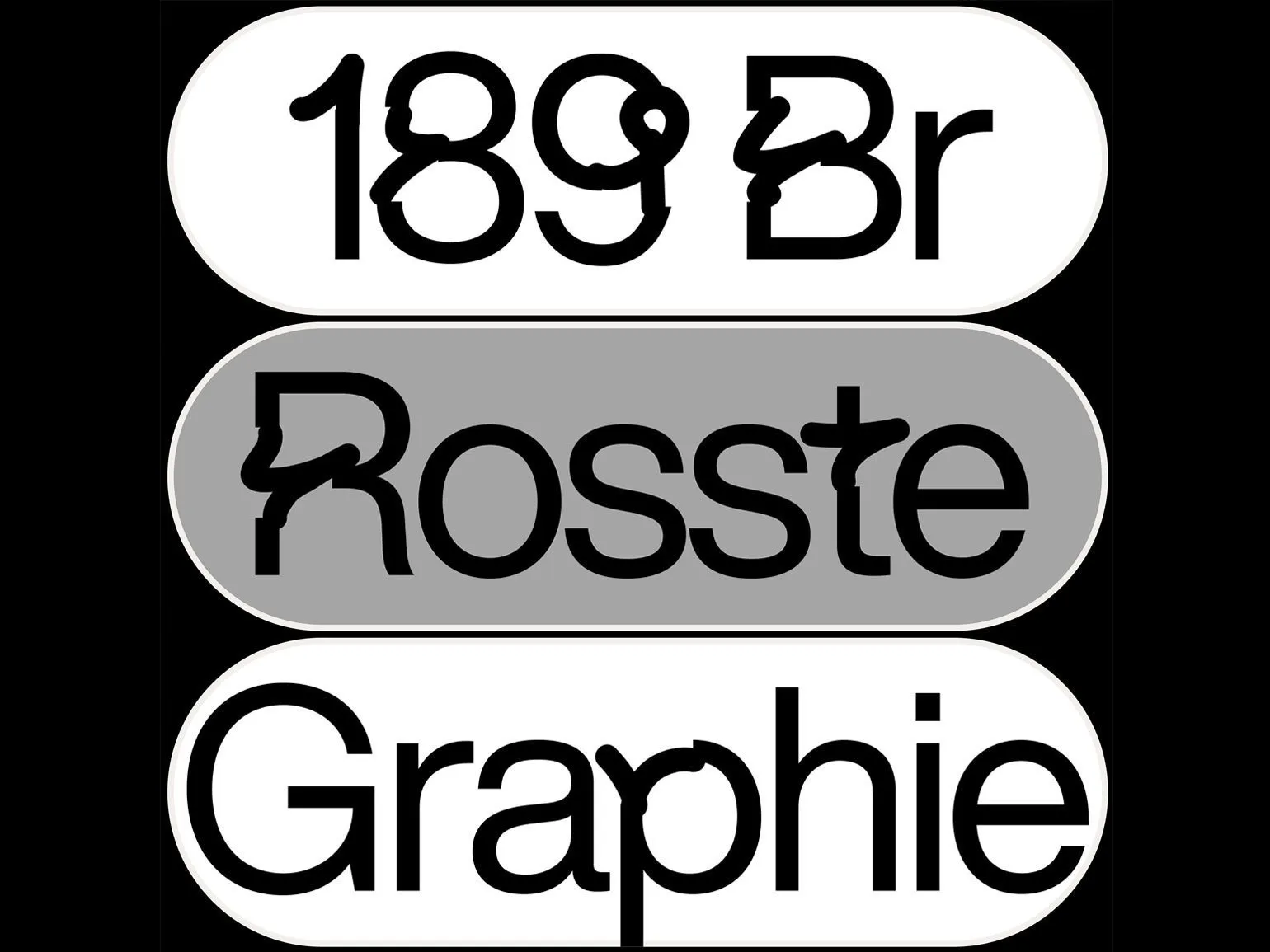
Distortions
Expressive distortions of strokes, stretches, intricate knots, vanished lines, abruptly broken text, and shifted blocks are key elements of the bold typography that is trending today. This design is often based on humanist and geometric sans-serifs, which ensure good legibility. This typographic style attracts attention and creates a unique visual atmosphere that is memorable. Using unconventional solutions in font design and text layout helps to distinguish a brand and make it more memorable.
The bottom line is that distorting well-known fonts and breaking the modular grid remain relevant, but are no longer such new approaches in design. Contemporary trends involve the use of melting, dissolving, and erasing effects on strokes, letters, and words. This creates the impression that the viewer is watching a flickering screen with a damaged display. Visual disruptions represent a new interpretation of the metaverse trend: distorted typography reflects an imperfect reality, highlighting its flaws rather than simply pleasing the eye with beautiful computer-generated images. This approach opens new horizons for designers, allowing them to experiment with perception and create unique visual solutions that interact with the user on a deep level.

Read also:
A bad font is one that makes the text difficult to read and perceive. It can be hard to distinguish, too small, or, conversely, too large. Poorly designed fonts often have poor proportions, unusual letterforms, or insufficient contrast with the background. Furthermore, using too many different fonts in a single project can also negatively impact the perception of information. To ensure comfortable reading, it's important to choose fonts that are easy to read, harmoniously coordinate, and consistent with the overall theme of the content. A high-quality font should be easy to read and facilitate better comprehension of the text.
Light sci-fi
A new approach to the science fiction genre is characterized by grotesque elements, in the design of which one can see the influence of "Dune", as well as modern Tesla cars and Lucid. High technology is becoming a key solution to a wide range of global problems. Fonts may be narrow, but the typography is replete with cosmic space and light, creating a sense of limitlessness and futurism. This style reflects a desire for innovation and the search for new solutions in visual art, emphasizing the harmony between form and function. The essence is that the growing popularity of technology and science fiction is supported by crypto and NFT businesses, which actively utilize visual solutions with sleek, monospaced fonts. However, the modern design trend is shifting from purely futuristic lettering to the development and implementation of alternative glyphs. These glyphs allow for the creation of typography that can be both cosmic and more earthly. Using unique glyphs opens new horizons in design and allows you to attract the attention of the audience, which is especially important in the fields of technology and art.
Learn also:
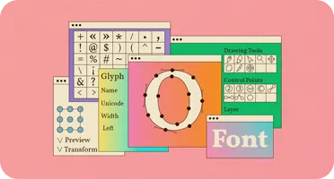
How to Create a Font: 8 Best Programs for Typographers
Font creation is a fun and creative process that requires both an artistic and technical approach. This article presents eight programs that will help you design your own font. These tools offer a wide range of possibilities, from simple design to complex editing features.
FontForge is a free and open-source program that provides powerful tools for creating and editing fonts. It supports various formats and allows you to work with vector graphics.
Glyphs is a popular tool among professional font designers on Mac. It offers an intuitive interface and a variety of features for creating high-quality fonts.
RoboFont is another Mac app that focuses on flexibility and customization. It is suitable for both beginners and experienced users, allowing you to create fonts using Python.
BirdFont is a free font editor that allows you to create vector fonts. It offers a user-friendly interface and support for various formats, including TTF and OTF.
FontLab is a professional font editor that offers all the necessary tools for creating fonts of any complexity. Suitable for those who want to dive deeper into typography.
Dafont is an online platform where you can not only create your font but also upload and share it with others. A user-friendly interface makes the font creation process simple and accessible.
TypeTool is a simpler and more accessible option from the developers of FontLab. It is the perfect tool for beginners looking to get started with font creation.
Calligraphr is an online program that allows you to turn handwritten text into a font. It is a great way to create unique fonts that reflect your personality.
Choosing the right font creation program depends on your needs and skill level. Use the proposed tools to begin your journey in the world of typography and design a unique font that will reflect your style and ideas.
Nostalgia
Designs that express nostalgia for past eras use visual codes inherent in those times. This can include fonts and design solutions reminiscent of iconic products or the graphics of famous music albums. Nostalgic typography doesn't focus on historical styles, science, or humanism, but rather reworks powerful marketing designs from years past. For example, this might be related to Diesel clothing ads or old Pepsi branding. This approach creates a unique atmosphere, evoking associations with vibrant moments of the past, which is especially relevant in contemporary design. The essence of the new nostalgia is that it isn't tied to a specific decade, but freely combines key images from various eras, including the 1980s, 1990s, and Y2K. As a result, both slab serif typefaces and lettering, which interpret elements of famous corporate designs from different periods, are becoming popular in design. In 2023, the nostalgic typography trend is not limited to simply reproducing retro aesthetics. Designers use typefaces and compositions to create new images that allude to an idealized past that may never have existed. This approach allows you to create unique visual solutions by combining style elements that evoke emotions and memories in viewers.


Reading is an important aspect of personal and professional development. It opens new horizons, broadens horizons, and helps improve critical thinking skills. In today's world, where information is available in large quantities, choosing quality sources and books is especially important.
Immersing yourself in literature not only helps you gain knowledge but also develop your imagination. It fosters a unique perspective on the world and helps you find innovative solutions to various situations. Reading also strengthens your memory and attention, which in turn improves overall productivity.
Furthermore, regularly reading books and articles on topics of interest helps you stay up-to-date on current trends and innovations in your field. This is essential for professionals striving for growth and development. A variety of genres and styles allows you to find inspiration and new ideas, making reading not only useful but also engaging.
In conclusion, reading is a powerful tool that contributes to personal and professional development. Don't miss the opportunity to enrich your life with new knowledge and emotions.
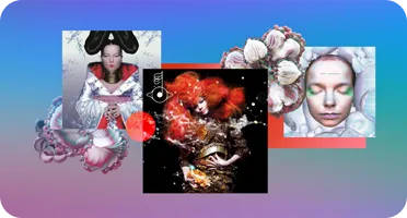
Björk is a unique artist whose music and visual style have won numerous fans around the world. One of the most striking aspects of her work is her album covers, which reflect her individuality and creative approach. In this text, we will look at five of Björk's most beautiful album covers, which have become true works of art.
The first cover worth noting is "Debut". It features Björk herself in a bright and unusual outfit, which emphasizes her originality and unique style. The second cover is "Post", which uses a collage of bright images, symbolizing the variety of musical styles of the album. The third cover is "Homogenic", in which Björk looks majestic and mysterious, which perfectly matches the sound of the album.
The fourth cover is "Vespertine", done in delicate colors and reflecting the intimacy and depth of the musical content. Finally, the cover of "Biophilia" Björk combines elements of science and nature, highlighting her conceptual approach to music and art. These works not only attract attention, but also become a reflection of her unique world, in which music and visual art are harmoniously intertwined.
Compression
Contemporary condensed typefaces use fonts with narrow letters and minimal spaces between characters. This approach often does not use specially designed condensed typefaces, but instead, regular fonts are modified using graphic editors, which allows for the creation of visually appealing text compositions. This style of design helps to attract attention and create a unique visual effect.
The essence of using condensed fonts is their ability to effectively convey information in a limited space, which was originally necessary for newspaper headlines. In modern typographic designs, this approach continues to attract viewers' attention: condensed text stands out from other elements and holds their interest. Emoji-style illustrations are also gaining popularity as part of current trends. These images are sized to fit the em-size, allowing them to fill the space effectively and blend harmoniously with the text. Using such fonts and illustrations helps create a bright and memorable visual series that effectively conveys information to the audience.
Expressive organic forms.
Fonts with smooth lines and natural curves create the impression of handwriting, which gives the text an emotional Coloring. These thickened strokes add personality and uniqueness, making these fonts ideal for creating friendly and welcoming typography. They are perfect for brands seeking to convey warmth and openness in their visual presentation. Using such fonts, you can achieve a harmonious combination of aesthetics and legibility, making the text more appealing to the audience. The idea is that adding drama, impulsiveness, and expression to letterforms, as well as creating typography as a dance, will be a major trend in 2023. Emotions, however, need not be exclusively negative. The font dance should be free and modern, creating an organic text layout that forms a human and emotional design, rather than a lifeless corporate aesthetic. This approach will help attract attention and establish a deeper connection with the audience, emphasizing the individuality and uniqueness of each project.

Learn more about design by subscribing to our Telegram channel. We share interesting news, ideas, and inspiration in the design industry. Don't miss the opportunity to stay up-to-date on the latest trends and get helpful tips from the pros. Subscribe to our channel and develop your design skills.
Study additional materials:
- Design trends - 2022
- "About the font": simple principles of good typography
- Best logos: jewelry brands
- Best logos: perfumery
Profession Graphic Designer PRO
You will learn how to create corporate identity elements and graphics for business. Create a portfolio that reflects your style and demonstrates your design skills. Start your career in a studio or as a freelancer.
Learn more