
Table of Contents:

Data analyst from scratch: 7 steps to success
Find out moreUnderstanding Dashboards: What They Are and What Are Their Benefits
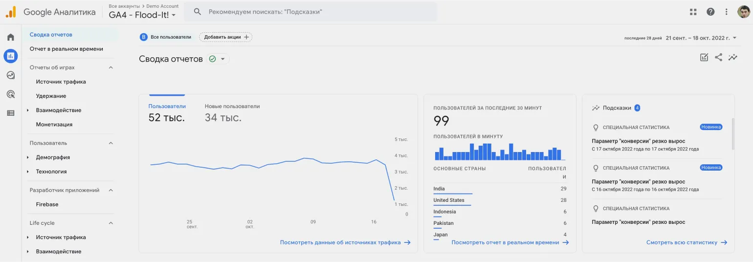
A dashboard is a powerful data visualization tool that collects and organizes information from various sources. It simplifies the data's perception and allows users to quickly analyze key metrics. Using graphs, charts, and text blocks, dashboards provide a visual representation of information in real time or on a set schedule. This makes them indispensable for businesses, enabling informed decisions based on relevant data and improving overall management efficiency.
Dashboards are designed to simplify the process of data-driven decision-making. Instead of analyzing multiple reports, users can quickly obtain summary information by accessing a single dashboard. This allows for an instant assessment of key metrics, such as the number of active machines in a production stream, energy consumption, and projected production volumes. Dashboards provide visibility and convenience, which contributes to more effective management and prompt response to changes in the business.
The term "dashboard" comes from the English word "dashboard." While the concept of a dashboard is most often associated with business, such tools are also widely used in everyday life. Dashboards are visual interfaces that allow users to quickly and easily analyze data, monitor metrics, and make informed decisions. They help organize information by creating visual reports and graphs, making complex data much easier to understand. In today's world, dashboards are becoming indispensable management tools for both business and personal life, providing effective control and analysis of various processes.
- An electronic board in an elevator displays the floor, direction of travel, and permitted weight.
- A car's dashboard provides information on time, speed, distance traveled, and fuel level.
- A digital clock displays the date, time, and day of the week.
These devices facilitate decision-making. For example, if your watch shows that you have only half an hour left before a meeting, you might decide to call a taxi. Using such gadgets allows you to optimize your time and improve your planning efficiency. Modern technologies help people be more organized and respond to schedule changes in a timely manner.

Dashboards in business have begun to actively develop in recent years. Previously, decisions were often made based on managerial opinion, leading to subjective conclusions. As an alternative, a data-driven approach known as Data Driven Decision Making (DDDM) was proposed. This method requires collecting and presenting information in a user-friendly format, which became the basis for the creation of dashboards. Dashboards allow for the visualization of key metrics and data, which facilitates more informed and objective business decisions.
Professionals began modifying reports to simplify data processing by adding visualizations and creating dashboards. Nowadays, dashboards are integrated into many systems, including web analytics and CRM systems. Companies also have the opportunity to develop their own dashboards, adapting them to unique business goals and needs. This allows for improved information comprehension and more informed decisions based on analytics.
Dashboard Functionality: How They Work
Dashboards are effective data visualization tools that facilitate quick decision-making based on relevant information. A simple example of dashboard use can be seen in a car: when the driver turns on the low beams, the electronics register this action and display the corresponding indicator light on the dashboard. This approach allows the driver to instantly receive important information about the vehicle's condition, which is a key aspect of road safety. The use of dashboards in various sectors, from business to healthcare, helps optimize processes and increase efficiency by providing visual data for analysis and informed decision-making.
In business, dashboards operate on a similar principle, but their functionality is significantly broader. The main stages of a dashboard include data collection, processing, and visualization in a convenient format. Dashboards help analyze key performance indicators (KPIs), monitor business dynamics, and make informed decisions based on up-to-date information. Effective use of dashboards improves management efficiency and enhances a company's competitiveness.
- An event occurs in a managed environment, for example, a machine breaks down overnight on a production floor.
- The control system records information about the breakdown and transmits it to the dashboard.
- The data is processed by various IT systems, such as ERP (enterprise resource planning), corporate data warehouses, or analytical platforms.
- The information is displayed on a dashboard, which is automatically updated to reflect the current status.
Every morning at 9:00 a.m., the plant holds an operational management meeting. By this time, information about machine breakdowns should be available on the dashboard. This will ensure the team can promptly see new incidents and an updated production forecast. Effective use of dashboard data facilitates rapid problem response and process optimization.
Critical events are highlighted on the dashboard to attract user attention. For example, in the event of an equipment failure or emergency, normally neutral data areas are colored red. This immediately signals a problem, allowing for quick assessment and appropriate action to resolve it. An effective visual design of the dashboard facilitates a prompt response to emergency situations and improves overall management efficiency.
Dashboards are an important tool not only for executives, but also for specialists and managers. They allow you to effectively monitor current indicators and analyze data in real time. Using dashboards helps improve decision-making, increase the speed of response to changes, and optimize business processes. Thanks to data visualization, users can quickly assess the situation and identify key trends, making dashboards an indispensable tool for successful management.
How to create dashboards: from idea to implementation
Creating dashboards is a complex process that depends on the size and structure of the company. In small organizations, one specialist, for example, a data analyst, who independently handles all stages of development is usually enough. In large companies, this process is responsible for a team of IT experts, including business analysts, systems analysts, and developers. Effective dashboards enable data visualization, which facilitates informed decision-making and improves overall business productivity.
Dashboard development consists of four main stages, each requiring careful analysis and attention to detail. The first stage involves gathering requirements and analyzing the target audience, which helps determine which data and features will be most useful. The second stage involves interface design, where it is important to consider ease of navigation and information visualization. The third stage encompasses development and integration, where the intended design is implemented and the necessary data sources are connected. The fourth stage is testing and optimization, where functionality and usability are checked, and necessary adjustments are made to improve the dashboard's effectiveness. Each of these stages is critical to creating a high-quality product that meets user needs.
The first stage of dashboard development involves analyzing user needs. A business analyst interviews key executives, such as the CEO and CCO, to determine the necessary data. They carefully examine existing business processes and formulate requirements for the information to be displayed on the dashboard. This process helps create an effective tool that meets business needs and supports informed decision-making.
The second stage involves identifying data sources. Working with the business analyst, the systems analyst identifies the data needed for analysis and its sources. This may include both internal information systems and manual data collection from employees. This approach ensures the completeness and accuracy of the data, which is essential for further analysis and informed decision-making.
- The required data set for creating a dashboard. For example, profitability analysis requires data on profit and cost.
- Data sources. They can be both centralized and decentralized, which requires additional coordination.
- Methodology for each indicator. Large businesses often develop regulatory documents that outline the rules for collecting and evaluating data.
The third stage of the project involves addressing key technical issues, in which the IT architect plays a key role. They are responsible for developing the IT system architecture, selecting suitable data storage, and defining information transfer protocols. A proper architecture ensures the efficient functioning of the system and the optimization of data processing processes. The IT architect also analyzes business requirements to create a reliable and scalable infrastructure capable of adapting to changing market conditions.
A UX/UI designer, responsible for developing the dashboard's user interface, works alongside the architect on the project. The designer's primary task is to create an intuitive and user-friendly interface that will ensure comfortable user interaction with the system.
The fourth and final stage is dashboard development. After the information has been formalized and approved, the developer begins the programming process. At this stage, they can use ready-made platforms or develop a custom solution from scratch. It is important that the dashboard is intuitive and user-friendly, as well as providing easy access to the necessary information. The correct choice of tools and technologies at this stage affects the functionality and effectiveness of the final product.
Once development is complete, the dashboard undergoes testing. The tester evaluates the functionality and accuracy of the data, identifying potential errors. If any defects are discovered, the developer makes the necessary corrections. Once all aspects of the dashboard meet the requirements, it is published and actively used by users. This approach ensures high quality and reliability of the dashboard, which facilitates effective decision-making based on the presented data.
Creating a dashboard is a complex process that requires the collaboration of various specialists. Effectively organizing each stage of dashboard development contributes to high efficiency and user satisfaction. It is important to consider the needs of end users, as well as implement best practices in design and functionality. Proper collaboration between teams will help create a tool that is not only informative but also easy to use.
Creating Your Own Dashboard: A Step-by-Step Guide
Creating a simple dashboard for personal or business purposes is possible using common office applications. If you need to regularly monitor financial flows, and the standard charts of the banking application do not meet your requirements, you should consider data visualization methods. Using dashboards allows you to analyze information more effectively, identify trends, and make informed decisions. Using tools like Excel or Google Sheets, you can easily customize visual elements to better understand your financial results and optimize your budget. Creating a PowerPoint slide with automatically updating fields for the current date and time is one of the simplest ways to visualize data. You can integrate charts and link the slide to a data source, such as an Excel file where you record your income and expenses. This allows your data to automatically appear on the dashboard, making it easier to analyze financial information and make informed decisions. This approach not only saves time but also ensures that the presented data is up-to-date, which is important for effective financial management.
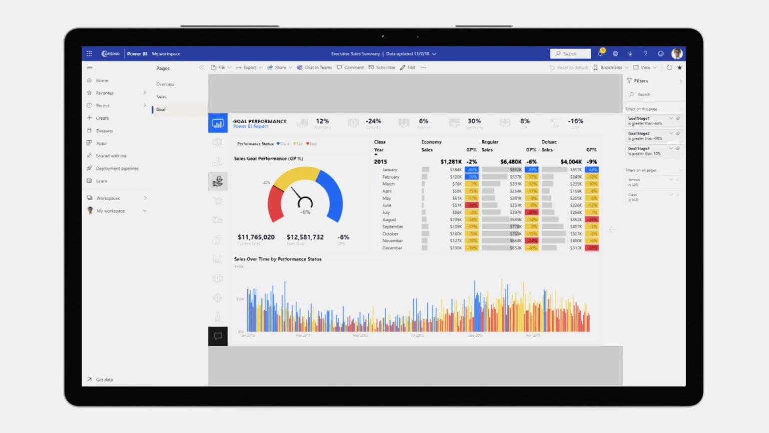
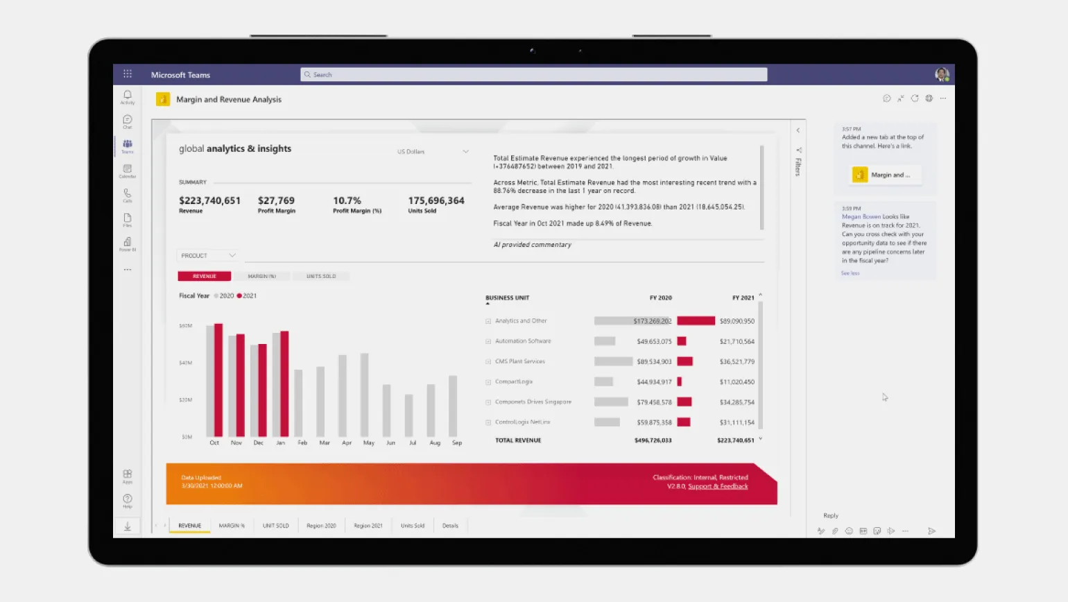
For more complex tasks related to creating business dashboards, BI systems are the optimal solution. Specialized programs such as Qlik, Microsoft Power BI, and Luxms BI are designed to effectively collect, process, and visualize company data. Using such tools allows businesses to make informed decisions based on the analysis of relevant information.
BI systems can automatically generate dashboards, but to work effectively with specific data sources, they require preliminary configuration. This process includes establishing data transfer routes, selecting key metrics, and determining their visualization formats. Configuration can take a significant amount of time—from several weeks to months, especially if you perform it yourself. Investing time in properly configuring a BI system will significantly improve the quality of data analysis and simplify the decision-making process based on the information obtained.
The dashboard represents the tip of the iceberg, providing summary information from vast amounts of data. For example, by clicking on a specific value on a dashboard, you get access to more detailed reports, which can be presented in the form of tables or map visualizations, if the corresponding feature was enabled at the design stage. This allows users to analyze data in more depth and make more informed decisions based on the information presented.
Key Aspects of Dashboards Worth Knowing
If you are new to the concept of dashboards, you may have various questions. In this article, we will try to answer the most common ones, based on information from the editorial team of Skillbox Media. Dashboards are effective tools for data visualization and monitoring key metrics. They help users quickly analyze information and make informed decisions based on the presented data. Understanding the basics of dashboards will help you better utilize their capabilities in various areas, such as business, analytics, and project management.
Dashboards play an important role in various areas of business. In online marketing, they are used to analyze the effectiveness of advertising campaigns, allowing for ROI assessment and budget optimization. In PR campaigns, dashboards help monitor public opinion by analyzing data from social media and other media outlets. In project management, dashboards provide visibility into team workloads, facilitating more efficient resource allocation. In HR analytics, dashboards allow for tracking employee salaries, key performance indicators (KPIs), as well as vacation and internship data, which helps make informed HR decisions. Using dashboards significantly simplifies data visualization and facilitates a more rapid response to changes in the business environment. Many people wonder whether a dashboard is the same as an infographic. In fact, they are two different tools. Infographics are used for static visualization of information, providing viewing only and no editing capabilities. Dashboards, on the other hand, not only visualize data but also allow for its analysis and interaction. Dashboards often use infographic elements that update in real time based on changes in the data. This makes dashboards more dynamic and useful for making decisions based on relevant information. Creating a business dashboard doesn't require professional analytical skills. Modern tools automate much of the work, simplifying the process. However, having basic analytical skills will significantly increase efficiency, allowing you to process and extract meaningful information from large volumes of data. The right approach to data analysis will help you make more informed decisions and improve business results. While there are no strict rules for creating dashboards, it is important to present information in a way that is easy to understand and use. Following data visualization principles is key. Edward Tufte, a recognized expert in this field, emphasizes that the main goal of visualization is to convey the maximum amount of useful information with a minimum of unnecessary graphic elements. This allows users to analyze data more quickly and effectively, making informed decisions. Optimizing dashboards for better user experience helps enhance their functionality and meet end-user needs.
Additional materials from Skillbox Media that will be useful for your training and development. We offer a variety of resources to help you deepen your knowledge and skills in various areas. Explore our materials to stay on top of the latest trends and improve your professional competence.
- What is BPMN notation and how is it used in business analysis?
- Power Pivot in Excel: uploading data from external sources into a single database.
- The profession of a product analyst: responsibilities, earnings, and the path to a career.
- Business communication: a complete guide for beginners.
- Logical functions in Excel: why they are needed and how to use them - examples with illustrations.
Data Analyst from Scratch: 5 Steps to a Career in BI
Want to become a data analyst? Learn 5 steps to a successful career with Python and SQL! Read the article.
Find out more